Don't be too upset that Fable is not available outside the US. Fable beats previous models in benchmarks, but represents a big step in the wrong direction.
Anthropic just released Fable, their most powerful model yet. Almost immediately after the release, the US Department of Justice had Anthropic disable it for all customers outside of the US. There is no real evidence to suggest that Fable poses a significantly larger security threat than existing models. This seems to just be a case of Anthropic's fear mongering catching up to them. If you missed the window to try Fable this time around, you will likely get the chance again soon.
Fable is, by any measure, the smartest model Anthropic has released to date. But rather than mark a new milestone in machine intelligence, it feels like an incremental improvement on the models that are already on the market. For most work, the models that are already on the market will produce results that are just as good as Fable. While Fable might lead on "intelligence" it is significantly worse in more important areas.
2x - 40x more expensive
Fable is priced at $10/M input tokens and $50/M output tokens. This is twice the cost of Anthropic’s previous flagship, Opus. Furthermore, Fable will not be available on Claude Pro and Max subscriptions that offer massive discounts on token costs. The cost difference between the latest Opus model and Fable for the same task can be as much as 40x. This is arguably one of the biggest issues with AI coding agents today. These models are undoubtedly useful, but they often do not provide enough value to justify the cost.
Take the recent example of Uber. In the first 3 months of 2026, they spent their entire yearly budget on tokens. When their COO investigated, he was unable to draw a line between this massive additional expense and any noticeable increase in productivity or new features.
If you work for a smaller company you might feel like you are getting a lot of value for money with Claude Pro or Claude Max. For smaller companies under 150 employees, these subscription costs are heavily subsidized. The plans are designed to get more people using Claude Code, and they are costing Anthropic billions of dollars each year.
The fact that Fable will not be available on these plans is a good indicator that Anthropic is planning to go the same way. Likely after their IPO later this year.
The most underrated metric
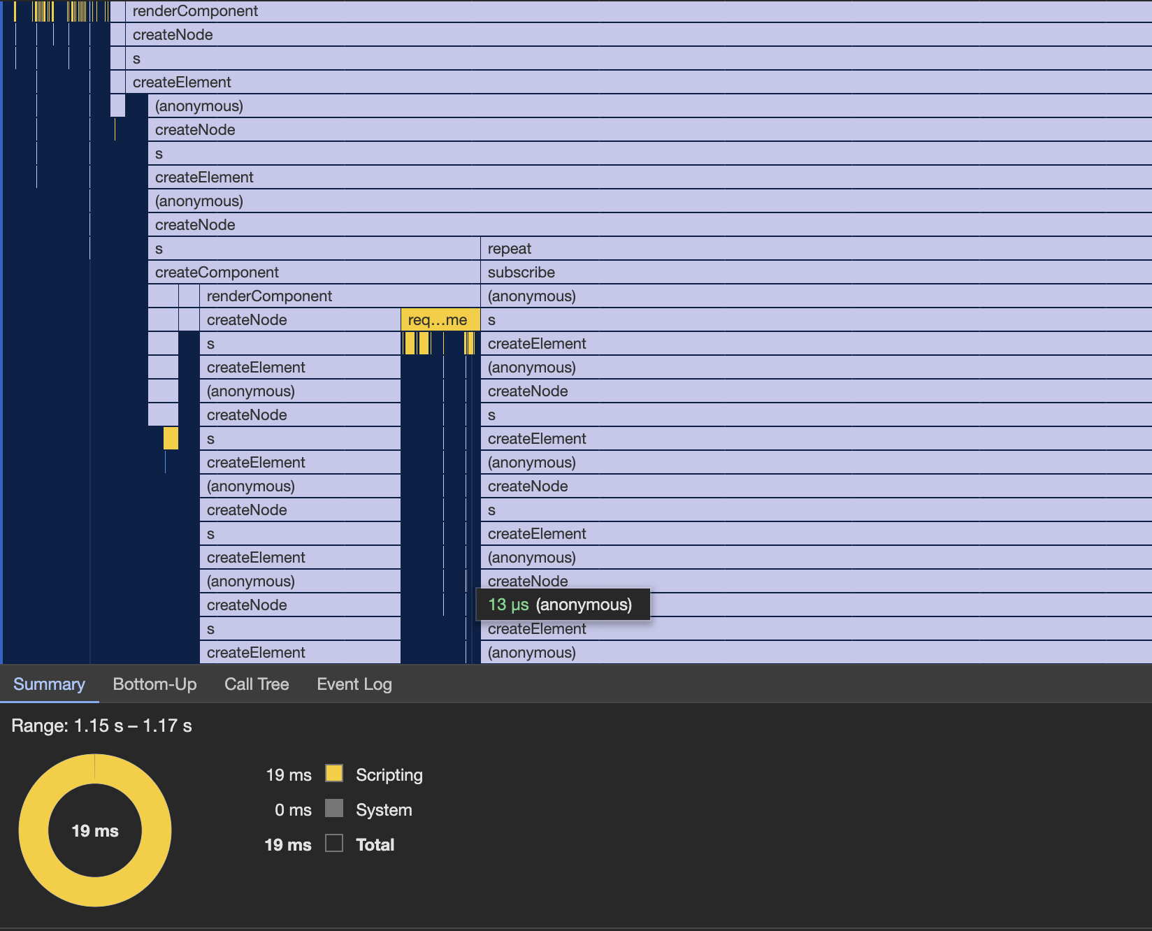
There are more AI benchmarks than anyone can possibly keep up with. Every time a new model is released, it references scores on a benchmark you almost certainly haven’t heard about before. But for all the countless ways to measure a model’s capabilities, one is almost always ignored: speed. How is it that an industry that seems obsessed with making software development faster never talks about the speed of different models?
Fable scores 82% on the Terminal Bench (verified) benchmark. In comparison, Google’s Gemini 3.5 Flash scores 76%, so Fable completes 7.9% more tasks than Gemini 3.5 Flash. However, Flash outputs an average of 133 tokens per second, compared to Fable’s 39 t/s.
This 3.5x difference is huge. Fable might be able to complete 7.9% more tasks on the first try, but it will take 3.5x longer and over 5x the cost to do so. And that’s when solving tasks specifically designed to challenge the models’ capabilities. In a normal coding setting, this difference will be even more pronounced.
The output speed of the frontier models we have today means that developers often spend more time waiting for the model to finish than on prompting and reviewing code. Current attempts to address this issue involve ignoring every single lesson we, as an industry, have learned about software development over the last 30 years.
It is always better to halve the time it takes to do a task than to do twice as many at the same time
People are trying to run multiple agents for every one developer, leading to rapid task switching and causing increased stress and burnout. We are regressing to “spec-driven development”, where the developer spends time writing a carefully detailed spec—almost at the level of code—to ensure that the AI agent is more likely to get it right on the first attempt. But these initiatives are not innovative new ways of working with AI. They are a desperate attempt to solve the real issue: AI agents are not fast enough. We are treating the symptoms instead of the underlying problem.
We already know that this is not how you increase productivity in a software team. It was the core message of the Agile Manifesto and books such as The Mythical Man-Month. If you want to move fast, break big tasks into smaller tasks and iterate quickly.
What can we do now?
For a while now I have been using a very simple workflow when working with AI agents. Start with a fast model (I mostly use Gemini 3.5 Flash or Cursor’s composer models). Break down complex tasks and ask the agent to solve one thing at a time. Give enough context so the model knows what it is working on, but don’t overdo it. Iterate with the model while solving the task. If I come across a task that the fast model cannot solve, I will either do it myself or switch to a frontier model while getting another cup of coffee. In practice, I almost never switch models.
For many people this might seem like a step back from running a swarm of parallel agents, but in reality it is much more productive. The faster model means that the majority of tasks get solved 3–4x faster with very few iterations. My mind is always on the task at hand, so I don’t have to pay the cost of task switching. This means that I don’t get fatigued as quickly and don’t need as many breaks. Since changes happen in smaller increments, it is much easier for me to keep up with what the AI agent is doing, so I don’t have to wait until the end of a task to review the code.
We need to start evaluating AI models on more than just their benchmark scores. Cost and speed are just as important, if not more so. Instead of compromising our work processes to accommodate AI models, we should ask for AI models that support the way we want to work.
Companies have rushed to adopt AI faster than any other technology in history. They have poured billions of dollars into AI, transformed organizations, delayed hiring and even made "tokens spend" a metric for success. When asked how this massive investment has impacted their bottom line, nobody seems to have an answer.
For years now AI companies have been selling us a story about where AI is going. The things that will be possible in 6 months or a year. The productivity that will be unlocked and the people that will be replaced. But AI coding is not a theoretical future. It is here right now. We don’t need another promise or an overhyped model at a heavily inflated price point. We need reliable, faster, and more cost-efficient tools.
Yesterday Webflow announced that they are restructuring and as a result, laying off a large part of their team. From what I can gather almost 200 employees.
Read the announcement here This is the latest in a long line of layoffs that explicitly mentions AI as the primary reason. In their own words they are moving to a simpler structure to build their new vision “The agentic web marketing platform”.
Webflow was a pioneer
Before we dive into Webflow's planned transformation and what “Agentic web” means, I want to first talk about Webflow the company.
Webflow used to be known for letting web designers create the most beautiful landing pages and engaging websites. For many years it was a favorite among creative studios worldwide. It was a major inspiration for Nordcraft.com. It was the first company that showed it was possible to build a tool that made web development faster and easier while producing high quality semantic code. Without Webflow, Nordcraft likely would have never existed. Read more about Nordcraft and Webflow
When Webflow first came out it was unlike any other tool on the market. It was the first website builder that felt like it was built for professional developers. Instead of hiding the HTML and CSS like most website builders, they put it front and center.
In recent years that has started to change. The company started shifting their focus from freelance developers and design studios to enterprise customers and marketing teams. The web platform is evolving faster than ever, but almost none of the new features are making their way into Webflow. Instead, the bulk of Webflow's development has been focused on enterprise features such as A/B testing and conversion optimization, features that Webflow users could already get through 3rd party integrations.
This transformation of the company and their target audience is what has now led to them laying off a large part of their team and the new focus on “The Agentic Web”.
The Agentic web
The Agentic Web means a web where AI agents, rather than people, are the primary consumers. It’s a web where people no longer use search engines and visit websites, but primarily interact with the web through an AI chat bot, and where companies care less about the user experience of their website and more about how easy it is for an AI agent to access the right information. Instead of SEO, companies focus on AEO or “Answer Engine Optimization”, where websites are built for AI agents first, and people second.
Webflow is far from the only company that is embracing the notion of the agentic web. Google recently added “AI mode” directly into their search box, so users can easily opt for AI-generated answers instead of search results.
What kind of web do we want?
It is hard not to feel that Webflow is abandoning the user base that made them what they are: the creative designers and developers who showed the world what a tool like Webflow was capable of in the right hands. With their new pivot that seems to all be in the past.
AI is undeniably a transformative technology, but what do we want that transformation to be? A web where every website is built for AI agents by AI agents does not sound like progress. It sounds like a place without creativity and without joy.
AI is a big part of what we do at Nordcraft. We use AI agents as part of our development workflow. Where other website builders treated AI as an add-on feature, Nordcraft's AI agent is fully integrated into the editor. We even designed a custom programming language specifically optimized for LLMs which is how we created the most powerful AI agent of any website builder. But at Nordcraft AI is the means and not the goal. The goal at Nordcraft is, and has always been, to empower creative designers and developers.
The web is an amazing canvas for creative ideas. With the technology we have today it is easier than ever to build a website. Someone with no experience can use the AI agent to build their first website and create a little corner of the web that is just their own. As they get better and learn more about the web, they can create even more engaging experiences.
That does not mean we should ignore agents. Making your website easily accessible to AI agents can increase brand awareness and can ultimately help generate more traffic to your site. But LLMs are already trained on the web. The best way to make your website “AI accessible” is to use clean and simple semantic HTML. That also happens to be the best way to make your website accessible to people.
We have to decide where we want to go from here. AI can be the end of the creative web, or the beginning of a whole new era.
Stop juggling multiple agents. Build 6x faster than Claude Code and Lovable in a visual website builder. We bring the speed. You stay in creative flow.
We started Nordcraft because we wanted to give creative people better tools to build amazing products. Today, we are proud to introduce the next exciting step in that mission: Nordcraft 2.0 and the new AI Agent.
Coding agents have quickly become a standard part of every developer’s toolbox, and now the full power of agentic development is available in Nordcraft as well. Use the agent to lay out content from a CMS, implement complex logic, or build full applications. The possibilities are endless.
6x faster than Claude Code
Nothing breaks your flow like having to wait for slow tools. That is why we made sure Nordcraft’s AI is fast. We optimized our AI Assistant to be highly token-efficient and run on the fastest models available. Nordcraft’s AI assistant is up to 6x faster than Claude Code and Lovable while delivering the same level of programming performance. There’s no need to juggle multiple agents. We eliminated the wait time so you can stay focused on one creative task at a time.
Real creative work is not something that is generated from a detailed plan in a markdown file, and that's why speed is so important. Creative work is a process that requires experimentation and iteration. Instead of switching between design tools, code agents and command lines, Nordcraft gives you everything you need in one tool, with a speed that keeps you in flow.
I want AI to do my laundry and dishes so that I can do art and writing, not for AI to do my art and writing so that I can do my laundry and dishes. – Joanna Maciejewska
Coding agents are great for generating large amounts of code in no time, but trying to get the final details right can be a frustrating experience. Instead of having to explain exactly what you mean, it is often much simpler to just open a color picker, drag an item to where you want it to be, or adjust that animation until it feels just right.
In Nordcraft 2.0, you can seamlessly switch between the new AI Assistant and visual builder, giving you the best of both worlds.
The new AI Assistant can scaffold projects and features, implement logic, or take over repetitive tasks. You can even ask it to build complete prototypes. Let the AI Assistant take care of the chores, so you can focus on what makes your websites and products stand out.
Build with confidence, not luck
Nordcraft’s AI Agent doesn’t just generate a bunch of code in the background: it is completely integrated into the editor. That means you can inspect every workflow and every bit of logic the AI Agent creates. No more prompting and hoping that the AI did the right thing. You can see and approve every change.
If you are new to logic and workflows in Nordcraft, the AI Assistant comes with Ask mode available for free. Ask the agent to show you how the different parts of your application work, ask it for SEO and accessibility tips, or let it introduce you to the latest CSS features that can make your website feel even more unique.
You can start using the new AI agent right away. Just click the “Ask AI” button in the editor or hit CMD + I (CTRL + I on Windows). You get a generous amount of free credits every day and you can buy more without having to sign up for a subscription. Go try it out today.
Each day this week we will be highlighting a new feature of Nordcraft 2.0, so make sure to check back daily or follow us on social media.
We’re removing seat-based pricing from Nordcraft. Start building for free, and add a custom domain for just $9 per month. Invite unlimited collaborators.
Previously, the Nordcraft Startup plan cost $29 per month for one seat, with each additional team member costing another $29 per month. And when you reached a cap of three seats, you had to move up to the Nordcraft Scaleup plan, which started at $479 per month for four team members.
At the heart of Nordcraft’s vision is collaboration, and so we wanted to introduce a new pricing model to make the collaboration experience of building amazing websites as smooth, fast and cost effective as possible.
Starting today, we’re removing all seat-based pricing from Nordcraft and removing the subscription model altogether. Now, you only pay for hosting which starts at just $9 per month. This means that you can invite as many collaborators as you want to your Nordcraft projects completely free of charge. And if you choose to keep the nordcraft.site domain and Nordcraft branding, then hosting is 100% free.
Managing an ever-growing number of subscriptions is a chore
The technology we use on a daily basis is overflowing with subscription-based pricing models, and we're getting tired of it. Too often we decide to keep paying for a subscription because there’s either so much friction surrounding canceling and resubscribing, or we don’t know when we might need to use that service again. You could downgrade a subscription one month, only to find that you need to upgrade again the next month.
More people than ever can build
With the advancements in agentic coding and the launch of Nordcraft’s new AI Assistant, more people than ever have access to the tools to collaborate and build exciting projects together. As a result, it no longer feels right to talk about developers and designers as separate entities, let alone sell a subscription model based on “developer seats”.
By removing the barriers of seats and labels, and by opening up each Nordcraft project to unlimited collaborators, we believe we’ll see you build more creative and exciting projects, where everyone can contribute their best skills and vision without being gate-kept behind a pricing model.
Only pay for what you use
From today, you can host your project on Nordcraft for just $9 per month, which allows you to add a custom domain, remove Nordcraft branding, and more. Additional costs are billed on how many requests your project receives per month. The first 100k requests are included in the $9 per month cost, and any additional requests are billed on a monthly basis. This means that if you’re just starting out, you only pay $9 per month. You only start paying more when your project grows and starts getting more traffic, at which point you can congratulate yourself on a job well done. If you keep an eye on your traffic growth, this makes it trivial to forecast your monthly costs based on your monthly requests.
As part of this pricing change, we’ve also rolled out analytics in Nordcraft so you can monitor your requests at a project and organization level. For more information on where to view analytics and the types of requests tracked in your Nordcraft projects, check out the official documentation.
And remember, you can also build for free on Nordcraft. Publish your website to a nordcraft.site domain and share your work with the world completely free of charge.
Try Nordcraft today
In removing subscription-based pricing, we’re opening up more opportunities for more and more people to build for the web. With Nordcraft 2.0, you’re no longer thinking about seats, limits, or whether adding one more collaborator is “worth it.” Whether you’re building your first project or your hundredth, Nordcraft is now designed to grow with you, not hold you back. Now, you can focus purely on creating, experimenting, and realizing your ideas alongside others without friction.
LLMs are incredible at generating large amounts of code faster than any programmer can type. For a select number of tasks they far outperform humans. They are especially useful when two criteria are met:
1. When the problem to be solved follows a similar pattern to ones the LLM has seen in its training data. 2. When the desired outcome can be clearly defined. For example, “Write a function that finds the first element in the basket where the price including VAT is larger than €45.”
Criteria number 1 is purely up to the model, so there is not much that Cursor or any other AI-dependent tool can do about that. As models get better LLMs will be able to handle more cases, but this limitation will likely always exist to some extent.
Criteria number 2 is what Cursor is attempting to address with this new update. People who have been coding with LLMs for a while have probably seen that they tend to do well at back-end tasks but less so on the front end. When creating user interfaces, the first prompt often gets you 80% of the way to what you want, but the remaining 20% can be painful. You often have to get increasingly detailed about what exactly the LLM should do, and you often have to go through several prompt cycles getting more and more specific in your request.
Where back-end tasks often have only a few valid solutions, front-end and user interface programming is different. There are often dozens, if not hundreds of ways to accomplish the same thing, and it is hard to objectively say which of them are “correct” and which are not.
Ask any flagship model to: “Write me a function that takes a string as input and copies it to the user’s clipboard” and they will get it right 100% of the time. Ask them to create the button that actually copies that string and they are unlikely to produce the exact style, size and icon you were looking for.
The problem is not the LLM: it is that your request was not precise. You're prompting it wrong, bro! There were simply too many possible valid solutions for it to pick the one you were thinking of. When the LLMs can’t predict what you want, you have to tell it explicitly, and this is where the visual editor comes in.
The new visual editor in Cursor Browser allows you to make visual changes to your interface that are then converted into a prompt that precisely tells the LLM what changes to make. Making the same kind of detailed changes by prompting would require several iterations, waiting for the LLM at every step. The visual editor makes this process both easier and much faster.
AI and visual development: the perfect match
The problem Cursor is trying to solve is likely something you have experienced yourself.
While LLMs are excellent for the bulk of code generation, especially when it comes to commonly understood problems and repetitive tasks, we still need tools that allow us to do the fine-detailed work that makes our websites and apps special. If an LLM is a chainsaw, then visual editors are the carefully sharpened chisels. The key is learning when to use which.
We have previously written about the many benefits of visual editors when creating user interfaces. You can read more here.
While Cursor's solution is clever it does pose an obvious paradox:
If we have to give the machine precise unambiguous instructions on what to do, why do we need an LLM?
All of the tokens, none of the benefits
Cursor identified the right problem to solve. But their solution has none of the benefits we normally get from using LLMs, while still having all of the drawbacks. You still need to give Cursor the exact same precise instructions as if you were writing code, but by running your set of changes through an LLM, you not only have to wait for the LLM to apply those changes, you also have to deal with the indeterminism that AI models inherently impose. By running your precise set of instructions through LLMs you open them up to interpretation, which means you still have to verify that the resulting code is exactly what you intended.
As if all of these issues were not enough on their own, there is one more ironical cherry on top. Even though you did all the work, you still have to pay for the tokens. The promise of AI was that it would do the work for us. Instead, we are having to pay for work we did ourselves.
Nordcraft is designed from first principles
Cursor's vision is not that far from the one we have at Nordcraft. The next big innovation in web development is going to be focused on how we write code. Combining the raw power of LLMs with the precision of a visual editor creates unique opportunities and can remove a lot of the pain points of traditional coding.
Cursor's approach comes from incremental thinking: each new feature trying to fix the problems they created with the previous. At Nordcraft we took a step back and redesigned the entire stack. Every part of Nordcraft is designed for this new way of working.
The Nordcraft AI assistant will generate full pages in a manner of seconds, and the visual editor will let you make detailed changes fast and efficiently, without using extra tokens. The web framework that powers Nordcraft applications and the editor are designed for each other, so each change you make is committed instantly without any chance for an LLM to misinterpret your intentions and without wasting precious unnecessary tokens.
Nordcraft’s AI Assistant does not just generate large swathes of code for you, it will carefully take you through how every part works. And, Nordcraft's visual coding interface makes it simple to understand the logic and behavior of your application so that you are always in control of what you publish.
LLMs are a fantastic tool that can propel you forward faster than was possible just a few years ago, but the things that really matter, the things that make your product stand out from every other product out there, have to come from you.
Nordcraft AI is coming early 2026. Sign up now to get notified!
Modern CSS is amazing. It empowers us to build incredible experiences on the web, but as CSS becomes more powerful, we are beginning to see a new weak point.
When I got my first job as a web developer, it was common to have to come up with different hacks to work around the limitations of CSS. Those times are long gone. Modern CSS is amazing. It has powerful layout algorithms, 3D transforms and an incredibly capable set of animation primitives.
Most of the limitations of modern CSS don't actually have anything to do with its capabilities. Instead, it has to do with how we write it. For this reason, the future of CSS might not be text files, but visual editors.
You might be ready to call blasphemy and close the tab in anger, but if you stick around I'll do my best to make the case.
Colors
A great example is OKLCH. The OKLCH color space was added as part of the CSS Color Level 4 Specification. OKLCH has a lot of benefits over previous color spaces but you might have discovered that it can be tricky to wrap your head around if you are used to HEX or RGB.
Many web developers have built up an intuition for HEX and RGB over the years, but OKLCH is new way of thinking about colors that requires you to relearn much of that intuition. You can probably tell me what color #FF00FF is but likely not oklch(0.7017 0.3225 328.36).
In the recent 2025 State of CSS survey only 12% of participants reported that they had tried any of the new level 4 wide gamut color spaces and had a positive experience.
Using an OKLCH color picker (like the one below by Adam Argyle) completely changes this experience. The UI makes working with OKLCH intuitive and makes it trivial to e.g. create different shades of the same base color.
Gradients
When working with gradients, the benefit of visual tooling becomes even more clear.
Without a visual editor like https://gradient.style, working with gradients can be a very frustrating experience. Our brains are just not wired to visualize something like linear‑gradient(in srgb, 37deg, #8dea81 0%, #92d3d2 100%) This is even more true with the support for different interpolation color spaces which can have a big impact on how a gradient looks on screen.
Animations
Nowhere in CSS is this concept more clear than when working with timing functions for transitions and keyframe animations.
Our brains just aren’t wired to translate coordinates into a bezier curve, let alone allow us to visualize the resulting movement pattern. For tasks like this, a visual editor like the one below is all but required.
The tool below is the exact same we use in Nordcraft. It lets you create different timing functions for your animations and transitions.
CSS keyframe animations suffer from the same issue. Simple “from” and “to” animations are easy to write, but as soon as you start adding custom keyframes it quickly gets more complicated and fine-tuning keyframe positions can get very tiresome.
A keyframe animation editor like the one we built into Nordcraft, removes the friction when creating more complex animations.
It used to be case that the biggest barrier to adoption for new CSS features was cross browser support, but in recent years that is no longer the case. Though features like offset-path have been supported in all major browsers since 2022 but in the recent State of CSS survey from 2025, only 30% of respondents were even aware that it existed.
As the spec expands it becomes harder and harder to remember how each feature works. We are generally seeing quite slow adoption on many new CSS features simply because developers are having a hard time keeping up.
Visual Editors and IDEs are a great way for web developers to discover new features, especially when paired with built-in documentation.
Encouraging play
Visual editors are not just about making CSS easier to use.
The thing each of the examples so far has had in common is that they are styles that usually requires some adjustment before you get them just right. Creating the perfect gradient that looks great and still has a good contrast to your text color is more art than science. You need to get in there and play with the color tones and stops.
The same is true for your animations and transitions. You can tell right away if someone has taken the time to get the details right. For your animations and transitions to have the right “weight”, you need to tune the keyframes, durations, and timing functions.
Visual tools like the ones we have shown above naturally encourage you to play with the different values and see their effect. I have always believed that play is the best way to master a new tool.
More to come
We are getting more and more advanced CSS features. The new shape() and path() functions are incredibly powerful features, but writing something like the example below, by hand, can be tedious.
clip‑path: shape(from 87% 0.5%, hline to 1%, curve to 16% 52% with 1% 1% / 17% 17%, curve to 1% 100% with 16% 87% / 1% 100%, hline to 87%, curve to 100% 52% with 87% 100% / 100% 89%, curve to 87% 1% with 100% 15% / 87% 1%, close);
So many of the new amazing features like, mask-image, offset-path and conic-gradients are likely going to be underused simply because of the complexity and friction of writing the css for these properties.
A new generation of tools
CSS is becoming more powerful and has in many cases outgrown the text editor is of course a good thing and worth celebrating. Most web developers are already relying on visual editors for creating gradients, paths, and timing functions for animations and transitions but visual editors can do so much more.
Visual editors open up a whole new way of designing with CSS and we have only started scratching the surface of what is possible.
Using visual editors for writing CSS is not only a great way to specify colors, gradients and animations. They are also a great way for developers to discover new CSS features. When new features are paired with an intuitive interface it becomes much easier to adopt these features as part of your developer toolbox.
At Nordcraft we are excited to be at the frontier of this new approach to writing CSS and we have so much more in the works. We can’t wait to show you.
One of our big goals for 2025 is to go fully open-source, and we’ve just taken our first steps toward that ambition. Nordcraft's open-source journey starts now!
We have started our work to go open-source, and the first five packages and two repositories are already available on npm and GitHub.
So far, we have released five packages:
Core: This package includes shared logic for our runtime and server and all code for formulas.
Lib: These are all the built-in formulas and actions in Nordcraft.
SSR: This package includes all the functionality for rendering a Nordcraft project on the server. If you self-host, you don’t want to limit yourself to a subpar runtime, so we’re putting much effort into getting this right.
Search: This library is built to help find issues in a Nordcraft project—similar to ES Lint. It’s the “engine” behind Nordcraft's built-in issues panel. Later, we want to add functionality to help search for dependencies across a project.
Runtime: This powers our front-end, ensures things render correctly, and applications stay interactive.
… and two repositories:
Nordcraft: Holds all the packages above will eventually enable self-hosting.
Documentation: Will host all Nordcraft's documentation.
Our primary focus, for now, is to reach a point where it’s possible to self-host a Nordcraft project. Once we have completed this work, we will open-source the rest of Nordcraft — including our editor project.
Everything will come in waves, and we will follow our initial schedule, posted here.
A few more updates
We want to keep you in the loop as we ship, so we have updated the README and will continue to do so. A big update is that you can now contribute to the Nordcraft project. If you think something is missing or not sufficient, you can now submit pull requests to the repository.
What’s next?
Our immediate next steps will be to release guidelines on how we release and how you can best submit pull requests to increase your chances of contributing successfully to the project.
We have a lot of new changes coming, and in January, we plan to introduce a guide on how to run Nordcraft in a self-hosted environment, whether with a different provider or on-prem. Please do not expect the first version to be smooth; it will be the case under no circumstances. We very much expect the first iteration to be tedious and cumbersome, but we’ll eventually ensure it will be a smooth affair.
We are going open-source to keep the web open and accessible
We want to change how the web is built, and we can’t do this in a vacuum or only for a subset of developers who are happy to rely on a hosted service with vendor lock-in. To change how the web is built, it needs to be built like the web: open and accessible to everyone. That’s also why the team decided to license Nordcraft under the Apache 2.0 License, which they believe is the most open version.
Open-source also means that we hold ourselves and future selves accountable for mechanisms like vendor lock-in and all the things that come with it, such as unreasonable price hikes and questionable ownership structures. If you build intellectual property, you should own it and decide what ownership looks like. Lastly and most importantly, we can build Nordcraft with you instead of for you. You get to have a say in what the future of web development should look like, which is how it should be.
We are now open to pull requests! Learn how to contribute!
The two repositories are now open to pull requests. You can also download the project and create a fork, although I’d probably recommend you hold off until we finish the work. If you aren’t comfortable building, you are welcome to help improve our documentation or simply give us a star on GitHub.
How to follow our progress
The easiest way to follow progress is to look at our GitHub repositories. We’ll update them as we build. You can also "Star" the project to keep tabs on new updates.
The internet is vast, and there are tools for every purpose. If you want to build a form, there’s Typeform and a hundred variants. That's true for most tools
You have Webflow, Framer, and more than 100 other platforms, each with unique features and design capabilities that can make your brand stand out. In this sea of options, Nordcraft and Webflow stands tall, offering unique features that can revolutionize your web development process.
The most crucial thing in your tech stack is interoperability. Do your tools connect? When they do, you unlock automation, which enhances your productivity and saves you the time to refactor your code or manually copy-paste from one platform to another.
Imagine the freedom and flexibility of continuing with your codebase and adding to it from other tools.
With web component export, you can export code generated by Nordcraft and add it to your existing codebase. You can, for example, build a terrific drum machine like the T-beat and embed it into your code as a web component.
Many of our best customers do just that. They build their marketing website in Webflow and suddenly find themselves limited. That was the case with Even founders who needed to add a database to their Webflow site. They had an Airtable with over 3,000 records that they needed to load as fast as their Webflow site. Rather than building their site from scratch, they built the database in Nordcraft, exported it as a web component, and embedded it natively on their Webflow site. The team did not need to consider another tool for a small task. They used what they had with a little Nordcraft magic, and now they have a smooth experience that users love.
Can’t I do this with an iframe?
Iframes were created to show a web page on another web page. They work well for that purpose, but not so much if you must show a single component. So technically, yes, you can do it, but it requires more work, runs slower, and has many unnecessary drawbacks.
It’s slow. You must load an additional page from scratch rather than just a component.
It has no context. Iframes don’t know their contents. They need styling to avoid scrollbars.
It doesn’t play well with other components. It’s not meant to interact with other elements.
Here’s Jacob, who explains the differences between iframes and web components.
A web component is much more flexible. You can style it as you like, update CSS variables, and add attributes that allow you to alter the contents of your web components from the code base you have exported it to.
The most potent feature of web components, something that’s nearly impossible to do with iframes, is the ability to add slots. A slot is a component that contains another component that you can update. It essentially enables you to add a web component inside of another web component.
You can add events to web components and trigger specific actions from the site where the component is embedded.
In other words, web components are a much more flexible tool that renders natively in your codebase.
The best way to describe the benefits is to see them side by side.
On the left, you have a web component with a backdrop covering the whole site; on the right, you have an iframe covering only the embedded iframe.
The iframe.
An iframe will typically only cover the embedded frame. There are many ways to work around this, but it's extra work and less performant.
The web component.
With a web component, you have more flexibility. It renders natively as part of your site, and you can add elements outside the embedded frame that allow you to trigger events inside it.
Try Even Founders' database here to get a good sense of the power of embedded web components and how fast they render once embedded. (Note! The backend is Airtable, which isn't designed as a backend. It can still get faster.)
Web components are a great way to test out new frameworks and programming languages. You can build a single component to embed in your codebase without committing to a complete rebuild. This will allow you to test the performance and capabilities in a confined environment.
Are frameworks converging? Lets explore the topic of carcinization within the web development world, and can we glimpse what the future holds, by looking back?
In biological sciences, carcinization refers to the evolutionary phenomenon of non-crab-like crustaceans evolving into forms resembling crabs. A similar story is currently taking place within the web development world. Web frameworks are seemingly undergoing carcinization! To be clear, the frameworks are not actually developing claws or exoskeletons; rather, they seem to converge towards a similar set of features and are increasingly harder to differentiate conceptually.
Spoiler alert: I am not suggesting that a theoretically perfect framework exists. Each project is different, and different requirements call for new solutions and tools. However, there might exist a set of near-perfect features that most frameworks will eventually adopt. Perhaps we can catch a glimpse of it in this article.
What happened?
A long long time ago, JavaScript frameworks worked entirely differently from each other; in fact, this was usually their main selling point: "A new, better, but mostly just a different way to develop on the web". jQuery looked to add utilities to the browsers to develop faster and more cross-browser-friendly websites. Angular wanted to bring the whole suite of Object Oriented Programming (OOP) to the web in an attempt to build more scalable web apps. React proposed using functional principles in few, but sophisticated ways to let developers create web apps using only functions and composition. Other frameworks were based on entirely new foundations, and some simply improved on existing frameworks by making them faster, smaller, or combining different ideas.
Naturally, things evolved... Some frameworks gained more traction than others. The best ideas were incorporated into the new frameworks, as well as existing ones. AngularJS moved its focus to angular 2. A simplified version that dropped some of the OOP values. Vue implemented React's hooks, and React ditched their class components in favor of functions. Even Svelte, once considered the breakout framework, has recently implemented Runes (which mimics signal`, as seen in Solid, Nordcraft, and Preact).
So, what features are we seeing across the board today?
Immutability
It is somewhat of a controversial topic for programmers. Immutable data-handing is a significant tradeoff in performance vs. developer experience (*DX*). It first seems wasteful to duplicate entire objects and arrays on each simple mutation, so it is no wonder this was not the default for many years. However, by committing to immutability, your app may lack some up-front performance optimizations but make up for it by shipping fewer bugs and having faster development cycles. That being said, immutability has become such a cornerstone in today's frameworks that we often forget when not to use it.
Many frameworks expect you to pass them purely immutable data. Modifying references may have dangerous and unforeseeable side effects. However, ejecting from immutability in isolation is always acceptable. What your framework doesn't know, can't hurt it:
Slow, but is thoroughly immutable
let arr = [] for(let n = 0; i < 1000; i++) { arr = [...arr, i] }
Fast, but is mutating the array directly 😱
let arr = [] for(let n = 0; i < 1000; i++) { arr.push(i) }
The second example is much faster and is perfectly fine as long as you write test cases and wrap it in a function to encapsulate the mutable code as a pure function.
Single-directional flow of data
Two-way data binding was first introduced by the angular team, and it seemed like dark magic 🪄 Too good to be true ✨ Change data in a child component, and the parent would update itself and all of its remaining children. What's not to like?
In real-world examples, however, this often led to spaghetti code where no one truly owns the data. The source of truth, so to speak, existed everywhere and nowhere simultaneously. You could not figure out who corrupted the data when something didn't work.
With a strict single-directional flow of data, we ensure that data always have one single owner. When something breaks, you simply follow the stream of data to find the culprit. This forced limitation solved many of the issues haunting web developers. Though, it does require us to be more explicit with our code. Today, almost all frameworks follow a data-down events-up approach.
Signals
State management is likely the most important concept when making a framework scalable or not. Each time you add a global state variable, you, at minimum, double the complexity of your app in terms of how many theoretical states exist. As an app grows, the state does as well, often with billions of possible states it can be in at any point. When the number of states reaches a critical size, an app becomes nearly impossible to develop. As one changes one part of the app, it statistically breaks at least one other thing somewhere else.
Considering the complexity and importance of handling state, it is no surprise that state management has historically been one of the main differentiators between JavaScript frameworks. Angular has had multiple state systems over its lifetime, and so has Vue and Svelte. React has had multiple systems, along with thousands of compatible state-management libraries. We have gone from two-way data binding to observables to hooks, and now the next big craze: Signals
However, signals may be more than just the latest craze. While it can initially be tricky to understand signals, they are surprisingly simple and can be implemented in just a few lines of code. Signals support granular reactivity and can be used for global states and updates of the smallest primitives.
Did you know signals are so popular now that native adoption has been proposed? Nordcraft utilizes a custom signal implementation to achieve its fine-grained reactivity and blazing performance!
Server-side rendering
For years, frameworks proudly presented themselves as client-side-only libraries. A way to avoid having to write server code to render a website. No more PHP or Java, just simple JavaScript. Today, these tiny client-only libraries have grown to become entire ecosystems and are expected to have, you've guessed it, Server Side Rendering.
We have now come full circle. Except it is now often the client-side languages that dictate what the server outputs. You write your app once, and the server emulates the first state of each page and sends it back to you as pure HTML, CSS, and JavaScript. In frameworks like NextJS, you can even write Server Actions that run on the server!
SSR has quickly become mainstream as it offers better SEO and often a faster time to first paint. Today, SSR is a strict requirement for almost any project. Nordcraft also has full SSR support and can even run complex formulas and fetch APIs on the server to ensure optimal SEO and get content to the screen as fast as possible.
Predictions
Frameworks may have converged a lot already, but there is still room for innovation. Let us look at some exciting developments in the field that I predict will copied, improved, and implemented in most frameworks.
Resumability
Resumability is an improvement to Server-Side Rendering. It represents an evolution in how applications handle the initial rendering process, offering better performance and user experience. For example, frameworks like React Server Components aim to leverage streaming capabilities to deliver components to the client incrementally, enhancing the user experience by progressively hydrating the UI. Qwik coined the term and has excellent support already.
Resumability will likely become a more prominent feature in the future as developers inevitably seek to optimize performance and improve the scalability of their applications in an increasingly interactive web landscape.
Web components
The adoption of web components seems to always be right around the corner. It is perhaps forever a prediction, but we have recently seen some exciting new browser support for Declarative Shadow DOM and other additions to custom elements. Web components are fantastic for a multitude of reasons. You can build a component in one framework and then drop it into any other App without friction! While not a first-class citizen, SolidJS does support web components, and many other frameworks have partial support. In Nordcraft, components inherit from the web component spec directly and are not only compatible but literally built as web components. Any Nordcraft component can be exported as a web component with no additional setup.
If/when web components become mainstream, it enables a bunch of improvements for all web developers:
Try a new framework at no cost! Build one web component and implement it in your existing site as a native element. No need to go from scratch when switching frameworks.
Each team in an organization can pick their framework. Components between teams can communicate through the web component standard and compose seamlessly.
The inherited island architecture of web components makes it easy to iteratively move a legacy app to a more modern one made in Nordcraft, solid, or Qwik. Convert one component at a time to slowly devour and overtake the old website as islands spread.
A less chaotic world
It seemed for a while that a new framework was released every week. This probably still holds, but each new framework is much like what we already know as we converge on some basic features that have proven the test of time. If you know Framework A, you also nearly know Framework B. Syntax and a few features may vary, but the core concepts translate easily. If you already know React or Vue, you should give Qwik or Nordcraft a go, as learning them is a breeze.
As a bonus, as frameworks have converged, it has made it more evident for the W3C team which features our browsers need the most. Due to its extreme popularity, nearly all the functionality of jQuery now lives natively in the browser you are currently reading this article. We are now seeing the same with Signals, Declarative Shadow DOM, and more that will enable framework-like capabilities without actually downloading an entire framework. Perhaps the last framework will be no framework, just pure vanilla browser features once the carcinization is complete? At Nordcraft, we are excited to experiment with the bleeding edge of browser capabilities. It is truly an exciting time to develop for the web!
Unlock intuitive, physics-inspired animations in CSS. Explore interactive examples on how you may utilise the new linear() timing function for great effect!
Linear() is finally baseline and available in all major browsers. This means we can define CSS timing functions using any combination of straight lines, rather than being limited to smooth cubic-bezier curves.
At first glance, this might seem like a downgrade. A classic linear timing function feels flat and robotic, especially compared to the smooth elegance of cubic-bezier(ease). Can you spot the difference in this demo between linear() and cubic-bezier(ease)?
This was a trick question. Both animations are actually using linear(). The second one just approximates ease using a finely-sampled set of linear points. It feels just as smooth to the eye. But why bother? If ease already exists, why approximate it?
You shouldn't, as you are strictly worse off with an approximation. But here’s the key: "linear()" isn’t just for mimicking bezier curves. It can approximate any function that maps a time t between 0 and 1 to an output value.
You can approximate any function with linear()
Example: Suppose you want the animation to follow the curve f(t) = t². Sampling that function 10 times from 0 to 1 gives us:
Each point maps an input time percentage to a new output. In effect, you’re warping time. You can even go negative or overshoot beyond 1. It is powerful, but not something you’d want to write by hand.
linear() is a compilation target
Even simple linear() timing functions are difficult to read and even harder to visualize. Like gradients, keyframes, or clip-path, the linear() spec was likely not designed to be something you would ever want to write by hand. It’s intended for generation.
Using Nordcraft, I have set up an interactive tool where you can input any math function (in JS syntax) where t goes from 0 → 1. Try presets or input your own formula. Use the precision slider to control how many steps we sample the function (e.g., 200 steps means t = 0, 0.005, 0.01, ... 1).
You can copy-paste the CSS timing function if you want to, but we have something even better coming up!
Beyond math: Simulating reality
Math functions are powerful and beautiful in their simplicity. Some behaviors however, like a bouncing ball or an elastic band, don’t have a clean formula. Instead, we must simulate them. Think about the three-body problem: there’s no closed-form solution, but with small time-steps and enough compute, we can simulate it accurately. It’s the same technique that helped land a spacecraft on a comet.
This idea applies to UI transitions too. Real-world motion involves friction, mass, gravity, stiffness, things that are hard to describe with a single function as the output of one step is used in the next. But if we simulate them and sample the result, we can convert that into a linear() timing function.
Physics-based timing functions
Unlike bezier curves, physics-based motions feel intuitive because they reflect the world we live in. That’s why Apple built “Liquid Glass”, which gladly spends billions of GPU cycles and your phone's battery life to mimic refraction and light distortion, and why Google spent years researching real world shadows for Material Design. Our world is chaotic, but also predictable by us humans who have lived here a long time. Great UX is predictable and intuitive so should behave as things do in the real world.
Simulations are inherently compute-intensive. By precomputing and sampling their output, you can store the approximate result as a linear() timing function. Cheap to run, tiny in size, and indistinguishable to the user.
Lastly, here is a similar demo for a spring-like simulation:
Mass = 5 Stiffness = 100 Damping = 20
In both demos the math-based approach does an honorable job, but the details are off. Nothing in the universe with mass can accelerate instantly. Yet if you look closely this is exactly what happens in the spring example. In contrast, the simulation first accelerates before it moves, which leads to a more pleasing animation.
At Nordcraft, we use physics-based timing functions every day. So much, in fact, that you can generate spring and bounce timing functions with just a few clicks in the editor. They’re precomputed, snappy, and feel natural to users, because they are natural! You can try our timing function generator in the Nordcraft editor or directly below to copy-paste timing functions anywhere.
Notice how the output length of the bounce and spring functions isn’t fixed. It grows with the complexity of the graph. Nordcraft’s linear() functions are generated with ultra-high precision using tiny time steps. After generation, the graph is optimized for quality vs. size using a combination of basic distance-based simplification and the Ramer–Douglas–Peucker algorithm.
Fetching data has never been easier. You can use GraphQL with Supabase, Contentful, DatoCMS, Umbraco or any of the 1,000 other services that support GraphQL
What is GraphQL?
GraphQL is a language for querying and manipulating data using a strongly typed schema. GraphQL allows clients to request only the data they need, making it more efficient than traditional REST APIs. It was developed by Facebook in 2012, released as an open-source project in 2015.
GraphQL is an alternative to REST APIs, but they are not mutually exclusive and many services support both GraphQL and REST.
What makes GraphQL so powerful?
Unlike REST, GraphQL is its own language which allows the client to clearly specify exactly what data it needs. You no longer have to waste bandwidth on fetching data that is not actually relevant for the current page.
The flexibility of GraphQL means that you can create much more complex data queries compared to REST. With GraphQL you can often get the data you need with fewer roundtrips to the server which will result in significantly faster load times.
No more browsing API docs for hours
Each GraphQL server has a schema that specifies exactly what data the client can access and exactly what you can do with it. It even has documentation for each data type built in. That means you don't have to spend hours browsing API documentation to figure out exactly how to access the data you need. The GraphQL schema provides all that information directly.
Huge catalog of services
GraphQL quickly became popular after its release and there are now thousands of services that support GraphQL. It is especially popular with CMS platforms like Contentful, DatoCMS and Umbraco each of which has first class support for GraphQL.
When you create new Service in Nordcraft you will now also see 3 new GraphQL services: DatoCMS, Umbraco and Contentful, and we also added support for Supabase GraphQL.
Nordcraft + GraphQL = 🔥
With all the power and flexibility of GraphQL you would expect it to also be more complex to learn and this has been the experience of many developers. This is where Nordcraft comes in.
Because each GraphQL powered services has a strict schema, Nordcraft can use that Schema in its query builder. The UI for querying each unique services is generated on the fly to match the exact capabilities of that service. You get all the flexibility and power of GraphQL without having to write a single query.
Nordcraft and GraphQL is the ultimate combo. It has never been simpler to get exactly the data you need.
Built on a powerful foundation
The GraphQL editor is built on top of Nordcrafts existing API system. That means you have all the same controls as with any other API in Nordcraft. Redirect rules? Yes! Debounce and timeout? Yes! Server side rendering? Of course!
As always you can also completely customize the url, and headers for each request.
Try it out today
The new GraphQL query builder is live today. If you already use Nordcraft with GraphQL, the API panel will automatically detect this and show the new interface. Otherwise just click the GraphQL button in the body tab.
We are super excited about this feature. We think it is a huge step forward that makes working with APIs and remote data so much more enjoyable.
Finally, we want to give a big shout-out to Zenodev who worked on the GraphQL query builder.
Designers and developers are divided by tools that speak different languages. It creates friction, hand-offs, and limits creativity. It is time we change that.
Once upon a time, design and code worked as one. Web designers would imagine beautiful designs and turn them into beautiful websites with HTML and CSS. As the web grew both in use and capability, companies started offering software services built entirely on the web. These companies needed more and more software to be built and more and more people to build it. They started sorting people under the names “Designer” and “Developer”, so they were easy to organize. Designers would go into a design team and draw user interfaces. Developers would go into a dev team and write code. And thus, the hand-off was born.
In the years to come, the divide grew stronger. Designers stopped writing CSS and withdrew to vector drawing tools like Figma. Developers started adopting web frameworks with increasingly complex build systems, making it ever more difficult for designers to contribute. And so, the hand-off grew stronger and darkness spread across the land.
Today, it is common for companies to have cross-functional product teams that combine both designers and developers, but they still work in separate tools and rely hesitantly on the dreaded hand-off.
Treating the symptom
Through the years there have been several attempts and hundreds of millions of dollars spent on trying to fix the hand-off. Despite this, we are no closer to solving the problem than we were 10 years ago. But, the hand-off is a symptom, not the disease. The real problem in this industry is the split we have created between “Designer” and “Developer”.
Where developers have HTML and CSS, designers have layers and style. Developers say “background”, designers say “fill”. Developers use flexbox, designers use auto-layout. The differences are tiny but just big enough to ensure there is friction. The hand-off is just a symptom of the larger issue: designers and developers speak entirely different languages.
A smaller and smaller box
When designers were kicked out of the codebase and found a new home in Figma, their roles slowly started to change. Instead of building user interfaces they created Figma designs. Instead of sharing links to websites they had built, they shared images on Dribbble and Behance. Designers became UI designers focusing more and more on the visual aspect of design and less on its function. Much of the functional aspects of design, such as interactions and accessibility, were left to the developers to figure out.
As the web evolved and CSS became more powerful, the gap between CSS and design tools grew. CSS now lets developers build responsive layouts using different layout modes, functions, and an ever-increasing number of relative units. Design tools still rely on pixels. Over time, more responsibility was moved to the developer, and the box that designers had been put in grew smaller.
Creativity withered
In the beginning CSS was very limited in scope, and designers often had to adjust their expectations to align with what could be implemented on the web. Today we face the opposite problem: CSS has far outgrown the capabilities of design tools like Figma in areas such as layout, animations, and especially interactivity. Even when it comes to colors and gradients, Figma is far outmatched by the capabilities of modern CSS.
Designers today are limited not by the platform, but by tools and processes.
Great design happens when you take good design and iterate.
Tools are not the only culprit. Any process with as much friction as the design hand-off will slowly kill creativity. When even the most trivial design fix requires you to create a Jira ticket for a developer, the easiest way is just to let it slide.
Great design happens when you take good design and iterate, but if the process for iteration is slow and cumbersome, then you never get there. For great design to happen people must be free to iterate, experiment and play: unburdened by tools and processes.
We wanted more
Some companies have addressed this by only hiring designers who can code. However, code was never a great medium for design.
The Nordcraft editor is built entirely in Nordcraft so we get to experience the benefits every day.
We started Nordcraft because we were not satisfied with the tools and processes that most software teams use today. We wanted a new set of tools that bring design and development together, instead of separating them. We wanted tools that are built on top of HTML and CSS that can take full advantage of the web platform, but with visual interfaces that enable rapid iteration and experimentation. Instead of being for designers or for developers, Nordcraft is for building websites and web applications. It does not dictate what roles you have, or who should do what. In Nordcraft, each team can draw their own lines and divide responsibilities as they see fit.
At Nordcraft we have brilliant designers who are more than capable of understanding most of the logic behind the product we are building. Likewise, we have engineers with a keen eye for design. Instead of putting people in boxes labelled “Designer” or “Developer”, we lean into the strengths of each team member, and complement each other when necessary. The Nordcraft editor is built entirely in Nordcraft so we get to experience these benefits every day. After working this way for three years it is hard to imagine ever going back.
For so many years we have been held back by the tools and processes that were the standard of the day. We spoke loftily about agility and the awfulness of waterfall, while picking up tickets from designers and passing them down the assembly line to a QA.
Almost every website on the Internet takes inspiration from two sources: Stripe and Linear. These websites set the standard for what a landing page should be.
It has a 100vh header, and each section triggers an animation effect when you scroll with catchy text, not to mention the .svg graphics that stay crisp when you zoom. It’s cool — Webflow built an entire business on it, but it’s been done before. It’s now so out of control with Runway, a website with so many animations that it requires an M3 processor to run smoothly. Not many include a Konami code, though (well done, Stripe).
Our old website followed this recipe to a T, and it’s been great, but why tell when you can show? Nordcraft is a fully-fledged development language where you can build whatever you want.
"Can it be built in React? [Then] it can be built in Nordcraft." TechCrunch
We don’t want to come across as just another website builder. There's nothing wrong with website builders, but that’s not what we do. At Nordcraft, you’ll find a new way to build software. Reliable, different, and incredibly powerful software — that's what we need to showcase.
Don’t come for the SaaS dashboards
We want developers to experience Nordcraft, not read about it. They should feel the software they can build without having to sign up. This website reflects that focus. Rather than overwhelming visitors with information and endless scrolling, we wanted to create an experience that mirrors the simplicity and power of Nordcraft. It’s about “less scrolling and more interaction” — we want users to dive in and understand what they can build in Nordcraft.
We didn’t build Nordcraft to help developers serve up SaaS dashboards 10x faster. We built Nordcraft to give development teams a robust playground where they can come together and build software in a new way, one where collaboration, flexibility, and sharing are core to the experience.
Show, don’t tell
We all stopped reading through entire websites a long time ago. We are blind to them and usually scroll down a few sections to see if anything grabs our attention. However, this rarely convinces us to explore further. We only sign up if it’s evident that a product fits a need.
We chose this approach because we believe in the power of experiences over explanations. Our product is built for developers, designers, and creators who value a visual development environment. An app built in Nordcraft is a better way to give potential users a taste of what they can achieve with our tool.
This approach aligns with our show, don’t tell philosophy: Instead of telling you what Nordcraft can do, we want to show you. Your first interaction with Nordcraft should be as meaningful and impactful as possible.
Build, don’t click
Our goal is to change the way software is built. Rather than optimizing for an arbitrary signup click, we want to optimize for engagement. Developers should experience what’s possible, not click their way to a dead end. When you experience what’s possible, you are likelier to try and keep trying when you hit small roadblocks.
We aim to create a memorable first impression that makes a deeper connection with Nordcraft, one that fosters trust and interest rather than forcing you through a funnel.
Where we’re going, you don’t feel lag
We put some extra effort into optimizing for speed to show that building a complex web app is possible without compromising speed. Nordcraft enables you to build lightning-fast applications; we used the new website to prove that point.
We've dug into Lighthouse scores and optimized Nordcraft to deliver the fastest experience for crawlers and users. We did this to showcase what the highest standards in speed, accessibility, and overall user experience look like. We spent a lot of resources to give anyone who builds in Nordcraft the foundation to achieve high performance with little effort.
Clone it, make it, do it, makes us. Harder, better, faster, stronger
The new website is available to everyone. You can clone it, change it, and make it your own. We built it as a public package in Nordcraft. Fire up Nordcraft, install the package, and use it as a foundation for your project — free of charge.
We believe that sharing helps us improve, and we need that to change how software is built. We need a transparent, collaborative, and creative community that builds as a network of developers, and it starts with us.
Open is what Nordcraft is all about, and we’re excited to see how you’ll take this app, make it your own, and push the boundaries of what’s possible with Nordcraft further.
Don't scroll, build
Sign up for Nordcraft and discover how easy it is to bring your vision to life. Seasoned developer or not, Nordcraft provides the tools and support you need to build something extraordinary.
And yes, we did use Inter and a Bento-grid. We are humans after all.
Responsive design is the art of presenting content in a way that makes your web application or site easy to use and navigate despite the available screen size.
"Responsive design" means to design your UI in a way where it looks good on every possible screen size. Almost every programming platform from IOS and Android to Windows and Mac supports building responsive applications but one platform has been leading the way for decades. When it comes to responsive design, you cant beat the web!
Every app is unique, or it should be. As the designer you must control every pixel regardless of the device. It is your job to ensure a good user experience across different devices. HTML and CSS are tried-and-tested languages, and our goal is not to reinvent the wheel but rather to present a much better way to wield their power.
Building fully responsive apps is not easy so we wanted to share a few tips on how to approach it in your projects. If you’re a seasoned web developer, you can skip this article, as the answer to how you do responsive design in Nordcraft is the same as how you do responsive design on the web. If you have focused on backend or no-code development, you may want to enlist advice from a developer who’s spent the last 20+ years pushing HTML and CSS to the limits.
Rule #1: Breakpoints should be the last tool you reach for
For many developers, “Responsive design” and “Breakpoints” are interchangeable. This is especially true for developers who primarily use visual page builders like Webflow and Framer. When you use a breakpoint (or media queries, officially called in CSS), you create a whole new set of styles only applied to a device size.
More sets of styles can make it harder to understand which styles are used at any given time, so when possible, don’t add unnecessary breakpoints.
Luckily, CSS has a lot of other tricks up its sleeves.
Rule #2: Use relative units and with constraints
Pixels are not the only unit in CSS—there are many others. Relative units such as percent (%) or “em " change your layout based on the size of the container element or the current font size.
You can use CSS properties such as min-width and max-width to create constraints that ensure your layouts don’t exceed certain thresholds.
For example, you can add a max width of 100% to a card element that has a width of 400px. This will prevent overflow issues on smaller screens.
Relative units and constraints should be the workhorse of any responsive layout.
Rule #3: Learn the different layout engines in CSS
CSS has multiple layout engines that you can choose between with the “display” property. In Nordcraft, the default for most elements is Flexbox since it is versatile and straightforward. Flexbox lets you create dynamic layouts that can adapt to both the screen size and the content placed inside each of its flex children. You can also control how and when the elements in a flex container should wrap onto new lines.
Flexbox makes it easy to center content within a container. It takes no more than a click on a button. Before the arrival of Flexbox, this was notoriously difficult in CSS.
For text, the standard flow layout engine is generally a better fit. Select “Text” under Layout to enable the flow layout in Nordcraft.
Knowing when to use which layout is crucial, and it’s a muscle you’ll slowly train as you build more. We also recommend reading up on the various layout engines to get a good feel for their utility.
It’s a bit of a chore, but it’s 100% worth it!
Rule #4: Use rem and em for text
The “rem” unit in CSS is a relative unit based on the font size of the root element (HTML). The browser normally specifies this size, but users can choose to increase their default font size if they have trouble reading small text on a screen.
A size of 1rem means 1 x the base font size. 2rem means twice that.
The em unit works like the rem but is relative to the current font size, not the root. This means that a font size of 1.25em will differ depending on the container it is inside, whereas 1.25rem will be the same everywhere.
You use rem and em units to respect the user's wish for a more legible font size and keep the relative size of different texts intact. This means the user can read your content without strain on their eyes, and you maintain your beautiful design.
Pro tip: Avoid font sizes below 1rem for blocks of text. Users set their preferences for a reason. It’s not just about your design but also about accessibility to your users.
Rule #5: Be careful with “height”
When the screen size changes, the content has to go somewhere. As the screen's width gets smaller, text will break into new lines, and flex layouts will start wrapping. Put another way: the content's height grows when the width gets smaller.
For this reason, you should avoid a fixed height on any element that will change its size on smaller screens. The default value for height is “auto,” which means that the element will shrink to fit the content inside it.
If you need an element's height to be limited, set an overflow value of either scroll or auto to ensure that the content does not overflow the element.
Rule #6: Don’t use device breakpoints
If none of the tools above will do the trick, then it is time to use a breakpoint. One rule that will save you a lot of trouble is to base your breakpoints on the layout rather than the device.
Many website builders, like Webflow and Framer, use fixed breakpoints, such as phones, tablets, laptops, etc. This can seem like a nice and simple approach, but the end result is usually less good.
Make sure each breakpoint is tailored to the specific design. This will ensure that your layout breaks at just the right time and, therefore, always looks the best it can on every screen size.
The big problem when you define breakpoints based on devices is that a device for almost every possible screen size now exists. There is no such thing as a “standard phone screen”; ask Tony Stark.
A deep dive into responsive design and breakpoints in Nordcraft
You can watch Andreas detail all these tips and see more about our approach to responsive design.
This advice will save you a tremendous amount of time. Unfortunately, I've had to learn these lessons the hard way.
Raising funds is not always easy. We previously wrote about Even Founders, who taught us that your network is the most significant factor when raising funds.
Our customers taught us that when you have a track record, you are a less risky investment. Your alma mater and your experience are all factors that come into play, mainly because that’s where you build your network. The people you know pave the path for what you can achieve, but this isn’t always true.
In Nordcraft's case, it was quite the opposite. While experienced, none of toddle’s founders have big-name backgrounds and are both first-time founders.
Andreas and Kasper wanted to improve their workflow, so they built a product that would do just that. Rather than raising funds pre-product, they built a Nordcraft next to their day jobs. Their passion project became their obsession, and they built a product that was so powerful that it spoke for itself.
The goal was to change how software is built. Andreas, a coder of 20+ years, didn’t particularly like coding. He became an engineer to solve complex problems, not to type in machine-readable characters.
Coding has become an art form, but it is still an abstraction that translates to 0’s and 1’s.
Nordcraft makes that apparent, making it easier for us to show long-term change to a large industry. Why would anyone ever build beautiful web apps in a text editor when they can build them in a visual tool without abstractions?
Investments are technically bets. Every investment is a hope for a better future and a belief that this vision will deliver an outsized return. Investors do everything they can to reduce risk; one factor is a track record, and another is product.
To close any investment, you must show investors what you have seen that no one else has. That can be your ability to build new markets, disrupt existing markets, or take advantage of a peculiar situation.
It’s not enough to slap AI on your pitch deck. To raise funds, you must have a strong vision and team and show that you can execute at a different pace than incumbents. These factors all help investors understand how and why your team can make a change.
You are judged on your team’s ability to execute, the viability of your product, and the market potential. All these must put you in the green, and to make it even harder, every investor measures them differently. Your ability to tell a story that compels your audience is crucial if you hope to convince anyone to take a bet on you.
We just raised a $4.3M seed round without AI or other buzzwords in our pitch deck.
Getting a meeting with investors isn't easy, and sometimes, you need to make a small gimmick to get the attention. We built our pitch deck in Nordcraft. Why not get investors to try the product before they invest?
Despite the gimmick, we were fortunate enough to present our story to the right investors at the opportune moment, backed by an exceptional team and a superior product. We spoke to more than 50 investors, and even with open doors, we still found ourselves in a difficult situation. We didn't need to raise, and if we did, we wanted to make sure that we found a partner who shared our vision of the future.
It's important to note that once you take money, you enter a lifelong partnership (no pressure 😅). They provide guidance, pressure, and support, for better or worse, and you need people around you who share your vision to get where you need to go.
Numerous factors influence investment decisions; don't let rejections discourage you. Use them to refine your pitch, not alter your vision. Build resilience that will fortify you against downturns and make you a force to be reckoned with. If you don’t, the path will be long, lonely, and most likely unsurmountable.
Each type of state has its own use cases, and when you understand them, you can ensure seamless state management across your applications. Let's dive in.
Developers think in states. They do so because you need to when you develop for the web. Each part of your app relies on different states, and the application can be viewed as a unique combination of all those different states at one point in time. State refers to the storage of data that reflects the condition or context of an application or component at a specific time. A single variable, for instance. Considering that developers think in states, it is incredibly important that we simplify how many states you have to juggle as you develop.
We will explore some types of states you can utilize when developing.
1. Local State
You use local state when you handle data that is only relevant within a specific part of your application, like toggling a dropdown menu or tracking input form values. In frameworks like react, vue.js, or Nordcraft, we usually refer to data used and managed by a single component. In a Nordcraft component, for instance, this would be a variable. Local state is the most common form of state, as it is perfectly encapsulated where it is used. So when you sit in some other part of your app, you don’t need to remember what goes on with this state; therefore, it scales better than some of the other types we will discuss.
2. Inherited State (Context)
An inherited state can be achieved when you borrow some state from another element. This can be through props/attributes & events or a more sophisticated measure such as a context system. Some modern web frameworks have a context feature built-in. In Nordcraft, you can use context to use any value throughout your app. It exposes certain values from a component considered “global” within a particular tree of your components, such as which user is logged in, what accordion is currently expanded, feature flags, or a theme variable. Therefore, context fits somewhere between local and global states.
3. Global State
Global state refers to data accessible by multiple components across the entire application. It is typically used for data that needs to be shared widely like user authentication status or other API data you want to ensure is only fetched once. Managing a global state can be complex and traditionally involves using state management libraries as complexity grows just a little. In Nordcraft, you can use either the URL Parameters (see 6.) or the context feature at a high level to expose to the entire subtree.
Why not use global state everywhere?
Global state seems great initially, but there are rarely good use cases. Using the global state too often can lead to an explosion in combined state complexity, leading to unpredictable state combinations and performance concerns. (In human speak: Don’t do it, you’ll regret it. Seriously, you’ll really regret it)
4. Local Storage
You can use local storage to store preferences, settings, or any data that should be kept across browser sessions. Data stored here is persistently in the browser, even when the browser is closed and reopened.
5. Session Storage
Session storage is great for data that should persist only as long as the session lasts, like data in a multi-step form on a single-page application. Session storage is similar to local storage, but it has a shorter lifespan. Data stored in session storage is cleared when the page session ends — that is when the browser tab is closed.
6. URL Parameters
URL parameters are used to maintain state in navigation, like the current page in pagination, or to store state across browser refreshes. URL parameters are dynamic values in the URL that can represent state. You can manipulate the URL parameters to maintain state without affecting the server or relying on local storage. URLs have been around for a long time, and they are still a great method for storing serialized states as they can be used to recreate this state across time and space. Just paste the URL, and you or that friend you gave the link to is back to where you were.
7. Server State
We usually access server state through APIs or Web Socket connections. The server state differs from the other states we've discussed, as you do not have direct access to the data. Instead, our job is to best sync the server's source of truth to the client. We have a few patterns to handle different use cases:
Invalidate APIs: After a request has been sent, we tell all our dependent client-side APIs that data may have changed. This comes with a small delay as we have to do a TCP from CLIENT -> SERVER -> CLIENT, but we won't have to write additional logic to keep the state on the server and client.
Optimistic update: Assume the request went fine and immediately update some state on the client side. This requires us to keep a copy of the state client-side.
Socket connection: If multiple users can modify the same data, we will need something that resembles live data, and the closest we can get is when we set up a Web Socket for dual-directional data. For even faster performance, you can combine a socket connection with optimistic updates.
Conclusion
If you want to build powerful web apps, you need to familiarize yourself with the various types of states. A good understanding of state is necessary to build highly performant and scalable apps. Each type of state has its use cases, and when you understand them, you can ensure seamless state management across your applications.
A note on complexity
A good tip is to use the lowest level of state pattern needed for each use case, as it can dramatically reduce your app's complexity. Each state variable you introduce will exponentially increase the number of possible states. It follows the formula 2^n for binary states. For example, adding a single extra global theme variable doubles (!) your app’s complexity in terms of possible states. This rapid growth makes it almost impossible to comprehensively test and predict every state combination, especially for edge cases. Encapsulating and controlling states is essential.
Whether you’re a Supabase fan, love Xano, or any other backend for reasons known to you. We can all agree that a front-end matters little without a back-end.
There’s much debate about the best backend, but we can all agree they're wonderful. Nordcraft does not care if you use Directus or Airtable as your backend, but we care about user experience. The API panel is the gateway to your backend and a core part of web development; it has to be the best experience possible.
Today, the Nordcraft API connector gets a massive upgrade. It’s packed with many new features that will take your apps to the next level.
You now get cool features like:
Inputs (Request, send, filter data, control actions, and authenticate access.)
Redirect rules (Avoid flashing during failed operations like a login.)
Performance metrics (See how many milliseconds it took for the request.)
Swagger support (Enable interactive API docs, testing, and code generation.)
Native support for request streaming. (Stream your AI-generated content directly to your app.)
And much, much more.
We introduced so many new features that it will take a month to show them all, so we’d like to introduce “Backend Appreciation Month,” or, as the cool kids call it, BAM!
Explore the more popular backends with BAM!
We’ll spend time with our favorites throughout November and show you how to build cool apps with the new API features.
Dropdowns are notoriously hard to build, especially for being such a small element. Why on earth would anyone bat an eyelid over a tooltip, isn't it a waste?
Dropdowns seem straightforward, but many hours go into building a simple button that triggers another element on click. The same goes for toasts, popups, and many other components.
Dropdowns are complex to build because you have to factor in many elements. You have to consider where the dropdown sits, how its response is triggered, where it needs to pop up, how it sits on top of other content, how you close the popup, and so much more. How something so small can get so complex is beyond us, but we get it, and that’s why we are incredibly excited about this week’s Firefox announcement.
This week, Firefox released support for the popover API. Firefox was the last browser to support the Popover API, but now they do, which means we now have full support across all the major browsers. This support is crucial because it turns the terrifying tooltip into a fluffy bunny, or at the very least, much simpler to build.
The popover API makes it infinitely easier to create components like toasts, dialogs, and, yes, you guessed it, dropdowns.
A Popover, what now?
A popover is an element that pops over other content on the screen. Its basic concept is an element triggered by an action that pops over existing content. A popover consists of a button, a popover element, and the triggers that execute the intended behavior.
One of the places you can use Popover in Nordcraft is for our color picker. It’s an element that’s hidden by default, and we hide it because you only need it when you need to change the color of another element.
When you build apps, you spend a lot of brain power on how these elements behave, interact, and look. The new Popover API takes many of these decisions off your hands, making it much faster for you to build, and the best part is that you don't have to use any Javascript to make them come to life.
A new CSS feature: Top layer
If you've ever built an application, there's a good chance you have fiddled with Z-index one too many times. Top layer makes this go away. You can now send an element to a layer on top of the page when opening a popover or a dialog, and it comes with light-dismiss for free. Top layer makes styling more consistent and gives you more control.
How do I use Popover in my dev process?
It’s pretty easy. Watch how Andreas showcases how Popover works and how to use it in Nordcraft.
In short, you can give your popover element a series of attributes that determine how elements react.
Attributes
id: Helps the browser understand which element has which attributes (You define the id). popover: Determines how elements are dismissed ("auto" or "manual"). popovertarget: Turns a <button> or <input> element into a popover control button. popovertargetaction: Specifies the action to be performed ("hide," "show," or "toggle.")
The popover API also has some neat CSS features that help you style different aspects of the popover.
CSS features
::backdrop: Style the fullscreen element placed directly behind popover elements. :popover-open: Style popover elements when they are showing.
Learn more about Popover
You can see how Popover is set up in a real app here. Feel free to dig around, test it live or read the documentation:
How can a web app built in a visual web framework possibly beat one of the World's fastest sites? One that only includes a top navigation and a search field?
80% of a great user experience is based on speed. Your site might be optimized to show every element in the best possible place and have every toggle tweaked to perfection, but if it’s slow, your hard work might never get noticed.
According to a study by TechReport, “40% of users will exit a website if it takes more than 4 seconds to load.” Speed is crucial not only for users but also for business metrics, and it should be tracked regularly.
One of the core pillars at Nordcraft is speed. As we’re responsible for how thousands of web applications are rendered, we are responsible for giving developers the foundation to build front-ends that load faster than 1 second.
We hit that goal, but we want to go faster. About a year ago, we started to dig into performance and identify the items we’d need to track to ensure a consistent performance of Nordcraft over time. The challenge was simple: Make Nordcraft the fastest programming language on the planet without harm to flexibility.
In March, we posted our first performance update. We increased the load speed by 2X and reduced our memory usage by 50%.
Our first findings led us to:
Reduced DOM Nodes: We've significantly reduced the number of DOM nodes by switching how we track references. This change also means that the final HTML output, in addition to faster renders, matches what you see in the editor.
Better Memory Usage: By studying memory snapshots, we found and removed some memory leaks and switched to weak references where possible.
Minimized DOM Manipulation: We opted to perform mutations over replacements for dynamic content. This change improved repeated items by moving elements around rather than destroying and recreating them.
We use Google Lighthouse to track our core web vitals, and it’s been an excellent guide for how we perform against their metrics. However, it did little to show what we were up against. We needed something a bit more…. Say… entertaining. We worked with a community member to build Lighthouse Wars. The basic idea was to create a tool to benchmark Nordcrafts performance against other sites.
That would give us a concrete set of metrics to start working towards and proactive feedback from the community.
Needless to say, we didn’t start great. But that was the whole point. We knew we weren’t the best, and that’s what we needed to fix.
The app was built exclusively in Nordcraft and hooks up to Google’s Lighthouse API. It’s a neat way to track our score over time and gives us the elusive score that changes based on the EDGE location it just happens to tap into.
How did Nordcraft become one of the fastest web frameworks?
Performance optimization is done through a continuous cycle of gathering metrics and optimizing one bottleneck at a time. In the past year, some of the bottlenecks we’ve dealt with include:
Font loading
For improved caching, Nordcraft now serves fonts directly instead of relying on third party CDNs. This change also allows us to support some exciting modern font features, like dynamic loading with “unicode-range”. These changes drastically reduce the amount of font data that needs to be shipped. Font data may sound innocent enough, but it is often one of the heaviest individual assets of websites. We observed improvements in font-loading by up to 20x, depending on the specific font and transfer speeds.
Server-Side Rendering
We always had server-side rendering (SSR), but like so many features, it is an ongoing iterative process, and we’re not done yet (ever). With the release of Nordcrafts latest API panel update, we took SSR to another level. You can render entire applications with multiple asynchronous levels of components, each with multiple APIs. Even more important, it’s now easier to control when NOT to use SSR. If you have a slow API or data that’s only needed below the fold, you can disable SSR for individual APIs to let the rest of your page load faster from the server.
Core runtime optimization
We have continued to reduce the number of DOM mutations, so you can now efficiently update tens of thousands of elements simultaneously without Nordcraft breaking a sweat. We would like to try a few more things, but as with all optimizations, the performance curve has a natural ceiling that we will likely approach soon. This leads us to:
Perceived performance
Perceived performance is equally important as raw performance. We implemented speculation rules for all links, which often close the gap between Nordcraft pages that load fast and Nordcraft pages that load instantly because we pre-load content before you even click a link.
We also improved our APIs with the new and upgraded API panel. This is a huge quality-of-life improvement but also adds more control over how and when data from APIs is shown. When you control the cache optimally, you can show stale or placeholder data as you fetch fresh content in the background. The new API panel significantly improves both raw and perceived performance.
Smarter issue rules
We now have more than 50 static analysis rules. These rules help users optimize their sites even further as they inform them about potential layout shifts, unnecessary formulas, workflows, and much more. The rules are constantly checking your apps in the background while in the editor, and live-updates with suggestions. We use this ourselves to optimize the Nordcraft editor, as Nordcraft is in fact built in Nordcraft!
Here are some of the scores we post today
We still have a lot of work to do, but we have progressed a lot since we started the work to become the fastest web framework.
Nordcraft vs. Netlify (92 - 89)
Netlify does well across the board, but Nordcraft wins by having the best overall score.
Nordcraft vs. Vercel (94 - 53)
This one surprised us. Vercel has long been the poster boy for performance. Nordcraft beats them on all but one metric.
Nordcraft vs. Google (92 - 88)
This one made us feel like we had unlocked God-mode. How does a ram-packed site compete with a search box made by one of the greatest companies in the world? On some days, we even outperform the fastest search engine on the planet. Ironically, Google happens to be the organization behind Lighthouse, so that makes us feel even better. To be fair, Google is likely downloading a lot of blocking tracking code.
The bar that constantly moves
As you’ve probably already spotted, the benchmark keeps moving. Every time we run this test, we’ll get a different score. It’s a bar constantly moving like a quantum particle under the Heisenberg uncertainty principle.
Some might find it frustrating, but for us, it’s a great reminder that performance has many variables that need to be controlled. We’ll continue to move the needle on performance and post these updates as we learn more. We’ll eventually want to be the fastest language programming language on the planet while maintaining the same flexibility you get from frameworks like React.
Next up?
Lighthouse is a convenient tool that allows us to compare ourselves with other cutting-edge technologies directly. However, it does not show the full picture. While Nordcraft is unopinionated in how you build your app and which third parties you connect to (backends), we try to steer our users towards the most performant and scalable development decisions. Our issue panel, for example, is now showing many more issues around performance. Still, we are investigating ways to go beyond static analysis and give you runtime feedback on how to optimize your apps. We would also like to show analytics from proxied APIs, page render times, and ways to improve it.
While we are close to a clean 100 score on Lighthouse, our journey to become the most performant web framework will continue.
Unleash the spectrum with an advanced color picker
A wealth of color, explore the full spectrum of color profiles, and learn how our advanced color picker component can transform your creative projects.
Colors bring life and are so crucial to the way we perceive things. They help us understand the world and can impact our moods and emotions. The same goes for the internet, and that’s where color pickers come in.
Imagine if your browser was limited to HTML's named color spectrum. Darkslategrey, mediumvioletred, etc. Then, you’d be able to use only 140 colors.
A developer named Anthony Lieuallen created the color wheel for named colors. While it looks incredibly cool, I’m sure it would raise an eyebrow or two among many UX designers.
You need as many colors as possible to achieve complete creative freedom when designing for the web. You’ll ideally want to have as many of the ~1 million different shades of colors visible to the human eye as possible or even as many as a tetrachromat can see, which is ~100 million different colors, and that’s where HEX, HSLA(), OKLCH(), and other complete color profiles come in.
These color profiles can more than cover the human spectrum, even the ones with “superpowers.”
The three main ways to pick a color are:
HTML, where you enter the names of colors like Red, Tomato, or Crimson from the wheel above.
HEX, where you use codes made of numbers and letters like #FFFFFF for white or #000000 for black. The codes tell the computer how much red, green, and blue it should mix.
HSL(A), where you pick a color with three numbers. One is for the type of color (hue), another is to determine if you want a bright or dull color(Saturation), and a third is to choose how light or dark you want the color (lightness). This also supports an alpha channel that helps you choose the opacity.
Named HTML colors
Named HTML colors all have regular names as their codes. This is probably the easiest to remember, mainly because there are only 140 of them.
Here are a few examples of the various codes you can use as colors:
Named color: Black Hex: #000000 RGB: 0, 0, 0 HSLA: 0, 0%, 0%, 1 OKLCH: 0, 0, 0
Named color: White Hex: #FFFFFF RGB: 255, 255, 255 HSLA: 0, 0%, 100%, 1 OKLCH: 100, 0, 0
Hexadecimal color codes (hex codes) commonly represent colors in the RGB color model, particularly for web design and digital graphics. Each hex code consists of six hexadecimal digits, which define the levels of red, green, and blue in the color. The six digits are typically preceded by a #. You'll sometimes see an additional two characters if the color has an alpha channel, which indicates opacity.
A hex color code is typically written as #RRGGBB, where RR, GG, and BB are two-digit hexadecimal numbers.
Each pair of digits represents the intensity of the red, green, and blue channels.
HSL(A) colors
HSL stands for hue, saturation, and lightness. The three components used in this color model. The HSL color model is designed to represent colors in a more intuitive way to human perception than the RGB model. Here's a breakdown of each component:
Hue (H)
Represents the type of color
Measured in degrees on the color wheel from 0 to 360
0 or 360 is red, 120 is green, 240 is blue, and values in between represent other colors
Saturation (S)
Represents the intensity or purity of the color
Measured as a percentage from 0% to 100%
0% is a shade of gray (no color), while 100% is the full color (vivid and pure)
Lightness (L)
Represents the brightness of the color
Measured as a percentage from 0% to 100%
0% is black, 100% is white, and 50% is the pure color (neither dark nor light)
Some consider it a more human-friendly way to describe and manipulate colors than RGB. This color profile is helpful in design and art, where intuitive adjustments to color properties are important.
Play with CSS
You can use a few CSS tricks that automatically change colors on your website. For example, you could make a button that changes color when you click it or make the whole website switch to night mode colors.
Those are the basics of how CSS lets you pick and play with colors for websites. It gives you many options to make your colors look how you want.
New excellent color profiles attempt to make color spaces more vibrant and ensure that colors look the same to everyone, even on different screens. More on that later.
Try it for yourself
Click the little colored square, select the color #fbbf25, and hit enter.
The color picker looks like a simple feature, but once you digest it, you quickly realize how much goes into building one.
The Nordcraft color picker
We recently revamped our color picker in Nordcraft and released it as a package you can install in your project. Color pickers are great if you are building a Figma clone, a new no-code tool, or a competitor to Google Slides. It’s a powerful component that lets you wield the power of color.
The package currently supports HEX and HSLA, and you can clone and republish it with RGB and OKLCH support. The community would love it.
You can switch between the two color profiles and specify the colors you want for each element; it even includes an eyedropper. Whether you prefer HEX or HSLA, you get a powerful color picker with everything you need.
This color picker consists of 9 different components. Each component controls a separate part of the color picker.
Panel - The panel that opens when you choose a color
Shade picker - Chooses the shade of color
Hue picker - Chooses the color
Transparency slider - Controls the color's opacity
Tooltip - Controls the eyedropper to select a color
Text input - Allow hex code inputs to choose a hex color
Number input - To allow entries that control the HSLA inputs
Popover menu - Opens the input box to type in your color values
Color picker - Shows the color picked once it’s selected
The beauty of the component is that each component can be edited separately. With little effort, you can add support for color profiles like OKLCH, RGB, CMYK, or even Pantone.
Copy ours or build your own, but please do share
We try to publish our core components as packages, making them freely available to all users. Browse some of them here. This is the right approach because we know how long it takes to make software work well. When components are freely available, they are easier to modify and improve. If there's one thing Github has taught us, sharing our work benefits us all.
Drum machines revolutionized music production in recording studios. They mimic the sound of a drum kit and make it easy to create repeatable beats. Try it out.
Why on earth are we talking about drum kits? Yes, you are correct. Drum kits are irrelevant to web development, and it makes no sense to write about them other than that they are an incredibly fun toy to play with.
But we wanted a good excuse to play around with one of the latest packages in Nordcraft: Web Media. This package allows you to control media playback in Nordcraft.
A drum machine is one of the best use cases for that package, so we thought we’d build one—not just any drum machine, but one that looks like something teenage engineering would build.
If anyone from @jugendingenieur wants to build one, you’ve got a customer.
The app lets you adjust the volume, insert new beats, adjust the output of each beat and share your beat to X.
The app is 100% built in Nordcraft. There’s no custom JavaScript code or other fancy tricks involved.
The app consists of a set of variables that control things like beats, beats per minute, etc. We also added a series of formulas for the various kits and configurations.
To bring it all together, we added some workflows to control things like the URL(updates every time you configure your drum machine), the beats, and more.
The drum machine is easy to use; click any button to add a beat. Each row controls the frequency of the beats, and each column represents various parts of a drum kit, such as crash, snare, kick, etc.
The dial controls your beats per minute. You can drag the mouse up to increase the speed to 280 or down to 0. The numbers 1, 2, and 3 represent different variations of the beats, and you control your session with the play and pause buttons.
You can share your beats to X or click the copy button to copy the URL and share it elsewhere.
Andreas made a short video of how it’s built and works.
You can build anything in Nordcraft, and this is an example of how you can let your creativity flow freely and create something other than a basic web app with landing pages. If you'd like to take it a step further and create a whole band, you could technically do that.
If you're curious and love to reverse engineer apps, you can see how we built the app here. Feel free to clone the app, make it your own.
We love designing and building software. But during our careers as software developers and designers, we have the same issue repeatedly. Software is hard.
Building software is just too hard! 🥵
We love designing and building software. But during our careers as software developers and designers, we have encountered the same issue repeatedly: building software is just too hard!
Learning to code takes years, and even after mastering the many different skills, you still need to learn daily and keep up with new trends and tools.
Building a modern web application requires a team with decades of combined experience.
Learning to code is just the beginning. To build a modern web application, you need to master several areas:
UI/UX Design
Source control
CI/CD workflows
QA
Dev-ops
Instrumentation and Monitoring
Analytics
Code is the great gatekeeper
We want more people to have that great feeling of having created something unique. We want people to share their fabulous new creations with the world. It does not matter if it is the next big thing or a silly application built for no other reason than to delight its users. The web is a beautiful place for creators, and we want more people to be creators.
We love the web, and we love building applications for the web. We want the web to get even better and more people building great applications. Everyone can learn to code, but the time and dedication it takes to build even simple applications means that most people never will. Everyone has an idea for an app, but most people will never have the chance to realize it.
The era of no-code
We are far from the only ones with this vision. In the last couple of years, we have seen many new services that allow users to build software that was only possible if they knew how to code. Services like Webflow, Airtable, Zapier, and Notion empower a new generation of software developers capable of building amazing things without writing a single line of code.
We use Notion as a CMS for our blog (built-in Nordc). We will cover that in depth in a future blog post.
It has never been easier to build a website, create a blog, or start a webshop, and you can do all these today without code.
We have seen incredible things from the no-code community. Today's tools have allowed amazing creators to build beautiful websites and apps. We believe this is just the beginning and that the community can go even further with the right tools.
We believe we are ready for the next generation of no-code tools.
Here comes Nordcraft 👋
Web development has come a long way in the last 10 years.
Modern JavaScript frameworks like React and Angular have changed how we build complex applications by focusing on reusable components. These frameworks make building applications much simpler without limiting our possibilities.
Modern JavaScript frameworks like React and Angular have changed how we build complex applications by focusing on reusable components. These frameworks make building applications much simpler without limiting our possibilities.
Built for professionals. Accessible for everyone. That’s Nordcraft.
Nordcraft gives you the power of a modern JavaScript framework but does not require years of studying to master it. Nordcraft is built for professional software teams, but it's simple enough so you can get started on your own.
Nordcraft is BYOB(Bring Your Own Backend). Many great no-code databases and services are available today, and more are always coming. Pick whichever one you want, or code your own. Nordcraft will work with it as long as it has a REST API.
Nordcraft is highly extensible. It can do a tonne out of the box, but if you are missing some functionality, we have made it simple to code your own extensions. This guarantees that you will never run into an issue that can’t be solved in Nordcraft.
Much more to come 🎁
While we have been working on Nordcraft for a long time, much remains to be done. We are big supporters of#buildInPublic and will share our progress as we go.
🗞️ Sign up for our newsletter or follow our X.com account to hear more about our work.
🔑 Make sure to sign up for Nordcraft to try it out!
Expand your no-code skills beyond a single tool to become a versatile, multi-platform developer. Don't limit your potential as a creator — grow with the web!
I still consider myself a newcomer to the no-code community. Before I created Nordcraft I spent over 20 years building web applications for over a dozen companies.
It was almost like I rediscovered programming when I met the next generation of developers who built terrific things with tools that didn't require code. I almost forgot the magical feeling you get when you create something out of nothing. In the no-code community, you get that feeling everywhere.
With a new generation of developers comes new ideas. It's an opportunity to rethink old practices and dogmas and a great time to introduce new paradigms. I would like to suggest one old idea that I think we should leave behind.
Don't define yourself by the technology or tool you use.
A sad trend in the world of code is that developers let their tools and technologies become part of their identity. They aren't web- or frontend developers but React- or VUE developers.
This prevents new developers from realizing their potential.
In software development, we see tools and technologies come and go. When I started building websites, I used PHP. Since then, I have seen major industry shifts to jQuery, Backbone, Angular, and, most recently, React.
We know more information today than yesterday; tomorrow, we'll know more than we do today. This is a normal part of life, and with more information comes change. Old technology is replaced with better technologies. When that happens, a developer needs to adapt, and the good news is that you can apply what you have learned to a new paradigm.
No-code is still in its infancy, and we will see many more tools emerge in the coming years. Whether you are a coder or a no-coder, your future success as a developer depends on your ability to learn new technologies and adapt them to your professional toolbox.
Tools and frameworks come and go, and the web remains.
The web has stood the test of time. The web platform is ever-evolving, and we always add unique new features. It's a remarkably robust platform; websites built almost 30 years ago still work in today's browsers. Just look at the Space Jam website from 1996.
If you understand the technologies that make up the web, you can apply that knowledge to any new tool. Learning about Semantic Markup, Flexbox layouts, WAI-ARIA, HTTP, and REST is much more essential than learning about Nordcraft, Bubble, or WeWeb.
Remember not to get too attached to the tools you use. Don't let them define who you are. Be a web developer, an app developer, or a full-stack developer. Don't be a React- or Bubble developer and...
An API is a set of rules that allow two software systems to communicate with each other, and a REST API is one of the most used to make systems communicate.
Hey there! Let's talk about REST, or REpresentational State Transfer. It's an architectural style for computer systems to communicate with each other on the web. But don't worry; we will break it down into bite-sized pieces so you can understand what's going on.
What is a REST API?
At its core, REST is an architectural style that provides guidelines for creating web services that are easily interoperable between different systems. This is achieved by defining a standard set of rules for communication between clients and servers, which allows them to exchange information in a predictable and reliable manner.
Separation of Concerns
One of the key principles of REST is the separation of concerns between the client and server. This means that each component can be developed independently of the other as long as they both adhere to the same set of standards. For example, the client may be developed using one programming language, while the server may be developed using a completely different language, as long as they both communicate using the same set of protocols.
Emphasis on Resources
Another important aspect of REST is its emphasis on resources. In RESTful web services, resources are represented by unique URLs, which can be used by clients to interact with them. For example, a RESTful web service that provides information about books might have a URL like this: https://example.com/books. Clients can then interact with this resource using HTTP verbs like GET, POST, PUT, and DELETE, which allow them to retrieve, create, update, and delete books, respectively.
One of the benefits of using resources in this way is that it makes it easy to design intuitive and flexible APIs.
Statelessness
Another key principle of REST is its emphasis on statelessness. This means that each request a client makes must contain all of the information necessary for the server to fulfill that request. In other words, the server doesn't need to maintain any information about the client's previous requests or state. This makes RESTful web services highly scalable and easy to maintain, as there is no need to keep track of session data or other stateful information.
How Does the Magic Happen?
So, how do clients and servers communicate in a RESTful web service? Let's take a closer look at the components involved. First, the client sends a request to the server. This request typically contains a URL that represents the resource the client is interested in and additional information, such as query parameters or headers. For example, a client that wants to retrieve a book might send a GET request to the URL https://example.com/books/123, where "123" is the ID of the book.
Once the server receives the request, it processes it and responds to the client. This response typically contains a status code indicating whether the request was successful or not, as well as any data or metadata associated with the requested resource. For example, if the client requested a book using a GET request, the server might respond with a JSON object containing information about that book and a status code of 200 (OK).
One of the key benefits of using REST is that it provides a standardized way for different systems to interact with each other. For example, a client developed using JavaScript could easily communicate with a Python server if they both adhere to the same set of protocols. This makes creating highly interoperable web services easy and essential for modern applications that rely on data from multiple sources.
Let's look at an example to see how this works in practice. Imagine you're developing a mobile app that allows users to search for and book flights. To do this, your app needs to communicate with a web service that provides flight information.
Example
Let's consider a simple example to understand how a REST API works. Suppose you have a database of cartoons and want to create a REST API to retrieve information about the cartoons.
To retrieve information about a specific cartoon, the client would send a GET request to the endpoint "/cartoon/{cartoonId}". The server would then return the information about the cartoon in the response.
If you want to add a new cartoon to the database, the client would send a POST request to the endpoint "/cartoons" with the information about the cartoon in the request body. The server would then add the new toon to the database and return a 201 Created status code.
To update information about a cartoon, the client would send a PUT request to the endpoint "/cartoon/{cartoonId}" with the updated information in the request body. The server would then update the information in the database and return a 200 OK status code.
To delete a cartoon from the database, the client would send a DELETE request to the endpoint "/cartoon/{cartoonId}". The server would then delete the cartoon from the database and return a 204 No Content status code in the response.
Communication between apps.
Using a RESTful API, your app can communicate with the web service in a standardized way, regardless of the programming language or technology used on either side. This makes creating robust and scalable applications that handle many use cases and scenarios easy.
In addition to its flexibility and scalability, REST also provides several other benefits for web developers. For example, it allows for caching of resources, which can improve performance and reduce the load on the server. It also provides a uniform interface for accessing resources, which makes it easier to develop and maintain web services over time.
Overall, REST is an incredibly powerful and flexible architectural style that has revolutionized how web services are developed and deployed. Whether you're building a mobile app, a web application, or a large-scale enterprise system, REST provides a standardized and reliable way to interact with the data and resources you need to get the job done. So, the next time you're working on a project involving web services, remember the REST principles and see how they can help you build a better, more scalable, and more interoperable system!
If you want to learn more about working with REST APIs in Nordcraft checkout the video below:
Spark One is a UI kit for Nordcraft heavily inspired but the famous shadCN UI. It offers beautiful designed components with excellent accessibility built-in.
Spark One offers a set of beautiful, carefully crafted components for your Nordcraft apps. It was built by Spark Agency one of the top Nordcraft agencies in the world.
Spark One lets you hit the ground running. Just choose the Spark One template when creating a new Nordcraft project and you will instantly have access to all the most commonly used UI components that you need.
Ask questions about the Spark One template on Discord.
Building accessible UI components is really complicated. You need to listen for all the different keyboard interactions, manage focus, and make sure that each element has the correct aria role.
Spark One components just works. The components them selves take care of keyboard navigation and focus management so you dont have to worry about it. Spark One also makes it simple to add semantic labels to different elements so your application works for people using screen readers and other assistive technologies.
Every component behaves just like a native element without looking like one. Your power users are going to love it.
Bring your own style
Spark component are available right there in your Nordcraft project so you can customize them as much as you like.
Want to add your own styling? You can completely modify every aspect of their visual appearance.
Built entirely in Nordcraft
Spark One components are lean and built entirely in Nordcraft. That means that every single component can be rendered on the server and does not require you to load a ton of extra JavaScript.
Both Spark One and Spark Core is completely open-source so you can go sand see how they are implemented.
Spark Core, the secret sauce
Spark One manages to be both incredibly powerful while also being simple to use. It is all because of the secret sauce: Spark Core.
Spark Core is a Nordcraft package that offers a set of low level building blocks for creating UI kits.
Pushing the platform forward
Along with spark we are also launching a new feature in Nordcraft that lest you override the styles of any component. It can be very difficult to design components in a way where they are easily reusable in all the different places you want to use them. In one place you might want it to have a fixed with and in another it should take up the full available with.
Before you would have to wrap components in divs with extra styling which added unnecessary html elements. Now you can just set the styles on the component directly end it will be applied to the root element of the component. This makes it much easier to use and customize components in Nordcraft.
So good we use it to build Nordcraft
The spark core library is so powerful that we actually started using it when building the Nordcraft editor. We have already updated many of or internal components to use Spark Core.
Yes this means that the Nordcraft editor was used to build Spark Core and that Spark Core is now used to build the Nordcraft editor.
Don't think too hard about it.
If you want to work with Spark Agency check out their website.
An MVP stands for Minimum Viable Product and is often attributed to Eric Ries, a Silicon Valley entrepreneur and the author of the book “The Lean Startup.”
An MVP stands for Minimum Viable Product and is often attributed to Eric Ries, a Silicon Valley entrepreneur and the author of the book “The Lean Startup,” published in 2011. In the book, Ries emphasizes the importance of quickly developing and releasing a product with the minimum features necessary to gather validated learning about customers' needs and preferences. It’s an approach that allows startups to avoid wasting a lot of resources on building a product people don’t want. You have probably heard the term thrown around a few times by now, as it’s widely adopted in the startup community and beyond as a fundamental principle for product development.
What is a minimum viable product?
It depends on many factors, but the fundamental idea is to figure out the minimum amount of work you can do to verify that your product suits the right people.
In Ries’ book, he outlines how his startup spent an entire year building a plugin for a chat. The book reflects how he could have validated his idea with minimal resources. He concluded that he could have drawn the idea on paper and shown it to people. This would have saved him and his team a year of work.
You can’t always draw a picture to validate if there is a market. But in general, you’d want to know whether your idea is solving someone's problem before you bring the perfect solution to market, and often, you can do this with a simple conversation.
The next step is to build the minimum viable product. There are many different schools of thought when it comes to the MVP. At Nordcraft, we believe you should be ashamed of some parts of your product, otherwise it’s too polished before you get it in customers' hands. An MVP should be shipped early because the point is that you’ll want to understand if you are solving a problem or improving a process as fast as possible. An MVP should validate or invalidate all your assumptions about your solution, and it’s time to identify which of your ideas hold water and which do not. Depending on your product, there probably are a few things that you’d need to build, but there is undoubtedly a lot that you do not need at all.
Why build an MVP?
The main reason is money and time. When you build a product exactly how you envision it without customer feedback, there’s a chance that what you have created isn’t valuable to potential customers. You may discover that your assumptions about people and their problems weren’t wrong, but they aren’t quite right. An extraordinary number of incredibly well-written web apps on the internet don’t do what their makers intended them to do, for better or worse.
One of the best examples is probably Google Wave. When Google introduced this product, it was supposed to disrupt our online collaboration. Where we used email in the past to communicate asynchronously, we now communicate in real-time. It was groundbreaking and later led to the introduction of collaboration in Google Docs, inspiring many of the features we now see in applications like Slack and GitHub. The big problem: People didn’t want to work this way. It turned out that people didn’t like others to see the email they were about to author.
Google spent enormous resources introducing a magical product with incredible engineering that no one wanted. In Google’s case, they spun out some of the features to their other products, but not everyone has that luxury. Most developers will benefit when they validate early and often, as it gives you a higher likelihood of building a product that people will use.
Don’t rely on friends and family.
Friends and family are suitable for many things, but not product feedback on a tool you are building. In the MVP process, you look for clarity. Friends and family often add unnecessary noise to encourage and support you. While support is excellent, you are trying to build software people will use and buy. One of the secrets that unlock quality feedback is that the second people need to pull money out of their pocket, they start to provide genuine feedback.
“Oh, I don’t think it’s a great product for me, but I could see someone using this.” When you hear this reply, you are asking the wrong person. Validate with potential customers, and state your intent early. Ask questions like: “How much is this worth to you?” “How much would you pay for a service like this?” or “How much time and/or money would this save you?”
The sooner you can get your potential customers to engage in a conversation about the commercials, the sooner you’ll get better quality hints to guide the direction of your product. In these cases, you also better understand their problems.
Getting people to use your product and eventually pay for it is the most critical stage for any company. In the primary example from the book “The Lean Startup,” they even tried to pay people to use their product, and people said no. This company made reasonable decisions along the way; they just didn’t validate their ideas. Don’t go to that extreme; get honest feedback early and often.
The desire to do good work leads us into a trap.
There’s an innate desire, primarily for technical founders, to do good work. You want to show off your craft and make things that load fast, are well put together, and handle all the edge cases. I spent six months building a queuing system for automobile dealerships in a previous startup before we realized no one wanted it. Six months is an eternity for a bootstrapped startup. In many cases, it’s the entire runway of the company. We based the whole company on one person's idea. We partnered with a guy from the automotive industry who told us he could get us everywhere. When we had built the product and deemed it worthy of outside input, we realized that our partner had a non-compete clause in his contract and couldn’t get us in anywhere; we also realized that no one needed the product we had built. It’s a common issue and why there’s so much emphasis on building an MVP.
Get varied feedback.
Don’t rely on feedback from five users. Once you’ve identified a pattern, broaden your search and determine how well the product you want to build serves others. The more people you can convince to use your product, the better. You’ll want to understand the various use cases and challenges your customers solve with your product.
How do you get to an MVP?
Use design prototyping before you get to an MVP to verify that the idea is a thing.
The next natural step is to figure out how early you can get to something that’s usable and could be a standalone product. Many services are out there that let you build MVPs quickly. Typeform is an excellent example of an easy tool that will soon get you to an MVP. SwagUp was constructed exclusively with typeform until it reached around $5M ARR, and that’s when they decided to create a web platform that could better service their customers' needs. When you onboard users to your product, you immediately get a more straightforward path toward building your product. It’s not always possible, but you should strive to get signups and have people use your product before creating it.
Some products or advanced use cases require some finished product version. In these cases, I recommend exploring some of the no-code tools. Several tools will help you build a product in a day or a week. One of my favorites is Glide, which will get you started quickly. It does come with some limitations, such as design and functionality. You may not be able to build exactly what you were hoping for, but that is the purpose of an MVP. We’d rather validate today than next month.
In extreme cases like Nordcraft, where you almost need a fully-fledged product to get to your MVP, Nordcraft is a great tool. It allows you to customize every aspect of your app fully, and you don’t have any throwaway work. You simply build your MVP and continue from there, whereas, with other tools, you may have to rebuild your app once you need it to scale, as in the case of SwagUp. An example our colleague Vakis gave me was from his time at Google. When they built the mechanism to serve ads on Gmail, they created an entire system outside of Adwords to validate that advertisers would buy ads on Gmail. Once they had reached $500M in revenue, they considered it validated and built it into Adwords, but they had to scrap all the work they did to enable advertisers to buy ads before it was part of Adwords.
When is an MVP ready?
An MVP is a product that has a place in the market. An MVP is a product that you can charge people to use. There are a lot of different definitions of an MVP, but I define it as a product that you can convince people to buy. There are many stages of an MVP, but you can make a simple solution good enough to convince someone to pay, and that’s the whole point of an MVP.
What are the three elements of an MVP?
If you boil down a Minimum Viable Product to the basics
It’s valuable enough to use and buy.
It satisfies and retains early adopters.
It creates a feedback loop that guides future development.
If you stick to these three points, you’ll go a long way. You must consider the best tools for your product but find a healthy line between fast shipping and minimizing throwaway work.
Build something users love that’s simple, not bad products.
An MVP is not a broken tool with a bad user experience. It’s a simple product that validates your hypothesis that you can expand upon. An MVP is a product you’ll eventually scale, not a poorly built product. If it takes 10 seconds to load your website and half the buttons aren’t working, then it’s not an MVP. It’s a terrible product. Instead, reduce the amount of buttons and boil it down to the necessary features to validate your idea.
MVPs are temporary.
An MVP is temporary, and as soon as you’ve validated it, you should build upon it and focus on the aspects that make it a great product.
Don’t be discouraged if your idea doesn’t work out. Try to tweak it based on feedback, and don’t fear adverse outcomes. If there’s one thing Silicon Valley has taught us, it’s good to fail fast and fail often, as long as you learn and reflect on your actions. As you decide what to build, I highly encourage you to make great products and avoid building things no one will use. Your time is too valuable.
AI "vibe coding" enables quick app creation, but lacks the control of traditional development. Developers ensure reliability, which AI alone can't provide.
Vibe coding has gotten a lot of attention recently. It allows people with no knowledge of coding to build simple applications simply by asking an AI agent to write the code for you.
Companies like Bolt.new and Lovable.dev have seen incredible growth in the last 6 months and Lovable.dev became the fastest growing startup in Europe.
If you have tried any of these tools, you should not be surprised. You just type in the app you want to build, and the AI builds it for you. If you want to change something, just tell the AI what you want and it will make the changes for you. It truly feels like magic.
Based on the success of these seemingly magical tools, a lot of people have been predicting the end of traditional software development. Why would you pay software developers when you have a magical tool that can do it for you instead?
Since their invention, technology, and especially computers, have been able to perform tasks that previously required a human mind. The first computers that were able to do arithmetic were met with equal parts wonder and skepticism. Eventually the skepticism receded and the wonder faded as computers became a normal part of our day. Why would the same not be true for the AI agents that are emerging now? The history of computing is a story of computers doing magical things and humans almost immediately taking them for granted.
Behind the curtain
While computers are absolutely magical, they are not magic. At the hardware level they are carrying out a surprisingly simple set of instructions. By combining those basic capabilities in clever ways through software you get modern computers that can run video games, send emails and fetch your social media feed. When you don't understand each step between what you see on the screen and the operations your CPU is doing (and very few people do) it seems indistinguishable from magic. I have been programming computers for over 20 years, and it still feels that way to me.
But there is one important difference between a technology seeming magical and actual magic. The reason why these technologies seem magical is because thousands of engineers have worked tirelessly to make it so. Whether it is me, the application developer who built the blog you are currently reading or the hardware engineer that designed the instruction set for the CPU that powers your phone or laptop, at every step there was someone who understood the technology and made sure that it worked the way it should.
But just because we don't see what happens inside the computer when we click a button does not mean it is not important. All the amazing software that you interact with every day works because of engineers that designed it to work in exactly that way. Companies like Netflix and Google can serve hundreds of millions of users because they have engineers at every level who understand exactly how every aspect of their systems work and they take their responsibilities very seriously. The fact that you are not aware of the engineers, simply means that they are doing their job.
The A is for artificial
Vibe coding is a fundamental break from this model because with vibe coding there is no engineer. The AI models don't understand your code or your business. It operates purely on probabilities.Given the input prompt, and the AI agent's vast amount of training data, it will output the most likely result that the user would want to see. The results are often incredible, but it is still just guessing.
When using AI to generate code for all of this, you probably won't know how it all works, but you are still responsible for it. You are responsible for designing your system architecture in a way that supports your product not just now, but also where it is supposed to go. You are responsible for making sure all the different services that make up your product are constantly operational.
This is why experienced developers do not use vibe coding for building software. They may still be using AI to help generate some of their code, but they are way more specific about what they want the AI to do. When using code generated by an AI, they will always verify that they code matches what they would have written on their own. Experienced engineers know the importance of understanding every part of the systems they are responsible for.
Vibe coding is fun, but it will never replace software developers because having software that is reliable is always going to be more important than how quickly you can produce it.
Why is everyone trying to replace Software Engineers?
At this point it is safe to say that software engineers are not in any immediate danger of being replaced by AI. So why do people keep trying to do just that?
If you have spent any serious time building software applications this probably come as no surprise to you. While large language models (LLMs) have shown in recent years to be surprisingly adept at generating code, as soon as they encounter a problem that does not look like anything in their training set they are pretty much entirely useless.
There is no reason to think that this will change in the near future. The most recent generation of LLMs are already trained on all the code ever written. And even if somehow OpenAI were to magically drum up some more data it probably isn’t going to make that much of a difference. Not all programming problems can be solved with pattern matching and contrary to what the name suggests the new generation of reasoning models aren’t actually capable of real reasoning.
But why is it that even though almost every software engineer I have talked to shares this exact same opinion, everyone is still talking about how AI will replace software engineers? Why are people so easily fooled into thinking that this new technology means the end of our profession?
Why is it that everyone is so desperate to replace us with AI?
Wielders of Syntax and Sorcery
Software engineering is a really strange profession. It would be wrong to say that it is harder than most other professions but it does have an unusually steep learning curve. This means that if you are working in a software company you are surrounded by people who either know quite a lot about programming or almost nothing at all. When talking to colleagues in the past I have often been shocked by just how little they understand about the software that they are supposed to be selling.
It is perfectly normal to hear phrases like:
I have no idea what any of those letters and symbols on your screen means, but surely it can’t take more than two days to build this thing?
As we are all collectively discovering at the moment. Our colleagues also have almost no idea what we actually do all day. The most common conception seems to be that software engineers translate English into code. This is also the worst definition of software development I have ever heard as it literally ignores everything that is challenging about our profession. The problem is that from their point of view, everything we do is a black box. They do not get to hear the analysis of the problem, the discussions around the suggested solutions or strategies for migration and release, they just see the cryptic drawings on the white board afterwards.
This problem is then further exacerbated by the fact that engineers are usually incredibly bad at explaining technical concepts to non-technical people. Most of the time we simply avoid talking to the rest of the business at all. We are perfectly comfortable just hanging out with the other engineers. When we are asked to explain some aspect of our system we tend to go into so much detail that anyone who hasn’t worked on that exact piece of code will have no way of following what we are saying.This often leads to the person asking leaving with the feeling that they understand the system less than before they asked.
So maybe we should not be so surprised that our colleagues are looking to replace us. They have little understanding of what we actually do and every time they have a question we make them feel stupid for asking.
It’s Business Time
The current AI hype might not actually pose a real threat to engineers but the fact that most of our colleagues do not understand the value that we bring is a serious problem that we need to address.
We need to start meeting our colleagues where they are and explain what we do in ways that make sense to them. The goal is not to turn them into engineers but to help them get a high level understanding of what it takes to build a software product.
Everybody wins if we can help level up their technical understanding. They will have a better knowledge of the product which will help them better market it and sell it to potential customers. We will have a much easier time explaining why some feature requests require more time than others, and why some features might not work as well as they seem on the surface.
If you are a mid to senior level engineer the best skill set you can acquire is to learn to communicate well with your non-technical colleagues. If you are the person that can explain complex concepts in a simple way then you are the person they will go to and you will stand out.
We need to start paying attention to the business we are working for. Many software engineers find it much too easy to just ignore the business around them and focus exclusively on the technical domain. The world of computers makes sense. It is rational. When you introduce users into it everything gets complicated so it can be tempting to just blame the users or to think that we know better. Users DO complicate everything, but they are also the point of all this. Your job was never to write code, it is to solve problems for your users. They are why we have a job. You need to talk with the users, empathize with them, understand their problems and feel their pains. This is much too important to be left exclusively in the hands of product managers and designers. You are the problem solver, so you need to fully understand the problem.
When we start changing our self image to be problem solvers rather than coders, then we can start getting other people to see us that way too. Then and only then will our colleagues start to understand that the software engineers, along with our design colleagues, are not a cost center for a company, but the very heart where the company's true value is generated.
Planned Downtime — Monday 27th Jan 8-11 AM CET (estimated)
The Nordcraft editor will be temporarily unavailable Monday the 27th between 8-11 AM CET (estimated) due to a planned upgrade of our Supabase database.
The Nordcraft editor will be temporarily unavailable Monday the 27th of January between 8-11 AM CET (estimated) due to a planned PostgreSQL upgrade of our Supabase backend.
All of your web apps will still be LIVE while the upgrade is taking place!
I repeat:
The downtime only effects the Nordcraft editor and NOT live web apps!
This will be the first longer downtime in the history of Nordcraft. You can see our uptime history here.
You can follow the update status on our Discord here.
The term no-code has always kind of rubbed me the wrong way. Why would you define your product based on what it is not, instead of what it actually is?
I never liked it for Nordcraft, because It completely misses the point. Nordcraft is about making the best possible tool for building web applications, whether that involves code or not is an implementation detail.
What I have come to realize is that the problem is not with the term no-code itself, but just that Nordcraft is not a no-code tool.
What is no-code?
I used to think that no-code just meant: “Programming without writing code”, but in actuality a more accurate definition would be: “Programming for people who can’t code”.
If you google “What is no-code?” you will see very similar definitions in the top results:
“The term no-code refers to an ecosystem of tools and methodologies that let people without technical skills or expertise build software without coding.” - nocode.tech
“No-code is a term used to describe a method of creating software, such as websites and apps, using visual drag-and-drop interfaces instead of code. In other words, no-code allows anyone, regardless of their technical ability, to build on the internet.” - makerpad
This distinction is actually quite significant.
No-code tools are designed for people who have little technical background, and often have no desire to become a full time developer. For this reason no–code tools focus on being easy to learn and will happily sacrifice flexibility and power if they can make the learning experience better for beginners.
Some of the most common criticisms of no-code is that you can’t build real SaaS apps, that no-code apps have terrible performance and that no-code can’t scale.
This perfectly matches what we can observe among no-code tools, and makes perfect sense, since flexibility, performance and scalability are simply not the primary focus for any of the no-code platforms
This post might begin to sound like a hatchet job against no-code platforms, but no-code platforms are not inherently bad. They are simply a set of tools with a very specific audience.
When you build a visual development platform you are forced to make tradeoffs all the time. A platform that lets complete beginners build a beautiful business app in a single day, can’t also be an effective tool for professional developers.
To build a great product you need to know who your customers are and give them your undivided attention.
What makes Nordcraft different?
No-code tools’ primary focus is to abstract away from code to make programming easy to learn, Nordcraft has different set of priorities. Nordcraft is first and foremost a tool for professionals. People who spend most of their day building software. I.e software developers.
We want Nordcraft to be as simple as possible, without compromising on flexibility, performance and scalability. Nordcraft's goal is not to remove code or parts of it, it's to make the best tool for professionals who build software.
This does not mean that you have to be a professional developer to start learning Nordcraft. In fact, we believe Nordcraft is the best way to learn many of the fundamental concepts that powers the web and programming in general. It does mean that Nordcraft has a slightly steeper learning curve than other platforms. Software development is a powerful skill and to do it well you should expect to invest some time.
To be clear about what kind of tool Nordcraft is, we have decided to move away from the term no-code completely, in favor of visual development or visual programming.
If two do it, It’s a movement
The team behind FlutterFlow recently released a video about why they hate the term no-code. If you haven't seen it, you can watch it here:
The arguments they make in the video closely resembles many of our internal conversations, and I found myself nodding along as I was watching it.
A few quotes from the video especially stood out to me:
“Our goal is to help people build great products and we do that by providing an intuitive and efficient interface. Writing less code is a byproduct of the goal, not the goal itself.”
When I started working on Nordcraft I wanted to build the kind of tool that I would want to use. It wasn’t about removing code. It wasn’t even about making programming more accessible to beginners. The fact that Nordcraft is such a great way to learn web development is similarly a by-product of our real goal: to make the best tool for building high quality web apps.
Just like the team at FlutterFlow, we believe that visual programming is the next logical step in the long evolutionary history of programming.
Visual tools like Nordcraft and FlutterFlow have the potential to change how most software is built in the future. No-code tools will not.
It's hard to learn new things like programming. Unlike Neo, you can’t just plug into The Matrix and instantly know how to develop — maybe someday, but not yet.
For now, we must work hard to become comfortable with new skills. Learning takes time, and we rarely have unlimited amounts to learn a new skill. We mostly encounter new tools because we have a job to be done that wasn’t solved by other tools. This often means that our patience to dive in and learn the ins and outs of this tool is limited. Nevertheless, this is precisely what we should do.
The problem with these scenarios is that we almost always come to a tool with a pre-existing idea of what to do. Whether it’s Figma, React, or Supabase, most have a challenge they need to solve, and they were told that solution x was best for them.
There are several problems with this approach:
Inadequate grasp of fundamental principles and concepts
Unable to troubleshoot or understand mechanisms
Confusion and frustration from error messages
Slow progress and demotivation
Difficulty with advanced topics without a strong foundation
We have found a trick to make the process a bit easier: Build useless apps.
On average, it takes 10,000 hours to master a new skill, and many applications require a certain level of mastery. While you don’t need to put in 10,000 hours to build, you can make your learning faster by building stupid shit. Building useless apps helps you scope your app to your means and introduces you to new concepts without frustration.
In product development, you need to learn fundamental principles and concepts. These principles help you avoid significant mistakes later in your build. Like an architect draws a building before a project begins, there are certain decisions you need to make before you start any project. The plans are then passed on to a building engineer who decides which materials to use and highlights areas that may not yet be feasible. Much work goes into a project before the building site begins, which is no less accurate for a software engineer.
The decisions you make before you start a build are based on your knowledge of limitations and the experience you have acquired as an engineer. The experience aspect is why it takes a long time to become a principal engineer (the highest engineering rank as an individual contributor). The more you build, the better you understand the principles, which errors will or may occur, and how to troubleshoot mistakes.
Building fast increases morale. The energy you get when you solve a complex problem is the energy that will get you through your build when mistakes happen. That’s why it’s so essential to balance success and failure. Some tools, like Canva or Evernote, are easy to learn, while others, like Nordcraft, have much more depth. The best way to learn a new development platform is to play around and build useless apps.
Useless apps are great because they have much less emotional value. Mistakes hurt less, and abandoning a project is less taxing. Useless apps are also smaller than: “I’ve got an idea for a marketplace app.” Every app you build will bring new challenges and creative solutions that you can leverage in your next project. In 2005, Ludvig Strigeus created uTorrent, a BitTorrent client. He later used the knowledge he had learned from peer-to-peer sharing when he built the underlying technology that serves music to Spotify’s hundreds of millions of users.
An engineer's job is not to code. Engineers are hired to solve complex problems, regardless of the language. The more you play, the better you’ll see unique solutions to hard problems.
Many of the digital services we access today result from curious souls who learn how to do things differently and experiment with various ideas. We advise you to play around, learn a ton, and put your big idea on hold just until you have a few apps under your belt.
2x Speed, half memory use, and what's next for Nordcraft?
Dive into some new performance improvements and future plans, including improving tooling and guidance for developers to create faster, more efficient apps.
At Nordcraft, we work on multiple features and enhancements simultaneously. Some work is temporary with a final release date. Other work, like improved performance, is always ongoing, and something we take extremely seriously at Nordcraft. Our goal is unmatched performance, and beyond 🚀
March updates
This March, Team Nordcraft rolled out some significant features. We introduced "Nordcraft Packages" - allowing users to bundle logic and visual components into universally reusable packages. We have already seen great adoption, and some community members have created some `awesomepackages`.
While the spotlight was on packages, some important performance improvements have been rolled out under the radar. Let us dive into what this turbocharge means for the editor and your Apps!
Reduced DOM Nodes: By switching how we track references, we've significantly cut down on the amount of DOM nodes. Besides faster renders, this change also means that the final HTML output matches what you see in the editor.
Better Memory Usage: By studying memory snapshots, we found and removed some memory leaks and switched to weak references where possible.
Minimized DOM Manipulation: Opt to perform mutations over replacements for dynamic content. This change greatly improves repeated items, as we move elements around rather than destroying and recreating them.
Long technical story short, these changes have significantly sped up the Nordcraft editor, particularly noticeable in large projects. Combined we have measured more than 2x speedup during load and runtime, and memory usage was cut in half 🔪 These same updates were later rolled out to all your projects for the same improvements!
Nordcraft is already blazingly fast, and our commitment to performance is unwavering. There is always something to improve - so what's next?
What's next?
When it comes to improving performance, step one is to gather data - lots of it. It's all about optimizing for the biggest impact; if you're working blindly without metrics you may end up spending time going for the high-hanging fruit or even hurt performance in the end. We have already gathered a bunch of data from multiple projects. From flame graphs, to see where time is spent during rendering (the graph below shows where time is spent rendering the blog post you're reading right now) to taking memory snapshots to see who hugs the most memory, or perhaps a list of network requests will show us where the most data is transferred from or which servers are slow to respond.
We are still gathering data and are currently in the research process on what to optimize next 🧑🔬 A promising opportunity looks to double down better tooling. Nordcraft is not just a renderer, it's also the editor you work in when building apps. This allows us to guide developers to build more scalable and performant apps! We can do a lot on our part (and we try! 😅) to optimize server infrastructure, caching middleware, and perform all our tricks to speed up rendering by a few percentages here and there. Unfortunately, there is no way to make an App as fast as we'd like, if it loads megabytes of data or relies on a slow third-parties. So what can we do to go fast?
Built to be fast
When building Nordcraft in Nordcraft (yes! Nordcraft is built using Nordcraft, including this blog post), we rely on some important patterns and techniques to ensure the best performance. However, developers who just picked up web development may work in less optimal ways. That's why we want to do more and better tooling to help locate slow parts of your app. This could be warnings on:
Rely on Server Side Rendering as much as possible (using APIs with auto-fetch). This reduces layout shifts and can speed up loading times; especially perceived load time!
Split APIs that load excessive data. Fetch only the data needed; when you need it.
Avoid APIs that take a long time to load (slow server)
There is so much to talk about, as virtually everything in web development has a connection to performance in one way or another. While we are working on improving our tooling further, we will also do a video and blog series on creating insanely performant apps using Nordcraft and fundamental programming principles.
We will also write more in-depth articles about web performance and why it matters so much, so stay tuned to our blog! You can sign up to Nordcraft to receive our newsletter and hear more about why and how we made Nordcraft so fast, together with other tips and tricks to build performant web Apps!
The tools you choose for your stack is key for any project. One-size-fits-all solutions may appeal, but they are usually more trouble than they are worth.
One of the questions we get asked most often is:
"Why doesn't Nordcraft have a database?"
To answer this question, we need to understand a little bit about how web applications work.
The anatomy of a web application
Modern web applications generally consist of two parts. The front-end is an application running in the browser on the user's machine, and the back-end runs on one or more servers.
The benefit of this model is that many instances of the same client application can use the same server and access the same data.
Let's take a closer look at the server or "back-end."
A back-end almost always consists of at least three different parts. A database for storing the user's data, an authentication system for verifying users' identity, and some custom logic that defines the various operations a user can do on the server.
Initially, this might not look too complicated, and it is reasonably straightforward for many applications.
The problem with one-size-fits-all solutions that aim to provide all of the above is that, over time, your application requirements will likely change.
Let's take Authentication as an example. Initially, the traditional email and password login might be fine, but eventually, you will most likely want to offer different options.
Each application usually has a different list of identity providers that is relevant. Do you need 2-factor authentication right now? How about later?
You also need to decide which database is right for your project. There are all sorts, and they each have different tradeoffs. Do you need more than one?
What other capabilities will your application need
Media streaming?
File storage?
Emails?
AI?
A native mobile application alongside your web application?
Most will answer: "I don't know". It's hard to know in the beginning and products have a way of taking on a life of their own.
The best design is the one that is easiest to change when you realize that your assumptions were wrong.
At the beginning of a project, you don't know enough to make all these decisions. That is why it is important to choose technologies that let you quickly make changes as you learn.
One-size-fits-all technologies always become one-size-fits-none over time.
Choose your stack carefully
This is why we have chosen to focus on one part of your tech stack and make the best tool we can for just that.
Nordcraft is meant to be combined with other platforms specializing in their part. The backend services we see most often used with Nordcraft are Supabase, Xano, Fastgen, and Buildship. We also have customers who write custom backends.
These are a few tips, but at the end of the day, It's up to you to choose the tools that work best for your project.
No-coders are real programmers and they deserve better tools
No-code has come a long way and incredible applications have been built using no-code tools, however most no-code platforms still lack core functionality.
In the early 2000s, the web started to take off as an application platform. In 2003, LinkedIn and MySpace were launched, followed by Facebook and Gmail in 2004. These were impressive applications, unlike anything we had seen on the web.
Unfortunately, at the time, the web was not designed for building large applications, and web developers had to resort to all kinds of "hacks" to achieve their desired results.
One example isCSS hacks such as the famousClear fix. Developers devised ways to trick the browser into showing what they wanted when a specific feature of CSS wasn’t supported in a specific browser. CSS hacks and other workarounds used to be basic tools in a web developer's toolbox.
History somehow always repeats itself.
Since the early 2000s, the web platform has come a long way, and the need for these hacks is long gone. However, we are beginning to see the same thing happen in the no-code ecosystem. No-code programmers develop creative ways to get around the limitations of the tools they are working with.
The no-code community has outgrown its tools. Most no-code platforms were built to develop prototypes or simple websites, not professional SaaS applications. Just like in the early 2000s, we see brilliant visual developers break out of the limitations of their tools using terribly complicated (but functional) workarounds.
Personally, I am impressed!
Breaking out from the limitations of your tools is the hallmark of a great programmer. But it doesn't have to be this way.
Great programmers deserve great tools!
Visual developers build incredible applications, and the output from the no-code community is remarkable. Visual programming has immense potential but in recent years, we have started to experience the limitations of the current toolbox. It’s become clear that we need a new generation of tools for visual developers to realize their full potential.
The new wave of tools needs to excel in 3 areas:
1. Flexibility and performance
In fact, developers do not like limits so much that their preferred tool to build web apps is a text editor. It doesn’t come with features, but it allows you to unfold your creativity and programming prowess. It also connects you to tools you can leverage for your build. We need to cut the ties with limits to allow developers access to the tools they need to build their users' desired features. Tools should be at hand, not hidden away; they should be part of the platform and make it easier for developers to manipulate basic data without writing code or installing a plugin.
Developers see modules, designers see a canvas, but visual developers see both. A developer tool should empower their users to create their designs. They can’t be limited to the look and feel of default elements. They should be there, but you should have the flexibility to create your default elements.
And none of this should come at the cost of performance. The next generation of platforms needs to be performant by default. It should render as fast and even better than custom code.
2. Collaboration and version control
If we are serious about building large-scale, no-code applications, we must address collaboration.
Most no-code tools today have some versioning system so that you can make changes and test your application before you publish it. This works great if you are working alone, but it does not scale to a team of developers working on the same project.
This problem was solved long ago for coders. The answer is GIT-style branches that let each programmer work on their own version without overwriting the changes made by their teammates.
Branches are a must-have feature for any modern programming environment. Code or No-code.
3. Community and sharing
There is a saying among coders: “The best line of code is the one you don’t have to write.” No-code might be 10x faster than coding, but installing a library is even faster. NPM (the package manager for JavaScript) has over 1.3 Million free packages. That is a lot of code you don’t have to write.
Any modern no-code platform must empower its users to build and share packages so the community can grow together.
An old story with a new ending
The idea of visual programming, or no-code as it has been called in recent years, has been around for over 60 years. So far, it has had very little overall impact on how we build software.
The recent wave is different. The new generation of no-code programmers can bring a paradigm shift that echoes throughout the software world. If only they are given the right tools to succeed.
Webflow made HTML and CSS visual, and this transformative approach is available for JavaScript with Nordcraft. it's never been a better time to build web apps.
There’s never been a better time to do web development. Whether building complex web apps or a simple website, you have more choice than ever. There’s a flurry of website builders, design tools, and repositories that make this process better and faster than ever. Some even prompt an AI and get a decent output.
Designers build in Figma, and developers push code to GitHub. In the past years, we have seen designers and developers move closer together and features like Zeplin and Figma’s developer handoff have emerged. These tools help designers translate their designs into a language developers understand. It’s been a stop-gap for the time wasted in handoffs.
“66% of designers spend 4-8 hours per week explaining design layout, while 65% of developers spend 4-8 hours per week interpreting it.”
Handoffs are expensive, and the available tools do not eliminate the time spent on the unnecessary back and forth.
Designers speak in vector, and developers speak in code, but at the end of the day, they are trying to create the same output. This slight disconnect is an inefficiency that no longer has to exist.
We have seen the first step with Webflow. Website developers used to transform code into beautiful sites, and now they use Webflow’s buttons to create the same output. It has the added benefit that designers, marketers, and copywriters can make slight changes without knowing how to code.
Webflow made HTML and CSS visual, and this transformative approach is available for JavaScript with Nordcraft.
You now get Figma's intuitive design interface, Git's robust version control, GitHub’s open-source libraries, and Webflow's advanced web-building capabilities merged into a powerful developer platform.
Unified Workflow
The primary outcome of this platform is a unified workflow for web development and design. Designers and developers no longer need to toggle between different tools for various aspects of a project. You can now wireframe and deploy a fully functional website in a single integrated environment. This seamlessness significantly streamlines project timelines and enhances collaboration among team members.
Enhanced Design-to-Code Process
Developers no longer need to translate designs to code; the design is already there. Rather than tabbing between multiple environments, developers can work on the formulas and variables that make the design come to life. Every web component is reusable and stored as packages that developers and designers can use across projects.
This bridges the gap between designers and developers and makes the process more efficient and error-free.
Advanced Version Control for Design
Git’s version control now extends to every design element of a project. This enables designers to track changes, experiment with different design versions, and collaborate more effectively, all within the same environment. It also facilitates better designer-developer communication, as both can refer to the same version history for every project element. Developers and designers can work together or apart. Whether it’s adjusting minor tweaks on separate feature branches or a tight collaboration on a large new feature in the same branch, Nordcraft is built for ultimate collaboration.
Make web development more accessible.
The ease of use from Webflow combined with the technical prowess of GitHub and the design capabilities of Figma, Nordcraft, make web development more accessible. It empowers those with less coding expertise to build and deploy sophisticated web apps with load speeds previously limited to apps built with custom code. It will unleash a new wave of creativity on the internet.
We built Nordcraft for the makers who obsess about quality, and we wanted to bring it to everyone.
Imagine caching as a temporary storage area that holds frequently accessed data for quick retrieval when needed. It's like stashing important info in a hole.
🌟 Introduction
Are you fed up with web pages loading at a snail's pace? Don't worry! Caching is here to save the day and enhance web applications' performance, scalability, and reliability. Imagine caching as a temporary storage area that holds frequently accessed data for quick retrieval when needed. It's like stashing important info in a secret hidey-hole so you can swiftly grab it without going on a wild goose chase.
However, like all good things, caching has potential downsides and challenges that can be tackled through best practices. Let's dive in! 🤿
🔎 The Challenges of Caching
1️⃣ One main challenge with caching is data inconsistency or outdated information. When data is cached, there's a risk that the cached info might not reflect the latest changes to the source data. This can lead to errors, inconsistencies, or even security vulnerabilities if sensitive data is cached and accessed by unauthorized parties. 😱
Solutions for addressing this challenge:
a) Time-based expiration policies: Set time-to-live (TTL) values for cache entries, ensuring that cached data is regularly refreshed and updated.
b) Event-driven expiration policies: Invalidate cache entries based on specific events (e.g., when the source data is updated).
c) Cache versioning: Assign version numbers to cache entries, enabling easy identification and invalidation of outdated cache entries.
d) ETag and Last-Modified headers: Employ these HTTP headers for cache validation, enabling the server to determine if the cached data matches the latest version available.
2️⃣ Another challenge with caching is that it can consume significant memory or disk space, particularly if the cached data is large or numerous. This can be an issue for applications with limited resources or users with slow or unreliable internet connections. 🌐
Solutions for addressing this challenge:
a) Selective caching: Cache only the most frequently accessed or critical data, optimizing resource usage.
b) Cache replacement policies: Implement algorithms like Least Recently Used (LRU) or Least Frequently Used (LFU) to evict less important cache entries when cache space is limited.
c) Cache compression: Compress cached data to save memory or disk space, reducing storage requirements.
d) Cache partitioning: Divide the cache into separate partitions based on data characteristics, allowing for more efficient cache management.
🔧 Types of Caching Techniques and Technologies:
1️⃣ In-Memory Caching:
In-memory caching caches data in the server's memory, providing fast access times and low latency. This technique is ideal for applications with high read rates and low write rates. Popular in-memory caching solutions include Redis and Memcached.
2️⃣ Browser Caching:
Browser caching caches data in the user's browser, improving page load times and reducing server load. This technique is perfect for static content applications that don't change frequently. Cache-Control and Expires headers can be used to manage browser caching behavior.
3️⃣ CDN Caching:
CDN caching caches data in a distributed network of servers, offering fast access times and reduced server load. This technique is well-suited for applications with a global audience or high traffic volumes. Popular CDN providers include Cloudflare, Akamai, and Amazon CloudFront.
4️⃣ Database Caching:
Database caching caches data in the database server's memory, improving database performance and reducing server load. This technique is optimal for applications with high write and low read rates. Popular database caching solutions include MySQL Query Cache and PostgreSQL's Pgpool-II.
📚 Additional Caching Techniques:
a) Application-level caching: Cache data within the application, enabling the control of caching behavior and granularity.
b) Distributed caching: Cache data across multiple servers, providing fault tolerance and load balancing for large-scale applications.
c) Object caching: Cache objects, such as ORM entities or DTOs, rather than raw data, improving the efficiency of data retrieval and processing.
🎉 Cache well for added speed
Caching is a vital technique for improving web applications' performance, scalability, and reliability. Although there are potential risks and challenges associated with caching, they can be minimized by implementing best practices. By carefully managing caching, developers can ensure that their applications provide a fast, responsive, consistent user experience. So, don't be afraid to embrace caching and enjoy its benefits while being aware of the potential pitfalls. With proper caching techniques, you can ensure that your web application is fast, reliable, and enjoyable for all users 😃
Ever wondered what happens when you enter a web address into your browser? Allow us to guide you through this fascinating process and give you an edge. 🤓
Welcome, fellow tech enthusiasts, to exploring the complex yet captivating world of the internet. Ever wondered what happens when you enter a web address into your browser? Allow us to guide you through this fascinating process.
Step 1: Typing the URL
Accessing a webpage begins with typing the URL (Uniform Resource Locator) into your web browser's address bar. A URL is a human-friendly address that pinpoints a specific resource on the internet, such as a webpage or file. This seemingly simple action initiates the process of connecting you to the desired webpage within the vast digital landscape.
URLs generally start with a protocol identifier, like "http://" or the more secure "https://". The "http" signifies Hypertext Transfer Protocol, the foundation of data communication on the World Wide Web. The "https" version provides a secure connection, encrypting data to safeguard sensitive information such as login credentials or payment details.
Taking the Nordcraft website as an example, you would enter "https://www.nordcraft.com" into the address bar. The URL consists of several components:
1. "https://" - The protocol identifier denoting a secure connection.
2. "www" - The subdomain typically represents the World Wide Web. Subdomains help organize various sections of a website.
3. "nordcraft" - The domain name, a human-readable label for the website's location online.
4. ".dev" - The top-level domain (TLD), which categorizes websites into groups like commercial organizations (".com"), educational institutions (".edu"), or, in this instance, developers (".dev").
Essentially, the URL serves as a key to access Nordcraft's digital domain, directing your browser to the precise location on the Internet where the desired content is stored. This streamlined process exemplifies the seamless integration of human-readable addresses and the underlying technical infrastructure that powers the World Wide Web.
Step 2: Resolving the Domain Name
Accessing a website goes beyond simply typing the URL, involving several crucial steps that often remain unnoticed by experienced internet users. This complex process unfolds in the background, ensuring the desired website is displayed seamlessly.
Once the URL is entered, the browser commences the domain name resolution process. While humans can easily recall web addresses like "www.nordcraft.com", computers and servers require IP addresses and numeric codes that pinpoint specific online locations.
To determine the IP address corresponding to a domain name, the browser consults Domain Name System (DNS) servers. These servers function as a phonebook for the internet, translating human-readable domain names into machine-friendly IP addresses through DNS resolution.
Led by the DNS servers, the browser navigates a hierarchical system of name servers to find the correct IP address for the given domain name. Throughout this journey, the browser encounters various DNS records containing specific information related to the domain.
Eventually, the browser uncovers the appropriate IP address associated with the domain name, such as "198.51.100.0" for Nordcraft's website. This unique identifier signifies the website's distinct location on the internet.
Eventually, the browser uncovers the appropriate IP address associated with the domain name, such as "198.51.100.0" for Nordcraft's website. This unique identifier signifies the website's distinct location on the internet.
With the IP address in hand, the browser proceeds to establish a connection to the website's server, which hosts the site's content. This moment marks the successful completion of the DNS resolution process, enabling the browser to retrieve and display the requested website. The domain name serves as a user-friendly guide, leading the browser to the hidden IP address and ultimately unveiling the website's content.
Step 3: Establishing a Connection
The browser's journey through the digital world has led to discovering the website server's hidden IP address. However, the task is not complete. The browser must now connect with the server to access the website's content fully.
At this stage, Transmission Control Protocol (TCP) becomes crucial. TCP is a remarkable dance of communication between the browser and server, spanning the virtual landscape. This intricate and sophisticated dialogue demands seamless cooperation from both parties.
Initiating the conversation, data packets are exchanged between the browser and the server. These packets serve as the building blocks of the digital world, each containing a vital piece of information required to establish a reliable connection.
Throughout this process, the browser and server engage in a delicate dance, sharing information and responding to each other's signals. Successful synchronization between the two is essential for the connection to be established.
Once the connection is secured, a moment of victory and awe ensues. The browser has successfully communicated with the server, granting access to the website's content. This accomplishment highlights the power and complexity of TCP and the digital realm.
In the context of the digital world, TCP can be likened to a grand dance, such as a waltz or a tango, where partners must be ideally in tune with each other's moves. In the same way, the browser and server must communicate effectively and work together harmoniously to fully reveal the secrets of the digital realm.
Step 4: Sending a Request
With the connection firmly established between the browser and the server, the time has come to make the request. And so, the browser sends forth an HTTP request.
With the connection firmly established between the browser and the server, it is time to make the request. And so, the browser sends an HTTP (Hypertext Transfer Protocol) request to the server.
This request is like a message in a bottle, carried across the vast digital expanse to the server on the other end. It includes a wealth of information, from the URL typed into the type of request being made (GET, POST, etc.), the user agent (the type of web browser being used), and any cookies that have been stored.
Upon receiving the request, the server starts processing it. It may access a database, run complex code, or perform other tasks to generate a response. The server acts like a powerful engine fuelled by requests from users across the digital world.
The server diligently processes the request, crafting a response to the browser. This response could be a webpage, a file, or various other types of data.
This process highlights the remarkable power and intricacy of the digital realm, as well as the ingenuity and skill of those who work within it. Processing even the most basic request necessitates considerable knowledge and expertise to deliver the appropriate response.
Ultimately, the effort proves worthwhile. Users across the digital world can access the information they seek, communicate with each other, and unravel the mysteries of the vast, enigmatic realm. This incredible capability is enabled by sending a request, invoking the power of the digital world to serve us all.
Step 5: Receiving a Response
After much anticipation, the server-generated its response and returned it to the awaiting browser. This response is intricate and multifaceted, encompassing all the requested information.
The response includes a status code (e.g., 200 for success, 404 for not found), headers offering additional details about the response, and, most crucially, the response body containing the actual webpage content.
Receiving the response is like opening a letter from a long-lost friend, brimming with the information you eagerly sought. The response body holds the text, images, and other media that compose the webpage, meticulously crafted and arranged to offer the user a rich, immersive experience.
Upon receiving the response, the browser begins processing it, ushering the user into a realm of wonders filled with knowledge and information. The webpage materializes before the user's eyes, demonstrating the digital realm's power and its architects' ingenuity.
It is a moment of joy and wonder that reminds us of the vast potential of the digital realm. In this world of code and data, there is the power to create, communicate, and explore. And it is all made possible by the simple act of receiving a response, tapping into the digital realm's magic, and unlocking its secrets.
Complex tech makes the Internet simple
Thus, we have uncovered the mysteries of the digital realm, delving deep into the intricate and fascinating world of website creation and browsing. The seamless browsing experience we enjoy today results from intricate processes and technologies working in harmony. From domain names guiding us to the correct IP addresses to the reliable connections established through TCP, these complex interactions enable us to access and enjoy countless web pages. So, the next time you visit a website, take a moment to appreciate the technology that makes it all possible. Remember the complex, technical processes behind the scenes, the intricate dance of protocols and data packets that bring the webpage to life before your eyes. Cheers!.
Responsiveness refers to a website or application's ability to adjust and adapt to different screen sizes and devices and offer good UX across all platforms.
Introduction
Ah, responsive web design. The unsung hero of the digital age, ensuring websites cater to users' needs across devices and screen sizes far and wide. In this blog post, we will delve deeper into the core aspects of responsive design, including fluid grids, flexible images, CSS Flexbox, and media queries. We'll also shine a light on the no-code community and its savvy developers and platforms, uncovering how they harmoniously embrace these responsive design principles.
The Birth of Responsive Web Design
Before diving into the technical aspects of responsiveness, it is essential to understand its origins. The term "responsive web design" was coined by Ethan Marcotte in 2010. As mobile devices gained popularity, web designers faced the challenge of designing websites that looked and functioned well on various devices and screen sizes. The concept of responsive design was introduced to address this challenge, enabling designers to create websites that adapted gracefully to different devices and screen resolutions.
CSS and the Evolution of Responsive Design
Since its inception in the late 1990s, Cascading Style Sheets (CSS) has been the cornerstone of responsive design. It allows designers to control the layout, appearance, and overall look of a website. By using CSS, web designers can create flexible, fluid layouts that automatically adjust to different screen sizes and orientations. This flexibility is achieved through the use of relative units (such as percentages) instead of absolute units (like pixels) for defining widths, heights, and other properties.
No-code platforms like Nordcraft have integrated these responsive design principles to empower non-technical developers to create adaptable websites without writing any code. With the introduction of CSS3, new features and capabilities further facilitated the implementation of responsive design, such as media queries and advanced layout modules like Flexbox and Grid. No-code platforms leverage these advancements to provide built-in responsiveness, visual design tools, and customisable options, making responsive design accessible to a broader audience.
Media Queries: Fine-Tuning the Responsive Experience
Media queries, first introduced in CSS3, serve as the linchpin of responsive design, allowing web designers to apply different CSS rules based on specific user device conditions. No-code platforms often incorporate media queries to provide breakpoint functionality and tailor the website's layout and appearance for various screen sizes, resolutions, and orientations. This fine-tuning ensures that users enjoy a seamless browsing experience, regardless of their device.
Media queries utilise the @media rule, followed by a media type (e.g., "screen" or "print") and one or more expressions that test device properties. For instance:
The media query above will apply the enclosed CSS rules only if the device's screen width is at least 768 pixels, enabling the designer to fine-tune the layout and appearance for a range of screen sizes.
When using a no-code platform such as Nordcraft, no-code developers can use visual interfaces to define breakpoints and adjust layout settings, while the platform generates the necessary media queries in the background. This approach abstracts the complexity of the code, making it easier for non-technical users to create responsive designs.
Fluid Grids: Adaptable Layouts for Every Screen Size
A fluid grid system lies at the heart of responsive design, ensuring that the layout adapts smoothly to different screen sizes. By using relative units (such as percentages) instead of absolute units (like pixels), designers can create layouts that automatically adjust to the available screen real estate.
For example, consider a three-column layout with fixed-width columns:
This layout would appear distorted or misaligned on smaller screens. By using percentages instead, the columns can adapt to the screen size:
In this case, each column takes up a third of the available space, regardless of the screen size, ensuring a consistent appearance across different devices.
Again, when using a No-code platform. Drag-and-drop functionality and visual tools allow users to create fluid grid layouts without writing code. Users can adjust settings and resize elements while the platform generates the appropriate CSS to ensure a responsive design.
Flexible Images: Maintaining Visual Integrity
Ensuring images scale and resize appropriately is crucial to maintaining a website's visual integrity. One common technique is to set the image's width to 100% and height to auto, which allows the images to maintain their aspect ratio and ensures they do not exceed their container's dimensions.
This approach prevents images from becoming distorted or pixelated as they adapt to different screen sizes. No-code platforms often include built-in functionality for handling responsive images, allowing users to maintain aspect ratios and ensure images do not exceed their container's dimensions. Using visual design tools, no-code developers can easily adjust image settings and implement best practices for responsive images without diving into the complexities of CSS, as shown above.
CSS Flexbox: A Modern Approach to Responsive Layouts
CSS Flexbox is a powerful layout module that simplifies creating flexible, responsive designs. It enables designers to create complex layouts easily and ensures that elements within a container automatically adjust their size and position based on available space. Here is a simple example of using Flexbox to create a responsive navigation menu:
In this example, the navigation menu items automatically adjust their width to fill the available space, ensuring an evenly spaced, visually appealing layout across different screen sizes. Again, the joy of a No-code platform like Nordcraft is that they incorporate Flexbox functionality into their visual design tools, making it easy for non-technical developers to build responsive layouts without writing any code. Users can drag and drop elements or adjust settings to leverage the power of Flexbox while the platform generates the necessary CSS in the background. A simple example of using Flexbox in a no-code platform could be creating a responsive navigation menu. By adjusting settings or using pre-built Flexbox components, no-code developers can create a navigation menu with items that automatically adjust their width to fill the available space, ensuring an evenly spaced, visually appealing layout across different screen sizes.
Responsiveness is crucial
Responsive web design has revolutionized how websites are built and experienced by users, and its integration into no-code development platforms has made it accessible to a much broader audience. By leveraging the capabilities of CSS, media queries, fluid grids, flexible images, and CSS Flexbox, no-code developers can craft websites that provide a seamless, enjoyable experience across various devices and screen sizes. As technology advances and new devices emerge, the importance of responsive design will only grow, making it an indispensable skill for both traditional web designers and no-code developers. By mastering these core concepts and techniques and taking advantage of the built-in functionality of no-code platforms, you can ensure that your websites remain accessible, visually appealing, and user-friendly. So let's toast the ever-evolving digital landscape, where responsive design reigns supreme, and websites dance gracefully across screens big and small. Cheers to a future with accessible, visually stunning, and oh-so-user-friendly digital creations! Made in a Nordcraft, of course!
Unleash the Power of Edge Computing for No-Code Developers
Leverage the power of Cloudflare's state-of-the-art technology with Nordcraft and gain a competitive edge. We walk you through how Nordcraft does this today 💪
Welcome, no-code developers! This article will explore the exciting world of edge computing and its potential benefits for your no-code apps. By leveraging the power of Nordcraft, which incorporates Cloudflare's state-of-the-art technology, you can gain a competitive edge. Let's examine the importance of edge computing for application development and discover how it can drive your applications to the forefront of innovation.
What is Edge Computing?
Before proceeding to the intricate details, it is essential to understand the concept of edge computing. The origins of edge computing can be traced back to content-distributed networks (CDNs) that were initially used to deliver web and video content from edge servers located near users in the late 1990s. Over time, these networks evolved to host applications and components on edge servers, leading to the first commercial edge computing services in the early 2000s. These services hosted applications such as dealer locators, shopping carts, real-time data aggregators, and ad insertion engines.
Edge computing is a distributed computing paradigm that facilitates data processing closer to the data source. Instead of transmitting all data to a centralized data center or cloud, edge computing enables local data processing at the "edge" of the network.
Edge computing is designed to decrease latency, conserve bandwidth, and bolster privacy. Now, let us delve into why it is revolutionizing the landscape for app developers.
Edge computing is a distributed computing paradigm that facilitates data processing closer to the data source.
Why do App Developers use Edge Computing?
Decreased Latency:
In our rapidly evolving world, speed is essential. Users demand instant responses from applications; even minimal delays can cause frustration. Edge computing significantly reduces latency by processing data locally, ensuring a smooth and responsive user experience. No-code developers can capitalize on this low latency to create real-time applications, such as augmented reality (AR) experiences or multiplayer gaming.
Bandwidth Conservation:
Bandwidth Conservation: Transmitting all data to the cloud for processing can consume considerable bandwidth, particularly when handling extensive data volumes. Edge computing permits no-code developers to process and filter data locally, sending only relevant information to the cloud. This method decreases bandwidth consumption and leads to cost savings, as numerous cloud providers charge based on data transfer.
Improved Privacy and Security:
Privacy and security are paramount concerns for no-code users, and edge computing can help address these issues. By processing sensitive data locally, no-code developers can minimize the exposure of personal information and reduce the risk of data breaches. Furthermore, edge computing can assist in complying with data protection regulations that limit data transfer across borders.
Offline Functionality:
Edge computing allows no-code developers to design applications that continue functioning even when internet connectivity is lost. Since data processing occurs at the edge, the application can still perform critical tasks and provide a consistent user experience despite intermittent connectivity. This feature is particularly beneficial for applications operating in remote areas or industries with unreliable internet connections.
Scalability:
As the number of IoT devices and connected applications grows, the pressure on centralized cloud resources also increases. Edge computing can aid no-code developers in scaling their applications more effectively by distributing processing tasks across multiple edge nodes. This approach can enhance overall performance and reliability, ensuring that applications run smoothly even as demand surges.
Cloudflare+Nordcraft: A Winning Combination
Any app built with Nordcraft uses a part of Cloudflare's edge computing platform called Workers. Workers enable developers to write and deploy serverless functions at the edge of the Cloudflare network. This results in faster processing times and reduced latency for end users. Additionally, Cloudflare offers services like Workers KV, a key-value store accessible from Workers functions, and Cloudflare Stream, providing video encoding and streaming services at the edge.
Harness Cloudflare's edge computing technology and create more responsive, efficient, and secure applications. You pave the way for a new era of interconnected experiences.
Adopt Edge
The synergistic partnership between Nordcraft's no-code platform and Cloudflare's edge computing services unlocks many opportunities for no-code developers. By capitalizing on this dynamic duo, developers can craft cutting-edge, high-performance applications that meet and exceed the expectations of today's interconnected world. This collaboration empowers no-code developers to build more responsive, efficient, and secure applications that transform digital experiences for the better.
How Becoming a No-Code Developer Made Me a Better Designer
Turning into a no-code developer has been a game-changer for me as a designer. It opened my eyes to software development and made me a better designer.
Intro
As a designer, I have always envied developers’ ability to create working software and not just static representations. While we as designers define the look and feel of a product, developers actually create it and make it available to the world.
You could argue that your entire team, from Project Managers to QA, creates the product together. However, developers are responsible for the actual craftsmanship of creating the buttons, links, text, and other elements that make up your software.
That was until no-code and AI tools arrived. Suddenly, everyone was able to create and launch products without the help of developers. Or so it seemed. In reality, you just became the developer yourself 😀
Co-founding the no-code startup Nordcraft, where we build Nordcraft using Nordcraft itself, made me realise how much design work developers actually do.
A Bit About Nordcraft
Over the past year, my co-founder Andreas Møller, our talented team, and I have been developing Nordcraft, a no-code platform for professional creatives.
With Nordcraft, you can create web apps without knowing how to code. It is essentially a visual adaptation of popular coding frameworks such as Vue, Angular, and React. This means that non-developers can harvest the know-how and performance of the biggest coding frameworks but wrapped in no-code packaging.
On a day-to-day basis, we use Nordcraft to extend and improve itself. The entire software is created in this way. Think of it as a kind of software inception 😀
It is not a marketing gimmick to prove Nordcraft's capabilities, but rather a way to enable the entire Nordcraft team to contribute to the software.
This is, after all, how we imagine other teams using Nordcraft in the near future: everyone, from Marketers to Project Managers, will design and implement features on their own. No more exhausting task handovers, tedious specifications, or endless back-and-forth communication.
From Designer to No-code Developer
Creating a large-scale application like Nordcraft has made me realise something about my past as a designer: my design specifications were always inadequate and I was never really in sync with the developers on my teams.
Even though I did everything by the book: researched the business objectives set out by my managers, created prototypes for initial user feedback, and encapsulated all my learnings in detailed design specifications for developers to implement, my designs rarely turned out 100% as intended.
Developers often kept returning with questions and pointed out inconsistencies or missing parts of my design. I was annoyed, first at the developers, and then at myself.
You could argue three things:
- I’m not a particularly good designer
- The design process in my previous teams had poor alignment between designers and developers, or
- Designers could learn a fair bit about design by implementing their own designs 😱
All of the statements above might be true, but I’ll focus on the third. By implementing my own design in Nordcraft, I have become a way better designer. Let me explain why.
Seeing Through the Eyes of a Developer
When you are building a large-scale application like Nordcraft — including business logic and everything — you soon realise the inadequacy of your career’s design work.
You think you have covered everything in your design specifications. You have created a Figma prototype with comments all over, attached a user story to a Jira ticket, and maybe even added unit testing in Gherkin. But no, you did not think of everything.This is a paragraph of text
Which input field should autofocus in that popover appearing? 👀
How does a visually impaired person navigate that paginated list? 👩🦯
How should the text wrap when displaying Finnish words (oh boy, they're long)? 🇫🇮
Implementing my own design through Nordcraft has forced me to become aware of such issues as mentioned above. And instead of getting caught in an endless back-and-forth conversation about every single pixel with a developer, I find myself implementing accessibility features, keyboard navigation, and error states all on my own — because it is right there, it is available and ready to be fixed.
By becoming a no-code developer, I am able to see issues as a traditional developer would and take these into account when iterating on my designs. This creates a constant feedback loop between myself and the software, which ultimately results in a final product that is closer to my initial vision. Without any filters between myself and the product, I am able to achieve my vision more efficiently.
Going Beyond Prototypes
One of the biggest benefits of no-code development is that it enables creators to go beyond basic prototyping with inadequate mock data and semi-broken user flows. Instead, you can implement parts of a real-life application with real data and interactions, which allows for far better user testing.In addition, these next-gen prototypes used in no-code development can facilitate better collaboration between designers and developers. By enabling designers to express their ideas through more than just prototypes, but an actual part of a product, they can more effectively communicate their ideas to developers and establish a shared understanding of the design objectives. This can streamline the development process and ultimately lead to a more refined and user-friendly product. In Nordcraft, instead of sharing a Figma design, we simply implement our design suggestion in a separate branch (version of the app) and share that with the Nordcraft team. In that way, the new design can be tested out right away with real data and context. This is the ultimate design brief — skipping the brief and just making the feature.Overall, the benefits of no-code development extend far beyond simplifying the development process. It can help designers focus on the user experience, improve collaboration with developers, and ultimately create more polished and user-friendly designs.
Final Thoughts
Turning into a no-code developer has been a game-changer for me as a designer. It has opened my eyes to several new parts of software development and created a better understanding and collaboration with my developer colleagues.I highly encourage other designers to explore the world of no-code development, as it can be a valuable tool for improving your design skills. But be warned, you might end up liking your newfound powers as a no-code developer. Nordcraft is launching Public Beta May 1st
The world of technology is always moving forward, and with the rise of no-code platforms, creating web applications has become accessible and easier than ever.
Unleash the Need for Speed! 🏎️💨
The world of technology is always moving forward, and with the rise of no-code platforms, creating web applications has become easier and more accessible than ever. However, even the most user-friendly platform can't prevent slow performance.
As you know, Nordcraft is built using Nordcraft, and it's pretty darn rapid. ⚡️
That's why we've compiled our 7 tips for speeding up your #NoCode app! 👇
🔬 Analyse Your Web App's Performance:
The first step to fixing performance issues is to identify them. Analyzing your web application's performance is crucial to understanding where your biggest performance bottlenecks are and how you can fix them. Many great tools are available for analyzing your web app's performance, and we recommend using Google PageSpeed Insights. With Google PageSpeed Insights, you'll get a detailed report of your website's performance, including suggestions for improvement and a score 100.
📸 Optimise Media Content:
Images and videos are a great way to enhance the user experience of your web app, but they can also severely slow it down if they're not correctly optimized for the web. Large image and video files take longer to load, which can harm your app's overall performance. To avoid this, it's important to optimize your media content. Many tools are available for optimizing images, and our favorite is Squoosh.
Squoosh is a free, web-based tool that allows you to optimize your images with just a few clicks.
🐢 Be Mindful of Third-Party Scripts:
Third-party scripts can be a great way to enhance the functionality of your no-code app, but they can also significantly impact its performance. When adding third-party scripts to your app, you must be mindful of their impact on performance and choose wisely. Check your page speed regularly and be mindful of the scripts you add to your app. For example, tools like Google Analytics and Intercom are great for tracking and communicating with your users, but they can also slow down your app if you're not careful.
🐰 Fast Data for a Fast App:
The speed of your API requests is crucial to your app's overall performance. If your API requests are slow, your users will have a poor experience, which can negatively impact your app's popularity. Choosing a backend optimized for speed is important to ensure a fast and seamless experience for your users. Additionally, it's essential to regularly monitor your API requests' performance to ensure they're as fast as possible. We recommend using Supabase for lightning-fast data requests.
🏏 Avoid Over-Fetching:
Over-fetching can significantly impact your app's performance. When your app fetches too much data, it takes longer to load, negatively impacting the user experience. To avoid over-fetching, it's important to use pagination to limit the amount of data fetched in a single request. Most no-code platforms support pagination, making it easy to limit the amount of data fetched and improve your app's performance.
⛓️ Unchain Your App's Speed:
Avoid Request Chaining. Request chaining is when one or more data requests must wait for another to finish before it can be executed. This can significantly increase the load time of your application and affect the user experience. To avoid request chaining, consider using parallel or asynchronous requests to load data simultaneously rather than waiting for one request to finish before starting another. This can help to speed up your application and provide a seamless user experience.
🏘️ Location, Location, Performance:
Choose a No-Code Platform Available in Every Region. The location of your application's hosting server can significantly impact the performance of your no-code app. Choosing a hosting server close to your target users is essential to reduce the data travel time and speed up the user experience. This will help minimize the latency and ensure your app loads quickly and smoothly. Consider opting for a no-code platform available in every region to choose the hosting server closest to your target users. So. To round things up, performance matters when building a no-code app. Following the tips outlined in this post, you can ensure that your app is fast, responsive, and provides a seamless user experience. From analyzing your application's performance to choosing a no-code platform available in every region, these tips can help you speed up your no-code app and take your user experience to the next level.
So why wait? Start optimising your no-code app today and feel that need for speed! 🏎️💨
URL stands for Uniform Resource Locator. A URL is a specific type of Uniform Resource Identifier (URI). A URL is called such for a reason: it's uniform!
As a no-code developer, understanding URLs is fundamental to your skillset. URLs serve as the language of APIs and send requests to access specific resources and perform actions on them.
In addition to APIs, URLs play a crucial role in web scraping and data extraction. They identify and locate the web pages and resources you need to extract information from.
Moreover, being familiar with URLs is essential for troubleshooting and debugging. By seeing the exact requests being made, you can quickly identify any issues and resolve them efficiently.
Understanding how URLs are constructed is key to effectively extracting data from the right sources. The most essential parts in a URL are highlighted below:
The Protocol
The Protocol is the first part of the URL, which tells your browser what protocol to use when requesting the resource (a protocol is a set method for exchanging or transferring data around a computer network). The scheme indicates whether you'll use HTTP or HTTPS (Encrypted) when requesting this content from the server. When using HTTP, the data sent between the client and server will be encrypted, and only the IP address and port will be visible.
A protocol is a set method for exchanging or transferring data around a computer network
The Domain
Next follows the *Domain*, separated from the scheme by the character pattern ://. It consists of two or more names separated by a “.”. Domain names are read from right to left.
The rightmost part is the Top-level domain or (TLD). There are a limited set of TLDs like “.com”, “.net” or “.dev” As of writing, there are 1589 TLDs, including most country codes.
The TLD is prefixed by one of more subdomains. e.g. (toddle.site) or (weather.toddle.site)
The domain specifies what server should handle the request. toddle.site and weather.toddle.site will be sent to different servers on the internet.
The Port
The port specifies what application on the server we want to connect to. Web servers might run multiple applications on the same server. Each application is set to listen for traffic on a predefined port. The port is usually omitted if the web server uses the standard ports.
(443 for HTTPS /80 for HTTP)
The Path
The path to a file in a URL is the file's location relative to the domain name. It specifies the location of the resource being requested and is represented by the characters that follow the domain name. Traditionally, the path would match a file path on the server's hard drive, but this is more of a metaphor in modern web servers. The path specifies what operation within an application should be performed. This includes what website page should be downloaded or what data should be fetched from a REST API.
The Query or Query Parameters
Query parameters allow you to send additional input to the operation.
As a no-code developer, understanding query or query parameters is crucial when working with web-based services and APIs. Query parameters specify additional information or options when requesting a server. They are added to the end of a URL, following a "?" character. For example, when making a search request to a website, the search term may be passed as a query parameter, like this "[https://example.com/search?q=searchterm](https://example.com/search?q=searchterm)". The query parameter "q" specifies the search term, and the value "searchterm" is the actual search term entered by the user. Understanding how to use and construct query parameters allows you to communicate effectively with web services and APIs and to retrieve the data you need.
Additionally, query parameters can also be used to filter, sort, and paginate data, which are common features in web-based services and applications. Understanding how to use these types of query parameters will allow you to retrieve and display the desired data.
The Anchor
An anchor in a URL, also known as a fragment identifier, is a specific part of a web page that is identified by a unique string after a "#" symbol in the URL. It allows linking to a specific section or element within a web page rather than linking to the entire page. Anchors are commonly used for navigation within long pages, table of contents, or to highlight specific content on the page. They are useful for creating more user-friendly and efficient navigation for visitors to your website.
The anchor is only used in browsers, it is not sent to the server
How does this look when using Nordcraft?
Let’s have a look at the following Nordcraft URL:https://todo.toddle.site/login?redirect_url=/”https://”: On Nordcraft, we serve everything over HTTPS to protect our user's privacy.”todo.toddle.site”: Nordcraft apps are run on a subdomain of the toddle.site.”/login”: Each page of a Nordcraft app specifies what path it should be on “redirect_url=/” All Nordcraft pages can accept additional query parameters too. There you have it! A look at how URLs work and what happens behind the scenes when we use them.
Speed is one of the primary metrics Google takes into account when they decide which search results to prioritize at the top of the search engine's result page.
One of the reasons Google takes speed so seriously is that it is a large part of the user experience. Most people have very limited patience, and that goes for people on any device and any connection. A large portion of traffic will leave your site or web application if it takes more than one second to load. For every additional second, you see a very large drop-off in traffic.
Many developers will quickly pull out their new iPhone, check their website on a full bar 5G connection, and proclaim their site loads fast. But you’ll need to build for all kinds of people and circumstances. Even in certain parts of California, you’ll run into a sloppy 3G connection or the dreaded Edge network, which we all thought was no longer in service. Appearances can deceive, and that’s why you need tools to optimize your app.
When you need more speed
Your app should run smoothly everywhere, and Google built a useful open-source developer tool that will rate your app based on the metrics that matter. Google Lighthouse is a powerful tool that audits your app across several metrics and aims to provide you with actionable insights to help you improve the quality of your web pages. It’s one of those tools you’ll want in your tool belt if you’re building web applications with content you’ll want indexed. For example, marketplaces, e-commerce stores, etc. These applications all benefit from SEO; you will struggle to rank high without a sound (90+) Lighthouse score.
While speed is a core part of how Google Lighthouse evaluates your score, it’s not the only factor, and that’s important. In the past, many websites tried to trick tools like Lighthouse. They would only load their HTML+CSS and leave their JavaScript for later. This would give them a fast-loading page but give their users a terrible experience with cumulative layout shifts and other unpleasantries.
Today, Google Lighthouse uses various factors to determine the quality of your page, such as:
1. Performance: How fast your web application loads and reacts. It looks at metrics like First Contentful Paint (FCP), Speed Index, and Time to Interactive (TTI). The faster your web application is, the higher your likelihood of ranking high in the organic search results with many search engines.
2. Accessibility: How accessible is your web application, and does it cater to people with disabilities? Lighthouse helps you identify missing alt text for images and assists you with setting the correct ARIA Labels and Landmarks to ensure your web application works well with assistive technologies. It will also identify poor contrast ratios, which can negatively impact the user experience. You’ll be surprised how easily an excellent web application turns to utter garbage if viewed by someone who has difficulty distinguishing between #FFFFFF and #FAFAFA.
3. Best Practices: Does your web application follow modern best practices? It performs basic security checks (like HTTPS usage), and deprecated APIs to help us maintain a secure, fast, and user-friendly web application.
4. SEO: How well does your web application cater to crawlers? Lighthouse will audit your web application and return recommendations that will help you optimize meta tags, proper use of headings, and mobile-friendliness. All to ensure that your site is optimized for crawlers.
5. Progressive Web App (PWA): The last point is to check to understand if your application is enabled as a Progressive Web App. Does it follow best practices and function like a native app? Does it work offline and load fast?
There’s a lot more to Google Lighthouse than speed. While apps can load fast, if they don’t follow the latest best practices, they risk running slow under less-than-ideal circumstances.
Note: Latest best practices is relative. They constantly change and that also goes for Lighthouse scores. As new frameworks and best practices are introduced, the bar moves. You can’t just set and forget. Our recommendation is to focus on the Core Web Vitals.
Core Web Vitals in Google Lighthouse
Core Web Vitals are a subset of performance metrics vital for a good user experience and directly tied to Google’s ranking algorithm. Here are the three significant aspects we’d recommend you to focus on: 1. Largest Contentful Paint (LCP): This metric measures how long the most significant content element (like an image or block of text) takes to load and become visible in the viewport. A good LCP score is under 2.5 seconds, but always aim for sub one second. The fastest way to improve LCP is often image optimization, which reduces render-blocking scripts (Check out squoosh.app). Server response times matter greatly here, but few developers can impact this unless they self-host. If they host through a platform, they rely on the platform to make these optimizations.
2. First Input Delay (FID): FID gauges how responsive your site is to user interactions, such as clicks, taps, or keyboard inputs. You’ll want to aim for a delay below 100 milliseconds. 100 milliseconds roughly feels like instant to humans, and that’s why Google has set the standard here. You’ll get a poor FID if there is a lag between the user action and the browser's response. Reduce the JavaScript execution times and defer non-essential scripts to improve the FID.
3. Cumulative Layout Shift (CLS): CLS measures the visual stability of a web page by tracking how often elements on the page shift unexpectedly during the loading process. You may have experienced a recipé or overzealous news site where the text you are reading pops up and down as it loads the abundance of ads that completely ruin your experience. That’s CLS for you; you should aim to have a CLS score below 0.1. Not only do a high CLS score lead to a frustrating user experience, it also often leads to misclicks and occasional flying devices. Specify size attributes for images and media files, and don’t inject dynamic content that pushes things around.
Try something different. Try Lighthouse Wars.
Google Lighthouse is but one of the tools that you can use to audit your web application. Pagespeed Insights is another, and one of our community members (Lucas Chae) just built Lighthouse Wars.
Lighthouse Wars is a Street Fighter-esque app where you can audit websites head-to-head to see how your web application fares against your competition. You can choose an established website builder, a no-code builder, a modern visual development tool, or your web application.
Lighthouse Wars was entirely built in Nordcraft, and it pings Google Lighthouse and renders the battle as a good old arcade-style fighting game.
Try it out and test your site against your competition or your tool of choice.
At Nordcraft, we care a lot about the user experience, and we have made many decisions to ensure that developers can build a world-class user experience that feels natural. If you ever wonder why Nordcraft web applications are so fast, it’s because one of the significant design decisions when building Nordcraft was to render all content server-side, resulting in a blazing-fast experience. It ensures all scripts are rendered before the user engages with the page. There’s no need to download the page before you can interact with it. It’s great for the user and incredible for SEO. We are also incredibly strict with cookies and third-party scripts. We track web application activity on non-logged-in users in an anonymous and privacy-friendly way—no device IDs, third-party cookies, or scripts that slow our performance down here.
For ages now, we have been trying to fix the handoff process between designers and developers. The truth is it should never have existed in the first place.
The design handoffs are a standard in every product team today.
1. UI/UX Designers draw up the UI for a new feature
2. Designers send the design to the Engineers
3. Engineers implement the design
4. Go to step 1
For as long as the design handoff has existed, people have been trying to fix it.
The design handoff makes it impossible to iterate quickly. The steps above represent a utopian view of the process. In reality you usually end up going back and forth between step 1 and 3 several times before the feature is done. This isn’t a failure of the team. We have long known that the assembly line approach to software development doesn’t work. As an industry, we collectively rejected the waterfall model decades ago, yet the tools we use today are still designed for that era.
The second problem is that information is lost at every step. The majority of designers today have little to no technical understanding of the platform they are designing for, whether it is the web or native apps. They also often lack an understanding of the technical limitations of the system the team is building. This impacts their ability to design functional solutions and is usually not discovered until the implementation starts. The design tools we use today are exclusively focused on the visual aspect of design, and provide no way of describing the functionality. How something behaves is just as important as how it looks, but behavior is all too often excluded from the design handoff.
There are many more problems, like the fact that every feature has to be built twice — Once by the designer in the design tool and later by the engineer implementing the feature, but we will focus on the first two.
I have come to realize that these problems aren’t incidental — they’re baked into the very nature of the design handoff. They are not edge cases to be fixed; they are the logical outcomes of splitting design and implementation into two separate worlds. If we want to solve them, we can’t optimize the handoff — we have to eliminate it entirely.
Can’t we just generate the code?
In order to speed up development, several companies have tried to automate the handoff process by generating code based on the design. Figma tried to do this by connecting the developer's code editor with Figma and generating code directly in the text editor when the Figma file was updated.
Recently, we have seen tools attempt the same thing but using AI to generate the code instead of a normal compiler. While AI does add some improvement over the previous solutions, the two main problems with the handoff still exist:
AI can attempt to guess what was intended, but it ultimately can’t know what the designer was thinking at every step.
The design tools we use today are not designed to create working applications. Just like with the handoff, much of the critical information is lost in the process. AI can attempt to guess what was intended, but it ultimately can’t know what the designer was thinking at every step.
The process still only works one way. When the design is updated, the code has to be generated again. If one of the engineers made changes to the code after the handoff, those changes will be overridden. In order to enable fast iteration, we have to eliminate the handoff altogether so designers and engineers are free to iterate without stepping on each other's toes.
Should designers learn to code?
That is one solution that does address the problem, but it also creates a new one. It used to be the case that all you needed to know was a bit of HTML and CSS in order to style a website, but for most web apps that is not the case anymore. With the introduction of web frameworks, TypeScript, and various build tools, the barrier to entry to web development has increased by several orders of magnitude in the last decade. Upskilling every designer to essentially be a junior frontend developer as well is simply not feasible.
Designers writing code is not the answer. That is probably a good thing. A large part of the design process is visual, so code was never really a good fit.
Hiding in plain sight
It turns out that the solution was right in front of us all along. We are not the only industry that has faced this problem. The game industry faced the very same problem, and over 30 years ago, it solved it. Every new game that has come out in the last 20+ years has been developed using a game development engine, which is essentially a framework and a set of design tools bundled into one: a single tool shared by both designers and developers.
Designers are not just drawing pictures of the characters and worlds in the game; they are creating them in the very same tool where the engineers are programming the logic and behaviors. Updating the design does not break the logic, just as changing the code does not invalidate the design. Designers and engineers can iterate on the same features without overriding each other's work.
Every major game engine even has a visual scripting system that lets designers create much of the logic on their own. Where the tools we use on the web are enforcing silos, game engines help break them down.
In the game development world, it means that your tools and workflows can now be adapted to the capabilities of the team. If you have a designer who is very technical, they can now own much more of the process without needing the assistance of an engineer. Similarly, designers who want to focus exclusively on the visual design of the application can do that without requiring the engineers to duplicate their work.
There is not a game studio today that would ever entertain building a video game without the use of a modern game engine and the excellent tools that come with it. It is an absolute necessity when building AAA games that have to push the boundaries of creativity and raw performance.
A web development engines combine interactive design tools with a powerful web framework.
The future of web development tools is borrowing from that same idea, but designed from the ground up for the web. This is a whole new category that we are calling a Web Development Engine. Web development engines combine interactive design tools with a powerful web framework. Web development engines are designed for high-performing product teams. Just like game engines, the goal is not to lower the bar for entry, but to raise the ceiling for what we can accomplish.
Ever notice how every new tech tool promises to "democratize" something? Is making our tools simpler really a kind of liberation, or a new form of control?
In the last couple of years we have seen a lot of tech startups become successful by providing simpler alternatives for well-established products.
Canva has seen impressive growth by offering a simpler graphic design tool. No-code tools like Retool are democratizing software development, Veed.io is democratizing video editing and AI is supposedly democratizing everything.
All these products make their field more accessible to people from the outside and have had a very meaningful impact on a lot of their customers. I have nothing but admiration for the tools, but I do have a problem with the narrative surrounding them. Specifically the term “democratization”.
In this context, democratization seems to mean going from using a (usually free) tool that requires study and learning to using a paid tool that does most of the work for you. Going from difficult but free to simple but controlled by a single company is almost the exact opposite of what the word democratization means.
But my issue with the phrase is much deeper. The word implies that what was there before was a form of oppression. Something was being kept from a class of people, but now finally they can access it. The reality is that if you wanted to learn graphic design, software development or video editing, you always could. There are excellent free tools available and anyone could learn to use them, if you were willing to spend the time.
When a word like democratization is used in this way it implies that having to learn things is a form of oppression. It shifts the responsibility away from the user. “It is not my fault that I don’t know Graphic design, it has not been democratized”.
This trend is even more clear with the onslaught of new AI tools that has hit the market in the last year. People are calling for the end of Software Engineers, Designers, Video Editors, Marketers and every other knowledge-based profession you can think of. You don’t need creative skills, what matters now is taste and a great idea. Yeah, about that.
You are not born with taste
The thing about taste is that people who aren't creative, don’t have it. Or at the very least, they lack the ability to express it. Anybody can look at a UI and decide that they don’t like it, but by itself that is not useful. What separates designers from everyone else is their ability to see what is wrong with a design and fix it. That is a skill that requires experience and training. Learning to use Figma takes a couple of hours. Learning to become a great designer takes years.
Design is also far from limited to the visual expression of software. Design is present in every aspect of how it looks, feels and functions. Software designers have to deeply understand who the software is for, and how it will be used. What is the user experience like for a completely new user and what is it like for someone that has been using it for years?
It is a massive puzzle that the software designer has to make sense of. It is a job that you can get better at your entire life without ever feeling that you have mastered it.
Tools are just tools
I like Canva because I am bad at design. Canva is dumbed down enough so even I can make visually appealing graphics. They are not great. But they are not terrible either. Canva accomplishes this by removing most of the actual tools from their graphic design tool, replacing it with templates and AI features. Using Canva does not make me a good designer and I am OK with that.
I almost never use no-code tools. I have been writing software for over 20 years and these tools don’t offer me anything that I can’t already do much better. These tools simply weren’t built for me.
If you are curious about design, software development or any other creative profession, by all means start with one of these simplified tools. Once you find the thing that you are passionate about, upgrade your tools and invest the time it takes to master them.
When the tools we use no longer require any skills, we no longer matter. The best design is the one generated by the best design tool and which ever company owns the best design tool has a monopoly on design.
Mastering your profession is what sets you apart in a world where every new tool seems to start a sprint for a collective race to the bottom. As AI is getting more and more efficient at generating slop, your hard-earned skillset is what is going to keep you relevant. Having to invest time in learning new skills is not oppression; it is what brings you freedom.
We spent the last few months completely redesigning the style panel from the ground up. Styling your application in Nordcraft is now more delightful than ever.
The new style panel is packed full of great features: many more than we can cover here. Lets take a look at the highlights.
Everything at a glance
You can now easily see every property that is set for the selected element without having to open panels or endlessly scroll. We removed the clutter but kept the most used properties front and center.
Each section expands to show you the full list of available styles.
⌘ + Search
We added a search feature so you can easily find any style property. This is great for new users who are learning to navigate the style panel, and for experienced users who want to work even faster.
Press ⌘/CTRL + S to highlight the search input.
Backgrounds
We have a brand new window for working with backgrounds. Set a color, image, or use the new gradient editor.
We believe that your tools should not hold you back, so we also let you control all the different properties of your backgrounds like background-position,background-size, and background-repeat.
You can add multiple backgrounds to the same element to create more interesting effects.
CSS if you want it
For every property you can see exactly what CSS will be set:
or you can see the complete CSS for an element with the CSS view:
One more thing...
You can now rearrange or duplicate elements directly inside the canvas using drag and drop.
Building a Drag and Drop feature for something as complex as a web app is actually quite a complex task because there are a lot of strange edge-cases, and deeply nested elements. To help make sure you are dragging to the right location we added a separate mode that gives you complete freedom to place the element exactly where you want. Just hold down ⌘ or CTRL while dragging.
We are not done! We still have a ton of new features and improvements coming to the style panel that will make building UI in Nordcraft even more enjoyable.
We are also working on an Animation editor that lets you create keyframe animations right inside the editor. Stay tuned!
It wasn’t the idea that failed: it was the execution
Step into 1995: when the web got images, JavaScript, and visual dev tools. This is how it all began, where it went wrong, and how it's still going wrong today.
Since writing my new talk, An Introduction to the World Wide Web for Very Senior Programmers, in which I transport the audience back to the year 1995, I’ve become somewhat of a proud and nerdy Internet historian. So much happened on the web in 1995. HTML 2.0 was released in September and saw the introduction of the HTML <img> tag, transitioning the online experience from something that resembled reading books and formal documents, to flicking through colorful magazines or photo albums. JavaScript was released in December 1995, which moved the web from a read-only medium to an interactive experience. Multimedia tools like Macromedia Shockwave Player and FutureWave FutureSplash Animator were created in 1995 out of a desire to bring exciting and interactive CD-ROM-like experiences to the browser.
While the end-user experience was evolving, new tools to support web developers who were building websites were also being invented. The World Wide Web Consortium (W3C) was formed in 1995. And, whilst the first version of CSS was not released until 1996, the 1994 proposal for Cascading HTML Style Sheets was being developed by the W3C. This would give web developers full control over the design of their websites, instead of allowing end-users to enhance the visuals of their internet-surfing experience using proprietary browser configurations. And, whilst the web was becoming more visual, so were the tools used to build websites.
It all started with Visual Basic
In 1991, Visual Basic was launched for Windows software application development. Visual Basic was a graphical user interface (GUI) that provided a visual abstraction layer on top of C/C++ and the Win32 API. Ryan Lucas describes this historical release in detail in The history and legacy of Visual Basic, and pays particular attention to how it saved the careers of “millions of mainframe COBOL programmers who were looking with terror at the microcomputer invasion,” as recalled by the creator of Visual Basic, Alan Cooper.
To design their UI, developers could drag and drop out components onto a WYSIWYG canvas. To add behavior to a UI element, they could simply select it and choose a click event handler from a dropdown. Mainframe programmers were suddenly empowered to quickly get up to speed writing Windows apps.
Whilst application developers were embracing a more visual way of working in the early 90s, developers on the web were still confined to the command line, Notepad, and MS-DOS Editor on Windows. That is, until FrontPage 1.0 was released in November 1995.
FrontPage was developed by Vermeer Technologies, and was categorised as a “World Wide Web publishing and site management tool”. Like Visual Basic, FrontPage was a WYSIWYG (what you see is what you get) visual interface, and this tool built HTML. It also provided a personal web server, which allowed you to preview your website on your local machine as you built it. It also included templates, automated scripts, and more. FrontPage was acquired by Microsoft just two months later in January 1996, and was rebranded to Microsoft FrontPage in June 1996 to coincide with the release of version 1.1.
Around the same time, a company called iBand worked on a similar visual tool to FrontPage called Backstage Designer. And, as is seemingly standard practice in this industry, iBand was acquired by Macromedia in 1996, and soon rebranded the Backstage Designer product as Macromedia Backstage Desktop Studio, which in 1998 became a web development GUI you may be more familiar with: DreamWeaver.
Development tools for building games were also evolving in the same way at the same time. Unreal Engine 1, a GUI built in Visual Basic, was also released in 1995.
And what’s very interesting to note at this point, is that while game development has largely adopted visual development tools across the industry, web development seemingly abandoned the visual tools of the mid-late 90s. Thirty years later, most of us are still building websites and web applications using text editors. Why is that?
Why didn’t we adopt visual website tools in the 90s?
The bottom line is that visual website tools in the 90s (and beyond) produced terrible HTML markup, and therefore, pretty terrible websites. I remember fondly using the Apple website builder iWeb in the early 2000s. In fact, it wasn’t very long ago that a website I built for a client in 2008 using iWeb was still up and running. The text-based CMS I built for them, which displayed a text file in an iframe that they uploaded via FTP, really stood the test of time. But now I have professional knowledge and experience of building things for the web, I know that the HTML markup that iWeb produced was absolute filthy garbage. And if the HTML markup is garbage, then your site is not accessible to those who use assistive technology, such as screen readers.
In 1986, IBM announced the first screen reader, but it wasn’t until the mid 90s that screen readers started to become a little more accessible themselves, when JAWS was released for Windows 1.0 in 1995. The first web accessibility guidelines, later branded as the Web Content Accessibility Guidelines or WCAG, were published in January 1995. Yet, despite this, tools that were created to build websites were not ever seemingly built with these official standards in mind. This goes for tools built in 1995, and astonishingly, 2025.
“…Unless you want to fail all the WCAGs, create litigation risk, close off opportunities in Europe, engage in reputational harm, and oh yeah, throw up barriers to your customers and users.”
It’s no surprise we weren’t getting it right in 1995, if we still can’t get it right 30 years later with all of this knowledge, experience, and empathy under our belts. And I’m not even going to mention at this point how AI can’t get this right, either. Of course it can’t; it doesn’t possess the capacity for empathy.
Developers want control
Developers want complete control over their HTML, CSS and JavaScript: and rightly so. If visual web development tools can’t generate clean and semantic HTML, organized and debuggable CSS, or performant JavaScript, it really is a no-brainer to continue to build websites and web applications using text-based web frameworks, or rolling your own.
It is no secret that I am writing all of these things on the Nordcraft blog, and that Nordcraft is an open-source Web Development Engine which combines a web framework with a suite of advanced visual tools that let designers and developers collaborate to build high performance web applications, and that I work at Nordcraft. And you might think that Nordcraft is just another visual website builder that produces the same old garbage that all the other visual tools do. But speaking as someone who has been building websites and writing code for over 20 years, and as someone who likes complete control over said websites and code, I can say for a fact that Nordcraft is very, very, different.
Nordcraft actually gives you control
In Nordcraft, your HTML markup is yours to control. Using the Nordcraft editor, you build your HTML structure in the same way you build HTML with text, using semantic element tags of your choosing, with full access to adding attributes and other web platform-based functionality. Nordcraft does not prescribe how to build your HTML markup: you do. The only difference (and advantage) is that you are building your HTML on a WYSIWYG canvas, where designers can collaborate with you and add design flair as part of the process, not as some preliminary task that sees designs in Figma thrown over the fence in a developer’s general direction (which is, all too often, the case). CSS and JavaScript work in the same way: you have complete control over what you ship to the browser, without any unexpected nonsense.
It’s 2025, and we can do better than what has come before us, and what is, unfortunately, currently unfolding in this visual web development landscape. By giving you, as developers and designers, full control over the end result you envision, I am confident that Nordcraft won’t suffer the same fate of the early visual tools of the 90s, or Figma Sites in 2025.
Your fate is in your own hands, as well as the fate of your websites.
Software is too complicated and time-consuming to build, and that needs to change. We think the solution is to change how we build software for the web.
Reinventing a paradigm does not mean that you have to reject every idea that came before. Creativity and innovation are not a single track; they are a combination of ideas. There are many great things about the web platform, and Nordcraft is very much the culmination of that. The most powerful thing about the web is that it is open. No one company or country controls it. It belongs to everyone. The software and technologies on which the web is built are also open and can be freely read, copied, and used by anyone.
Open-source software is a beautiful thing. It is at the heart of every computer system you interact with daily. The server that rendered this page, the phone or laptop you currently stare at, and the browser you use to read it are all powered by open-source software.
All these things are possible because many people choose to share their work with the world free of charge or with copyright. Without open-source software, the web would not exist.
If we want to change how software is built for the web, it’s our duty to make it accessible, and I am happy to announce that from July 2024, we will start the work to make Nordcraft open-source.
Why does this matter?
If you're curious about the benefits of open-source, Supabase's article is a must-read.
Supabase inspires us and makes us realize that the only way we can achieve our goal is to go open-source.
It is your app!
No matter if your project is a fun side hustle or the next unicorn B2B SaaS platform. If you built it, you should control the rights. We choose open-source, but what’s the point of intellectual property if you can’t decide where your application lives and who you want to host it? If your app is locked to a specific platform and vendor, do you really own it?
Freedom of movement is crucial to any serious developer. If we can’t provide that freedom, few will build, and we won’t be able to change how software is built for the web.
“If you want to go fast, go alone. If you want to go far, go together.”
Nordcraft is a small team of experienced engineers and designers. The team has adopted the new paradigm; it allowed us to build the most powerful and scalable visual programming platform on the market incredibly fast.
But if you want to change the world, even the best team will not suffice. We need a village.
The most fantastic thing about Nordcraft is the incredible community that has formed around it. Experienced users spend hours and hours a week with newcomers in our discord channel. They create videos and tutorials to help Nordcraft beginners. They also provide invaluable feedback and feature suggestions to our team.
In February, we launched our new package repository, which lets anyone create powerful packages for Nordcraft. Since then, people have built UI libraries, Drag-and-Drop toolkits, and much more. The community needed this functionality, and to save others time, they published them as packages that are open source and free to use.
The community makes Nordcraft possible and drives many fantastic features we shipped this year.
We take Nordcraft open source to thank you and show that Nordcraft belongs to all of us.
It’s an opportunity for our community members to contribute to their favorite platform and help improve Nordcraft. Since Nordcraft is built in Nordcraft, most of the community already knows how.
Come for the freedom. Stay because you want to.
We want our users and customers to choose Nordcraft because it is the best tool for the job, not because they are locked to our platform. By making the editor and runtime open source, we effectively let go of any vendor lock-in to our hosting platform. This means that you can build and run your Nordcraft application entirely without Nordcrafts hosting platform, and it will not cost you a dime.
This gives us a strong incentive to ensure that Nordcrafts hosting platform is the best place to host your Nordcraft application and gives you the right to choose.
The grand plan
It will take a lot of work to make this happen. Our engineers will go through all our code repositories and extract the open-source code from the code in the hosting platform. This means we will release the different parts in stages:
Phase 1: Enable self-hosting
First, we will release runtime libraries for Nordcraft applications. This enables anyone to host their own Nordcraft application anywhere. It will also allow anyone to build servers that serve Nordcraft apps or add that feature to an existing node server.
Then, we will release the language specification for the Nordcraft programming language. This allows third-party developers to build software that targets Nordcraft. E.g. a Nordcraft to React compiler, etc.
Phase 2: Run your own Nordcraft
In the second phase, we will release the Nordcraft editor. This will allow users to both build and run their Nordcraft applications without Nordcrafts hosting platform.
The first step is to make the Nordcraft editor and documentation projects public so we can accept contributions from the community.
The last step is to release the editor backend and a simple setup to run Nordcraft independently.
The future is brighter than ever.
We are super excited to take Nordcraft open-source and share it with the world! I want to thank all our extraordinary community members for their support until now. You are indeed what makes Nordcraft great!
Faster than light loading with the Speculation Rules API
The best loading time is none at all! With the new Speculation Rules API, your website’s load speed goes superluminal, and will feel as if instantaneous.
As web developers, we constantly optimize for the fastest possible loading time, as slow loading times are undeniably a lousy user experience. We can work in multiple areas to shave off milliseconds wherever possible:
Rendering: Render the initial page Server-Side (SSR). Any later enhancement, like setting up events, etc., happens seamlessly and efficiently at the later hydration stage.
Server response times: Server-side caching, database optimizations, and performant algorithms contribute to less time spent on the server and more time shipping bits.
Server distribution: Cloud hosting ensures that no single server gets overwhelmed and that you always connect to geographically nearby machines (more on this later).
Ship fewer bytes: Once the server starts streaming data to the client, we want to limit the stream's length so the client can focus on the next and most important step: getting something on the screen.
At Nordcraft.com, our time to first paint keeps getting lower, and we still want to explore many areas. However, physics is starting to significantly limit how long it takes to get data to the screen.
Lightspeed is too slow
Even with Nordcraft sites being distributed to 320 cities in more than 120 countries, data still has to move from server to client at the crippling slow speed of c, which in our universe is, unfortunately, just 299,792,458 m/s. This, combined with the HTTP requirement for an upfront TCP 3-Way Handshake, means we have to go back and forth multiple times at c to your nearest server before streaming data. Then there is the additional overhead of deflation, the whole layout engine pipeline, and finally, rendering to actual pixels. In other words, it's slow and realistically limits us to about 200ms for a simple page to load. More complex pages that include multiple resources like images or significant content may take twice that. All this is using state-of-the-art methods and optimized well beyond what you can expect on other platforms and pages that may load in seconds rather than milliseconds.
Perceived performance ~= raw performance
Usually, when physics gets in the way, you have to realize the limitation, settle, and pad yourself on the back for how far you've come. However, the engineers at Google decided that this wasn't enough for them, and perhaps there was a way to beat physics this one time. While Google engineers didn't invent faster-than-light travel (yet), they did switch to a clever optimization strategy, "perceived performance". Perceived performance is nearly as valuable as raw performance, as they are indistinguishable from the users' perspectives. Users don't care if something loads in 0 seconds or if the resource was fetched 200ms ahead of time in the background as long as they perceive the same thing. This brings us to the new Speculation Rules API.
Speculation rules to the rescue
As the name indicates, the new Speculation rules API allows developers to hint the browser on what to load ahead of time speculatively. Unlike previous browser APIs, this is not only about pre-connecting or prefetching individual resources. Instead, it is as if the page has been opened in an invisible background tab and then is activated by replacing the foreground tab with that pre-rendered page. This makes multi-page websites perform even better than single-page applications.
The new API is more powerful than previous iterations like the now-deprecated rel="prerender," as it has more general rules, and better tools to inspect the rules live. This screenshot is taken from Chrome on the Nordcraft blog:
Eagerness.
The new API allows you to specify a level of eagerness to speculate on:
Eager: This setting indicates that a resource should be prerendered as soon as possible.
Moderate: In Chrome, this setting indicates that a resource will prerender after 200 milliseconds of hover on a link (or on pointerdown event if that is sooner, and on mobile where there is no `hover` event).
Conservative: Triggers on pointers or touchdowns.
The new speculation rules outsource some details to browsers. Your job is to hint the browser what to do by defining the rules, but ultimately, the browser implementation makes the final call. This is great as the browser knows more about your users than you do, like what device they are on and whether they are running on low data mode or are running out of system memory.
Check out the official article for more details on the new Speculation Rules API.
You can use Speculation Rules in Nordcraft
As with many cutting-edge APIs, Speculation Rules have already been implemented in Nordcraft. Adding eagerness to a `<a>` tag is as simple as selecting it from a dropdown on the element itself. Since Nordcraft is built in Nordcraft, we have already added this feature to our pages. For example, in this blog https://blog.nordcraft.com - the main article has "eager" loading, while the rest have "moderate" loading.
Clicking posts should give the perception of instant loading, even though they are entirely different pages! Note! Speculation rules currently have 73.37% browser support. Make sure your browser is supported before you try it out!
See Nordcraft CEO Andreas' implement Speculation rules in Nordcraft
Yesterday the low-code platform Fastgen announced that they will shut down their service on the 30th of April 2025. That is just about five months from now.
You are correct. That gives their customers little under 5 months to rebuild their applications and critical workflows on a different platform.
Earlier this year the no-code platform Dynaboard was acquired by Figma and gave their users a 2-month warning before they deleted their apps and all their data.
It's not just startups that fail. In February Amazon shut down its No-code platform Honeycode after 4 years. Before them it was Google with their App Maker platform.
SaaS companies shut down all the time, but these cases are different. These weren’t just services. They were the core technology that their users built products on top of. There is no option to move your code to another platform when there is no code.
Whose app is it anyways?
When you choose to build an application on a proprietary platform you give away control. The platform might have long paragraphs of legal gibberish that states you own all the rights to the application you build, but do you really? If you can't run your own software without a platform's permission, do you really own it? What is your application worth if that platform is no longer around?
“It's an awfully nice app you have there. It would be a shame if something was to happen to it”
The problems with vendor lock are not limited to platforms that are shut down. In the last couple of years we have seen several no-code and low-code platforms introduce massive changes to their pricing models.
Customers have three choices:
Take the financial hit and pay up
Rebuild their applications on a different stack
Shut down their application and in some cases their entire business.
In many cases, businesses that used to flourish with healthy financials are now no longer viable.
Code export is a bandaid, not a cure
Few platforms now offer the option to export your code as a proposed solution for this very problem. While this does allow the customer an opportunity to maintain business operations for a while, it does little to solve the problem that the platform left behind. Now the customer is stuck with a codebase they are unfamiliar with and likely a set of developers with little coding experience. Alas they are still stuck with option 2.
Open-source is about freedom
Nordcrafts choice to open source was not about readable and accessible code. We made the choice to open-source to give any developer that works on this platform the freedom to make their own choices about their application. You own what you build. We will release Nordcrafts runtime, which is the part you need to self host your application, under the Apache 2 license. This means that you will be able to use it for whatever you want. You can use it as is, modify it, resell it etc. It means that you truly own the applications you build in Nordcraft.
Once the first phase is complete, we will begin the work to make the entire Nordcraft editor open-source. That means you can build, deploy and run your applications entirely without relying on our hosting platform.
We want you to choose our platform because it is the best way to host your application, not because you are forced to. That also creates a natural tension for us to make sure that our customers continue to choose our platform because it is the best, not because you don't have a choice.
From camelCase to kebab-case: Our naming convention
Creating amazing products comes with tons of decisions to be made every day - Deciding once and sticking to a convention removes future decision fatigue.
Unlike other programming languages, Nordcraft does not enforce strict naming. Often you can just use standard English, including spaces and special characters when naming your formulas and workflows.
Flexibility is great, but having conventions helps maintain consistency and efficiency in and across projects. That’s why we established a unified naming convention and are sharing it publicly—to reduce decision fatigue, allowing you to focus on building your amazing Nordcraft project!
Casing Types Explained
Numerous casing types are used in programming. Here is a quick recap on the most commonly used casing types.
camelCase: The first word is lowercase, and subsequent words are capitalized without spaces.
Sentence case: This is just like writing a normal sentence (also known as "Normal case"). Capitalize the first word. All subsequent words are lowercase with a few exceptions such as proper nouns "Set Marija's variable", "Connect Supabase", etc. We use English language and grammar as we are an international team and it is the only overlapping language between us.
-Examples: Search users, Get all CSS properties, Go to Homepage (as Homepage is a unique noun)
TL;DR
This table is an up-to-date reference on how we name things in Nordcraft. Keep in mind that while this is the naming convention team Nordcraft uses internally to develop Nordcraft in Nordcraft, it is by no means an official naming convention.
The examples are real-life data taken directly from the Nordcraft project. You can use the table above as is or modify to your liking. Please read along for why we decided on the convention above:
1. Pages
We use sentence casing for pages, with the limitation of no special characters as they are not permitted in Nordcraft.
Keep in mind that some page-names have special meaning and logic assigned to them. For example, naming a page "404" will be your go-to for any route that does not match any of your routes.
Examples • Blog • Blog post • 404
2. Components
We use kebab-case for our components. Component naming is special as it does not support special characters or even whitespace. This is a compatibility requirement for a [valid custom element name](https://html.spec.whatwg.org/multipage/custom-elements.html#valid-custom-element-name). Additionally, we try always to prefix our elements with at least one key to ensure unique naming when exported as web components (see note).
Note on web components When a Nordcraft component is exported as a web component, its name is used as the custom-element name. However, if the name does not include at least one hyphen(-), the component is prefixed with "nordcraft-" to be allowed as a custom element by the browser.
This could result in naming collisions, such as between "button" and "nordcraft-button".
In addition to avoiding collisions (see note above), we find that prefixing often leads to more precise naming. ie. what is a "sidebar" compared to a "dashboard-sidebar" and it avoids name-collision next time you need to make a "sidebar" for your "project" page.
We similarly use kebab-case for our attributes. This is a requirement built into Nordcraft to be compatible with the custom element spec. You may use reserved keywords such as id, name,class, style, etc. as long as you consider the implications when exported as a web component.
Examples • user-name • canvas-width • id
2.2 Variables
Sentence case.
Examples • Show confirm dialog • Offset • Project id to clone
2.3 APIs
Sentence casing.
Examples • Projects • User's projects • Get Discord topics
2.4 Events
Sentence case with a few additional rules. We strive to use event names similar to the [HTML standard elements](https://developer.mozilla.org/en-US/docs/Web/API/HTMLElement#events) but without all lowercase. So "click" is "Click" and "dragover" would be "Drag over" etc. We like to be close to the HTML standard and what those terms usually mean to native web development.
Time dimension is important to keep in mind when naming. Most of our events are in past times, as events are side-effects of DOM events. This means a click event would be called "Clicked" instead of "Click" unless the click event itself is passed.
The abstraction level is important. Often "Clicked" is less precise than "Selected" especially if the event can be triggered by both a click and a keyboard press. Creating components is all about the level of abstraction, so pick your event names carefully.
Examples • Click (Passes the actual click event) •Clicked (custom event object) • Closed • Node selected
2.5 Component formulas
We use sentence casing for formulas.
Exception: Formulas holding constants are in all uppercase. A formula constant means that it takes no arguments and that its output does not rely on stateful data such as APIs or variables. It could be a list of hardcoded project IDs ("PROJECT IDS") or a computed, but constant, value ("PI SQUARED" for example).
Examples • Selected node index • Number to HEX • Get all CSS properties • WEATHER CHALLENGE PROJECT ID
2.6 Component workflows
Sentence case for both the name and inputs.
Examples • Reward achievement • Set user status
2.7 Slots
kebab-case. When a Nordcraft component is exported as a web component, you can override slotted content by inserting an element inside with:
<img slot="my-slot" />
While custom elements don't technically limit you in what you call your slots, we prefer to avoid any potential casing issues and special character encoding in HTML and CSS by sticking to kebab-case.
Additionally, we try to use the default slot instead of named slots entirely for content that is strictly the main content of the component. For example, a ui-dialog component may have many slots for overriding various content, the default unnamed slot would be the content area of the dialog.
Examples • default (empty) • icon • loading-text
3. (Global) Formulas
Unlike component formulas, we use camelCase for global formulas. We would use sentence casing, but whitespace and special characters are not currently supported for global formulas due to technical limitations. There are rumors this may change in the future, in which case we will revisit our global formula naming convention to align more closely with component formulas.
Constants, which for global formulas means no arguments and no use of the few non-pure-functions (Random, Now & Get from Local Storage), are in all uppercase.
camelCase. Similar to global formulas, it is currently a requirement for actions not to use any special characters to be compatible with JavaScript function naming. As stated, there is an open issue to remove this limitation in the future, at which point we may update the naming convention here.
We generally don't have many actions. Usually, we only add custom code actions when we need a specific browser API that Nordcraft does not include as part of its core. If the API is likely to benefit other users we usually don't even create the action in our project, but rather create a package with the action and install it into our project to divide responsibility and help the community. If we need it, perhaps others may as well.
Instead of creating a single action to handle a specific use case, we prefer to create multiple that can be used more generically. This means that a good name often matches certain browser APIs. For example, we have a requestAnimationFrame, scrollIntoView, or useWorker which are just thin integration into browser features.
Once again, we follow the JavaScript standard and have arguments written in camelCase. If you were to use white space or special characters, then you would only be able to access your argument in custom code by key args ["My argument"] instead of having the standard accessor args.myArguement or the possibility to destruct the input arguments.
We use kebab-case for media files as they are consumed with a URL that includes their name, we try to stay away from special characters to avoid having to worry about escaping characters. By forcing lower-casing we also avoid issues when having to weakly type their name.
Additionally, we post-fix with the file extension. This is not a requirement as the file format is encoded into media files, but it allows having multiple formats for the same file to support the <picture> element fallback, etc.
While not essential to programming, naming conventions help reduce decision fatigue and create more structured, maintainable projects—especially in team environments. There’s no universal approach, but having a clear standard makes collaboration much smoother. What naming conventions do you follow? Share your thoughts in the Nordcraft Discord!
Most developers are using AI for speed and productivity. But at what cost? Could AI be sacrificing software delivery metrics such as efficiency and stability?
In October 2024, the DORA research programme published the 2024 Accelerate State of DevOps Report, which for the first time, included a section on how AI adoption is affecting software development at an individual, team and product level. With the recent emergence of the new “vibe coding” meta, a term introduced by Andrej Karpathy in February 2025, where AI is is enabling people to ship apps from idea to production in record time, I wanted to take the time to reflect on the report and discuss whether AI is really making us more productive as software developers.
Most developers are relying on AI
The report found that almost 76% of participants are “relying on” some form of AI tooling in their daily responsibilities as a software developer. This can include writing, optimising, documenting and debugging code, explaining unfamiliar code, writing tests, data analysis, and summarising information. “[D]evelopers who trust gen AI use it more”, but almost 40% of participants “reported having little or no trust in AI”.
I do not trust AI. I have over 11 years of professional industry experience, and have been making websites in some form or another for almost 30 years. With all this considered, AI code generation has only ever made me feel less productive. I prefer to understand every single line of code I ship in my applications: it makes everything easier to debug, fix, and extend. I have found that AI-generated code is often sloppy, unnecessarily complex, and a lot of the time, just plain wrong. For me, AI code generation is akin to mindlessly copy-pasting code snippets from Stack Overflow, and we all know how that goes. It usually takes me longer to understand AI generated code than write my own.
You may be sacrificing software delivery metrics by relying on AI
DORA’s software delivery metrics provide an effective way of measuring outcomes of software delivery processes. They are split into two categories: throughput and stability. The report found that “AI adoption is negatively impacting software delivery performance”, and the “negative impact on delivery stability is larger”.
Sacrificing throughput with AI
Throughput measures the velocity of changes in software that are being made, that is, how quickly and how frequently software teams can ship changes to production. Throughput is all about how efficient and responsive a team can be.
The report hypothesises that “the fundamental paradigm shift that AI has produced in terms of respondent productivity and code generation speed may have caused the field to forget one of DORA’s most basic principles — the importance of small batch sizes.” Since AI code generation will often spit out huge batches of code in one fell swoop, pull requests are getting larger. Larger pull requests and changes are much more difficult and time-consuming to review thoroughly for edge-cases and potential issues.
Speaking from experience, code reviewers are more likely to skim over large changes and miss important details; walls of impenetrable code are much more difficult to process and interpret by a real human brain than smaller changes, amidst an already busy work-day. Whilst combing through that +11456 -7892 code review, you’re probably thinking about all those lines of code you need to write yourself in order to stay “productive”.
Of course, there are tools that provide AI-assisted code reviews. But if we, as developers, do not trust AI to produce maintainable and reviewable code, why should we trust AI to review it? If you find yourself constantly reviewing large pull requests with a lot of AI generated code, you’re probably sacrificing throughput. You might not be shipping as fast.
Sacrificing stability with AI
Stability measures the quality of software changes delivered, and the team’s ability to fix bugs. Stability is measured using a combination of change fail percentage, which is the percentage of deployments to production that require hot-fixes or rollbacks, and failed deployment recovery time. A lower change fail percentage means the team has a reliable delivery process, and a lower recovery time indicates more resilient and responsive systems.
The report suggests that it’s “possible that we’re gaining speed through an over-reliance on AI for assisting in the process or trusting code generated by AI a bit too much.” I would argue that speed here is the illusion of speed, and the concept of “over-reliance” is key here, especially in the context of the new vibe coding meta. Vibe coding is about being dependent on AI code generation. Describe the app or code you want, and let an LLM take care of it for you. Ask it for a few edits. Ship it.
The report states that a developer’s productivity “is likely to increase by approximately 2.1% when an individual’s AI adoption is increased by 25%”. Vibe coding and any sort of AI adoption is attractive because it feels fast; it feels more productive. Now, I’m not proposing that professional software developers are going all-in on vibe coding, but increased adoption of AI and reported productivity increases poses a risk to software stability. We think we’re going faster, but we may be shipping poorer quality software and more broken changes, because we’re putting our trust in AI generated code too much.
They lied to you. Building software is really hard.
Every week there seems to be a new tool that promises to let anyone build applications 10x faster. The promise is always the same and so is the outcome.
It used to be no-code tools but recently AI programming platforms have been gaining a lot of traction.
No-code and AI programming tools might seem like different categories but they have a lot in common. They both target users with little prior knowledge of programming and promise to let them build anything they could desire. They are easy to learn and often have you building something in minutes that otherwise might have taken you weeks if not months.
The problem is that while these tools can help you build a simple prototype incredibly quickly, when it comes to building functional applications they are much more limited. They make the simple parts of software development simpler, but the complex parts can often become more difficult.
The reality is that if your goal is to become a software developer, relying on these tools early on often ends up slowing you down. You get the illusion of progress early on, but the flat learning curve just means that it will take much longer to learn all the things you need. When you eventually face a problem that the tool cannot solve for you, you will be back at where you started having to learn everything from scratch.
The great thing about a steep learning curve is that you progress a lot faster.
If you are looking for that one trick that lets you get ahead and jumpstart your career, my advice to you is: Don’t choose the path of least resistance. When training a muscle, you only get stronger with resistance. The same is true for learning any new skill. It is when you struggle with a specific problem or concept that you tend to remember. When you are fully engaged and wracking your brain to try and understand what is going on, that is when you grow. Relying on your tools is like copying the answer from your classmate. You forget it the next day.
In simple terms, the steeper the learning curve, the faster you are going to learn.
The true value of a software engineer is in our ability to analyze problems as well as design and implement creative solutions. To get good at these skills you need to understand not just the tools at your disposal but also the technologies you are building on top of. If you don’t understand how an application works then you have no chance of fixing its bugs and issues.
With no-code tools you often reach a hard limit where the tool simply does not make sense to use anymore. With AI it is more of a gradual curve. It is difficult to get any reliable data on how AI tools can impact developer productivity. One thing that does seem to hold true is that the effect greatly diminishes the more experienced the developer is.
My best estimate is that the curve looks something like this
As you gain more experience, you tend to spend more of your time on complex problems that AI assistants have a harder time solving. At the same time you also just get much better at coding and can solve problems much faster than in your junior years.
There has been a lot of chat on social media about the future of software developers. One point that seems to come up frequently is the idea that companies will only hire senior engineers and rely on AI for the tasks that were previously done by their junior colleagues. This is clearly absurd since without junior developers there would be no senior developers. There is however a real risk that we will start seeing junior developer salaries dropping as their contributions might not be deemed as valuable in the age of AI. In that case senior engineers will likely be even more in demand and their salaries will likely reflect that.
To sum up the advice in this article into a single, easily consumable bite it would be this:
Invest in yourself.
Your skills and experience as a developer have value. The harder it is to acquire a set of skills the more valuable they tend to be. Even though some of the things you will pick up along the way will become outdated, the experience you gained while using them will stay with you. Each language or technology you use makes the next one a little easier to learn.
Physics-based animation is a way to create natural and lifelike animations for web elements. It's a massive upgrade to the dull linear transitions most know.
Most websites use linear transitions with a set timeline and duration to animate something over a set duration. These animations can come across as dull and mechanical. Animations that mimic physics with a sense of weight, momentum, and organic movement to user interfaces are much more lifelike and natural.
We just released a new package called Spring to help you build hyper-realistic animations for your web elements.
The core idea is of physics-based animations is to simulate how a spring behaves in the physical world. When you pull a spring and release it, it doesn't just instantly snap back to its original position. It oscillates back and forth and gradually settles into its resting position. The movement of a spring is affected by factors like the spring's stiffness, the amount of damping (which reduces the oscillation over time), and the mass of the object attached to it.
We used a mathematical model to recreate a spring-like behavior. Here are the key components:
Rest position: Where the animated element wants to end up.
Current position: Where the element is at any given moment.
Velocity: How fast the element is moving.
Acceleration: How quickly the velocity is changing.
Spring force: This pulls the aspect towards the rest position. The further away the aspect is, the stronger the force.
Damping force: This slows the movement over time, preventing endless oscillation.
Mass: This simulates the object's weight, which affects its response to forces.
To create a spring animation, you continuously calculate these forces and update the position of the web element many times per second. This creates the illusion of smooth, spring-like motion.
Build with Spring
You can use the new package for any animation, and you control three factors:
Stiffness
Damping
Mass
The most important thing about this type of animation is to balance these three factors. A large discrepancy can mean the difference between a highly polished UI element and an utterly useless one. Here are a few key things to note for the three factors.
Stiffness, damping, and mass: The trio for lifelike UI animations
Stiffness: The bounce factor
Think of stiffness as the "bounciness" of your UI elements. It's what makes buttons feel snappy, or menus glide smoothly.
Use cases:
High stiffness: Perfect for buttons that need to feel responsive and alert.
Medium stiffness: Ideal for most UI elements, giving a natural, balanced feel.
Low stiffness: Great for subtle background animations or relaxed transitions.
Unlike CSS, you can dynamically adjust stiffness based on user interaction, creating truly responsive interfaces that adapt in real-time.
Damping: The smooth operator
Damping controls how quickly an animation settles. It's the difference between a bouncy ball and a stone dropped in water.
Use cases:
Low damping: Creates playful, bouncy animations. Great for error messages that need attention.
Medium damping: Suitable for most UI elements, offering a balance of smoothness and responsiveness.
High damping: Ideal for professional interfaces or sliders that need precise control.
CSS can't replicate the nuanced, physics-based settling behavior that damping provides, especially when combined with user input.
Mass: The weight of importance
Mass gives your UI elements a sense of weight, making interactions more substantial and meaningful.
Use cases:
Low mass: Best for small, quick elements like toggles or dropdown menus.
Medium mass: Suitable for standard buttons and card elements.
High mass: Perfect for essential call-to-action buttons or modal windows.
CSS animations can't easily simulate the feeling of mass and inertia, especially in response to user interactions like dragging or flicking.
The perfect power balance
When you adjust these three properties, you can create UI animations that feel incredibly natural and responsive.
For example:
A lightweight, high-stiffness, low-damping toggle switch that snaps into place quickly.
A medium-mass, -stiffness, and -damping card feels substantial, not heavy.
A high-mass, low-stiffness, and high-damping modal window slides in smoothly and settles with authority.
Move beyond CSS
These complex, physics-based behaviors unlock the limitations of CSS alone, especially when you want them to respond dynamically to user input or change based on the state of your application. With this approach, your UI adapts and responds in truly alive and intuitive ways.
With Spring, you can animate everything. Take, for example, a simple number animation. You know, the one where it counts up to 10.000. Because this animation alters content, you need more than just CSS. Here's an example of animated content.
Another example is an interruptable. An interruptible is an animation that can be smoothly altered or stopped mid-way in response to user input. This provides a more natural and responsive user interface than traditional, fixed CSS animations. CSS animations are limited to a timeline, and with physics-based animations, you can move beyond that limitation and create animations for things like drag. Here's an example of a drag animation.
The upside of physics-based animations
The benefit of physics-based animations is that they can make interfaces feel more dynamic and engaging. They can respond to user input in a natural and intuitive way. It enhances the overall user experience.
As with everything, use animations in moderation. These animations might be cool, but overuse leads to distractions and bloat in any user interface. The goal is to enhance usability and delight users, not to create unnecessary motion.
AI will not replace programming. Instead AI, combined with the power of visual programming platforms, will help more people than ever become programmers
Jensen Huang is the CEO of Nvidia, the world’s leading manufacturer of GPUs. The preferred hardware used to run AI models and a future where all programming is done with AI is one he’d like to promote. That’s probably the reason he predicted: “The metaverse was the future of the internet”.
Will AI replace programmers?
Jensen Huang's statements are just the most recent in a long list of people who have predicted the end of programming. After all, “Why would anyone need to learn programming if we can just ask an AI to generate the code for us?”
This sentiment is very naive, but to understand why, we have to take a deeper look at what programmers do.
Programmers collect requirements from people and use their knowledge of the overall system to design a solution that solves a problem.
Some problems are simple and easy to fix, others not. Over their careers, programmers solve the same problems often and develop an ability to recognize problems they have seen. An experienced programmer will often instinctively know how to solve a problem, even if they do not remember when they last encountered it.
More complex problems don’t necessarily have an easy solution. It requires even the more experienced programmer to conjure up a creative solution and that is where the real work begins.
Programmers analyze problems to find rational solutions. They will often try to break down complex problems into minor and easily solvable parts. They will prototype and test solutions. Discard the ideas that fail and iterate on the ideas that have potential.
Programmers do a lot more than write code
It can be a long and tiring process that requires deep concentration and can leave you feeling mentally depleted. AI systems are quite different. They look at a sentence and try and guess which is the most likely next word. This sounds too simple to be true, but the trick is that they are trained on massive amounts of data. Their probability model is fine-tuned, but their output is still a guess as to what the next most likely word is.
This model works particularly well to generate code that solves common problems. Given a simple programming problem, AIs like chatGPT or Github’s co-pilot can produce an answer much faster than any programmer.
You can almost think of AI as a programmer with superhuman intuition. It has seen many more problems than any one programmer and can, therefore, produce solutions to many more problems. There’s only one catch: it can’t reason. If the answer is not readily available, then it can’t solve the problem. If it can’t analyze a problem, it can’t form hypotheses and test it.
This is the fundamental limitation of modern AI. While ChatGPT 4.0 has a much better intuition than 3.0, it still cannot reason, and while modern AI will improve, the improvements will be smaller and smaller.
We’d need a paradigm shift to see an AI capable of creating large software systems without engineers verifying every line of code. While this is not impossible, we’d need systems that are designed to do this, and LLMs are not those systems.
What impact will AI have on programming?
AI will not replace programmers. It will multiply them and make them more efficient. Programmers can produce code much faster than before with tools like Github’s Copilot.
One way to look at this new trend is that companies won’t need to hire as many programmers to do the same work. Our view is that the value a company gets from every developer will increase.
If every resource gets you more value, you can afford more resources that will get you more value. This is growth, and it’s consistent with what we have seen over the last couple of decades.
Jensen was right about one thing: “Everybody in the world is now a programmer,” but that’s not because of AI. Everyone can program because of no-code and AI will be used as a tool to guess what we try to build, we still need our imagination to conjure up beautiful new ways of doing things, and that’s what Jensen fails to see. AI is not replacing programmers and the metaverse is not the future of the internet.
Picture this: you're working on your Web App or website, and you need to decide on the right image format – But what to use? Let's uncover the mystery 😵💫
Picture this: you're working on your website, and you need to decide on the right image format. There's a whole world of options out there, each with its own strengths and weaknesses. Fear not, dear reader, for in this post, we'll be taking a closer look at some of the most common image formats and what they mean.
Lossy versus Lossless
Before we go anywhere we should discuss the two terms “lossy” and “lossless”. What is the distinction between lossy and lossless images. You see, a lossy image is one that has undergone compression to reduce its file size, but in the process, some of the image data is discarded. This can result in a degradation of quality and a loss of detail in the image. On the other hand, a lossless image is one that has been compressed, but without any loss of data or detail.
JPEG
With that out of the way let's start with JPEG, the joint photographic experts group. This is one of the most popular image formats out there, and it's perfect for photographic images that don't require too much detail but need to keep file sizes small. Its like the workhorse of the image world - a trusty steed for all your photographic needs. One thing to keep in mind is that JPEG is a lossy compression format, which means it sacrifices some image quality to achieve smaller file sizes.
PNG
Next up, we have PNG, the portable network graphics. It's the old superhero of the image world - able to save the day with its transparency powers! It's perfect for graphics with sharp lines, text, or shapes, and it doesn't sacrifice any image quality due it being a lossless format. But beware, it can be a bit heavy on the file size and there are some youngsters joining that may have PNG’s number.
GIF
Moving on to GIFs, the graphics interchange format. Ah, GIFs, the lifeblood of the internet! These little guys are perfect for short animations, memes, and other silly shenanigans. They may be limited to 256 colours, but they make up for it with their ability to capture the essence of a moment. The only real dilemma when using a GIF is that argument as old as the internet itself…
is it pronounced "JIF" or "GIF"?
AVIF
Now, let's talk about AVIF, the AV1 image file format. It's the new kid on the block, the cool kid with the fancy compression algorithm and its ability to support transparency. It's all about superior image quality and small file sizes. Its newer and more efficient compression algorithm makes it ideal for images with a lot of detail, such as complex patterns or textures. However, not all browsers or image editing software may support it yet.
WebP
WebP is another relatively new format, developed by Google. JPEG’s younger and trendier cousin uses both lossless and lossy compression to achieve smaller file sizes without sacrificing image quality and supports transparency too. It's a good choice for photographic images and graphics and is supported by most modern web browsers. It's the perfect choice for those who want to keep up with the times.
SVG
Finally, we have SVG, the scalable vector graphics. It's like the chameleon of the image world, able to change size and still look good doing it. This format is often used for graphics, such as logos and icons. Unlike other formats, SVGs are vector-based, meaning that they can be scaled up or down without losing quality. But beware, they're not suitable for photographic images or images with complex gradients.So there you have it, folks!The wonderful world of image formats, full of creatures both new and old, each with their own unique quirks and abilities, so understanding them is key to optimising your images for the web. So, take a deep breath, choose wisely, and may your images be forever optimised! 📸


")

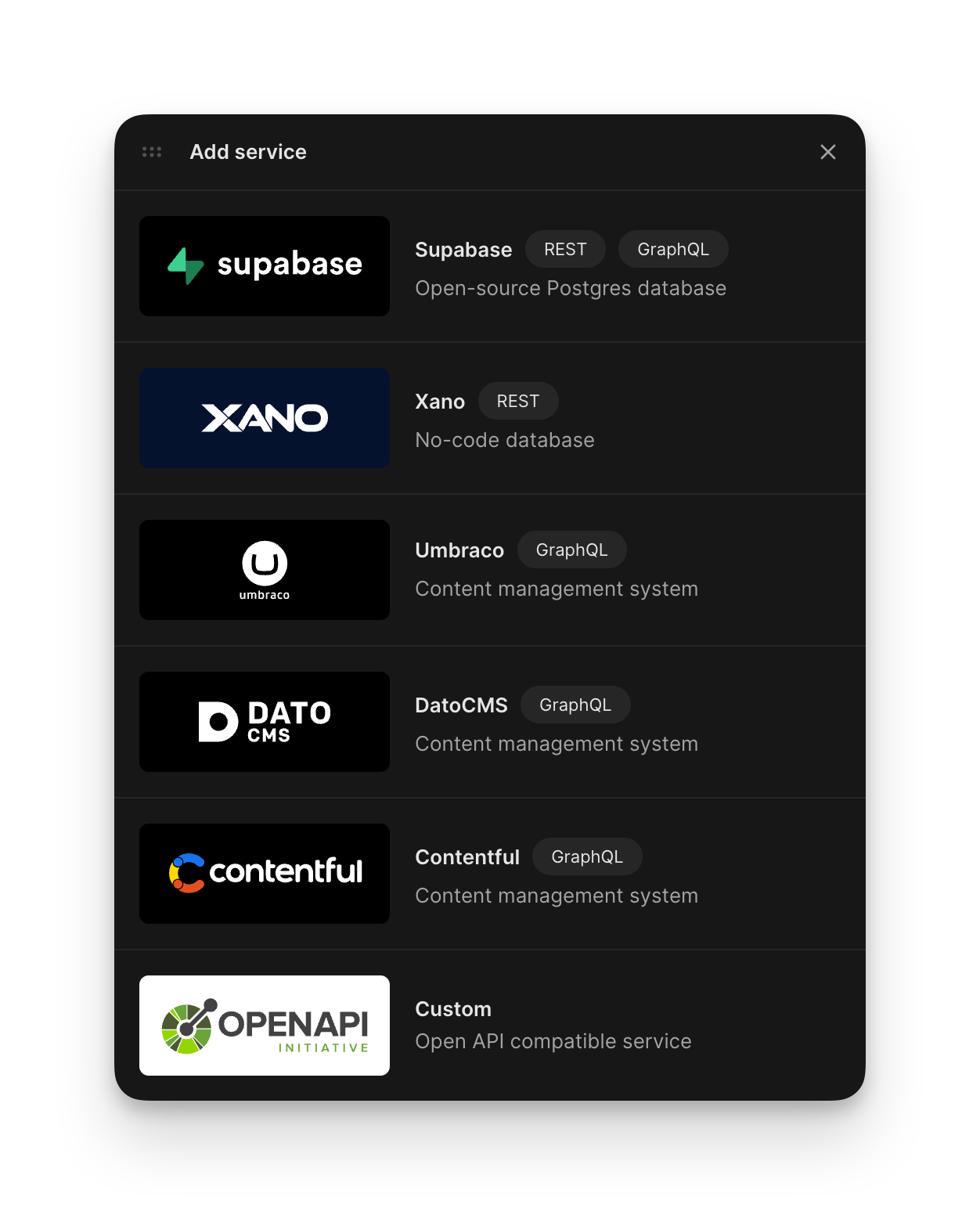
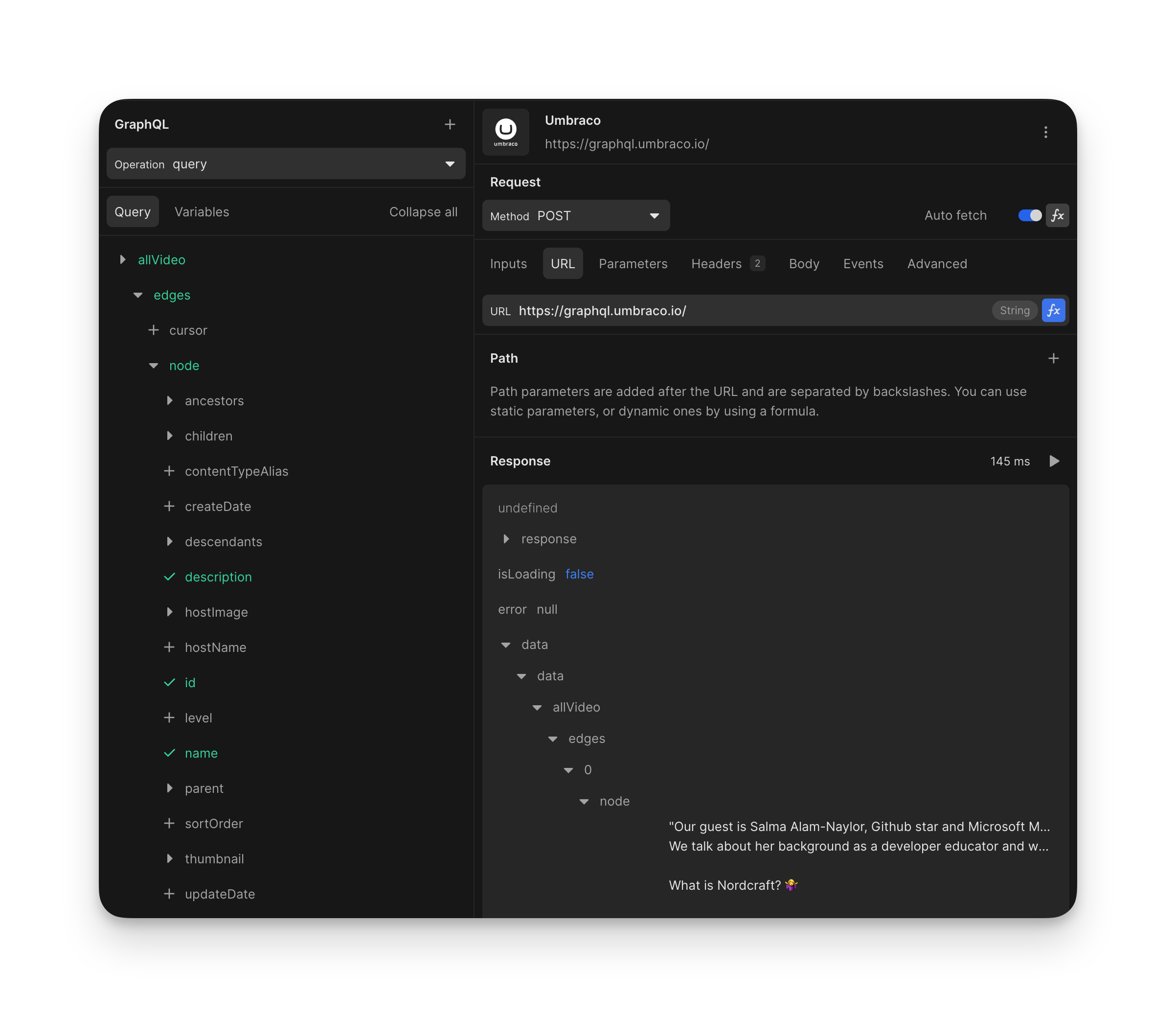


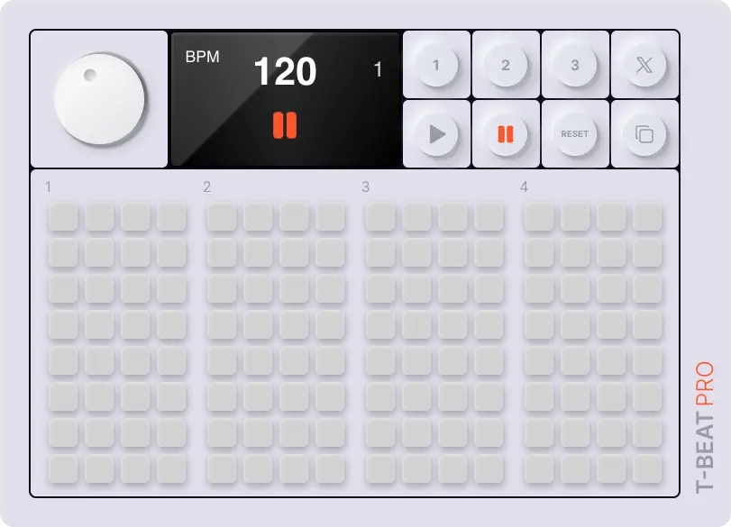


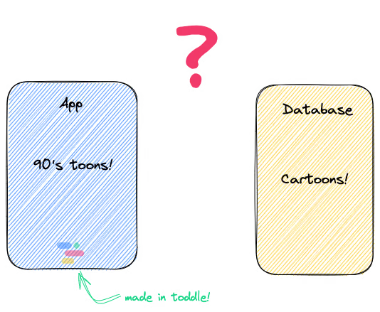
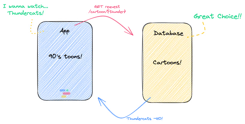
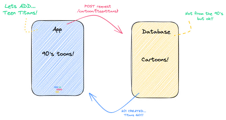


")